Pharmacy Overview Page for Health Plan Members
Consolidating scattered pharmacy tools into one clear, consistent experience.

Jonelle Boyd, Product Designer (UX/UI)
Consolidating scattered pharmacy tools into one clear, consistent experience.
Centene
Sr. UX/UI Designer
Figma, Miro, Fondue Design System, Adobe Experience Manager (AEM)
In 2025, Centene initiated the design of its new Secure Chassis member portal—a unified digital hub that brings together all health plan information for Medicare and Medicaid members, previously scattered across multiple sites and pages.
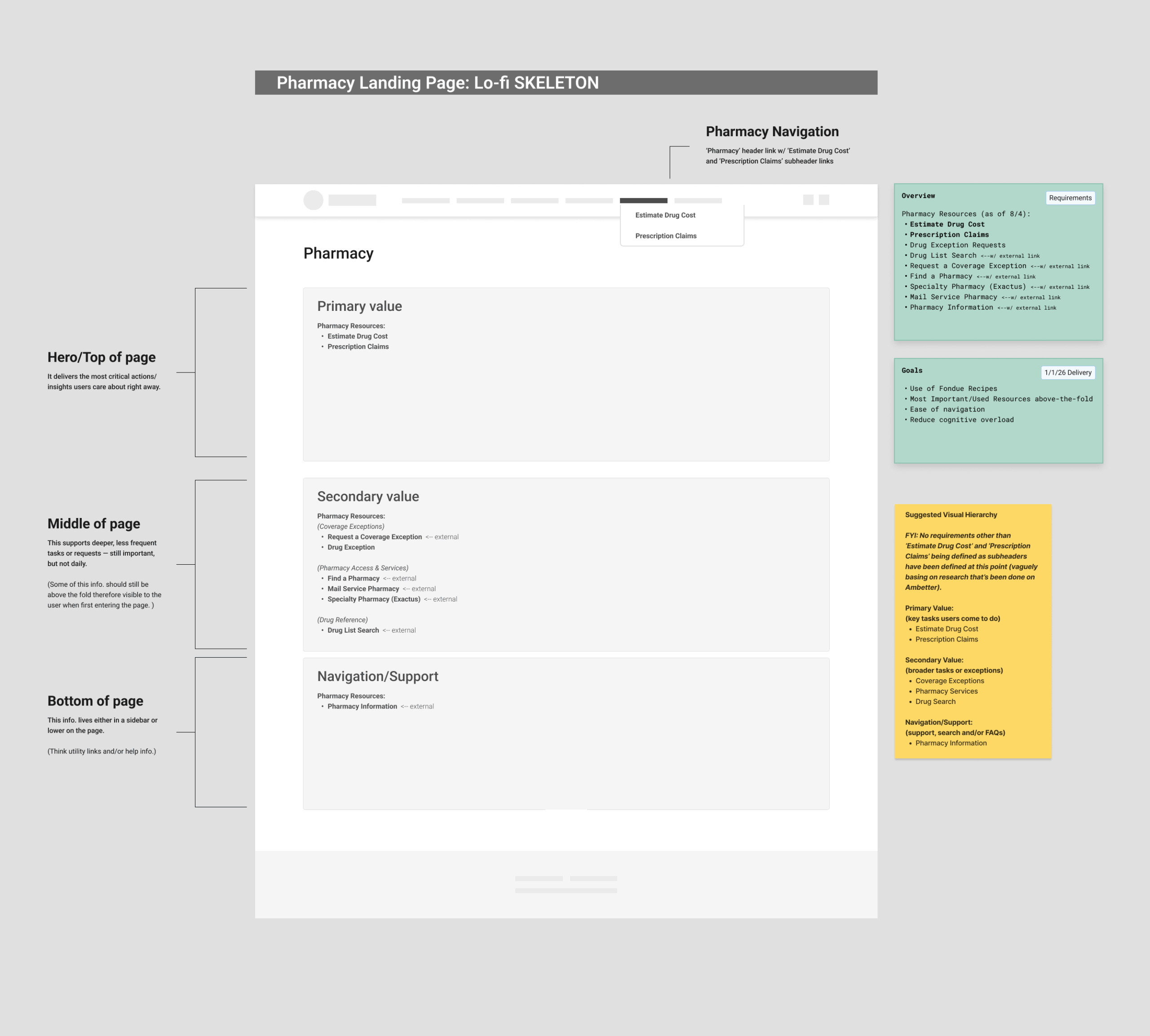
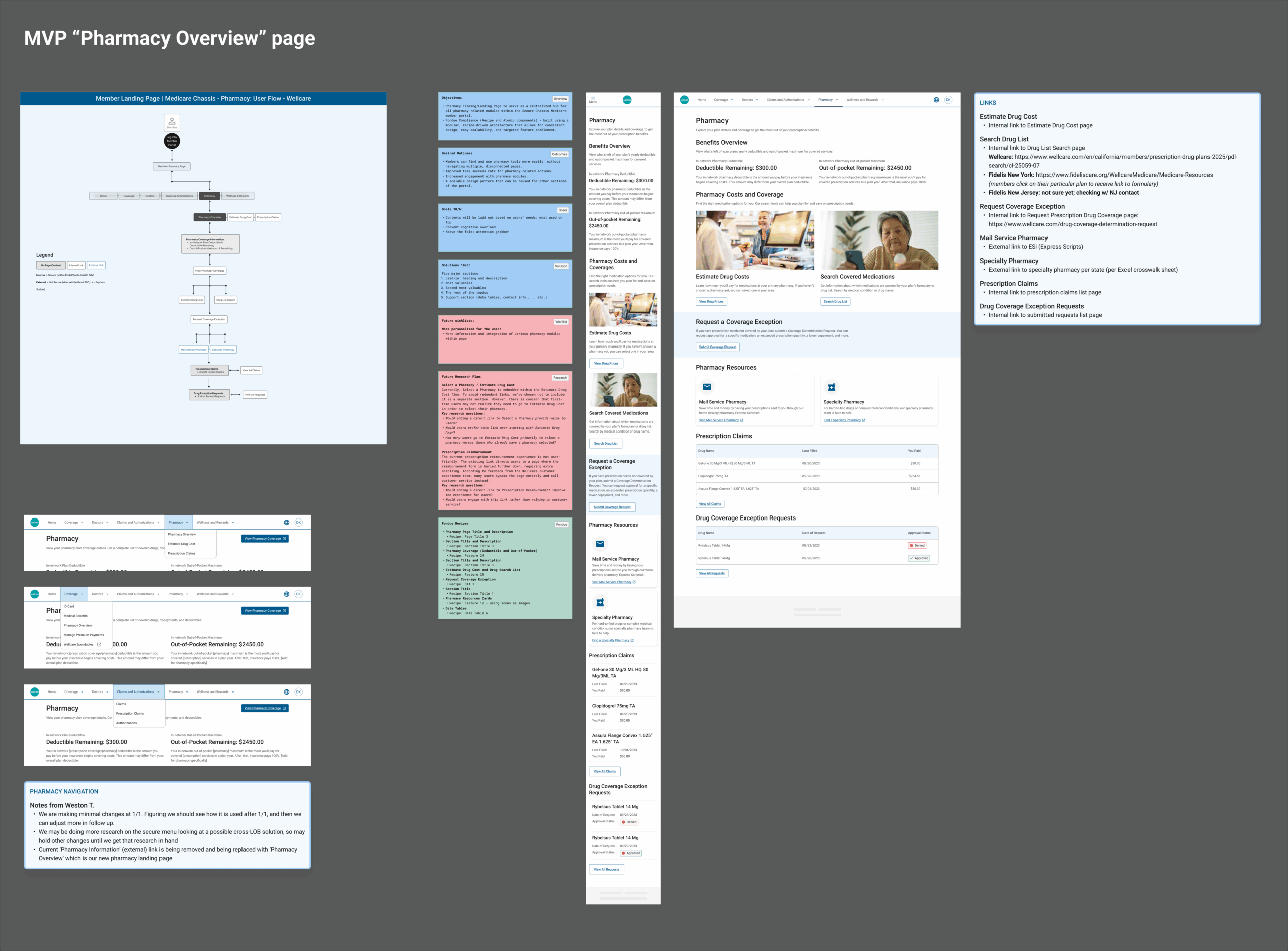
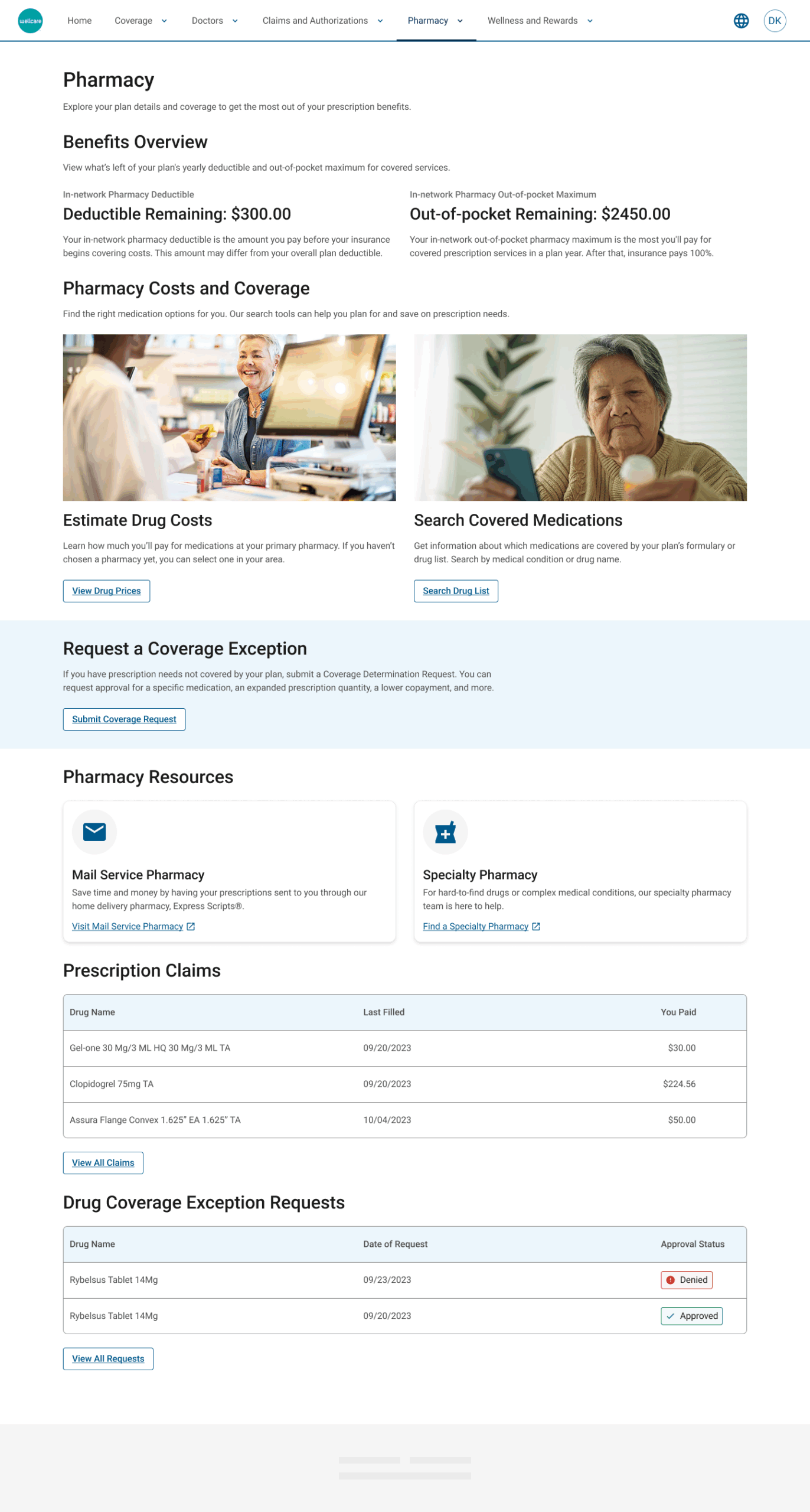
Within this new portal, the Pharmacy Overview page was created to streamline how members and caregivers access essential pharmacy resources—such as drug cost estimators, prescription claims, medication history, and coverage details—while ensuring consistency, accessibility, and long-term scalability across all Centene brands (WellCare, Fidelis, and Centene Legacy).
As the lead product designer, I partnered closely with product managers, business stakeholders, and the UX content and research teams to define requirements, align on user needs, and design a scalable, modular experience grounded in Centene’s Fondue design system.
Kristy Castro, Pharmacy SME
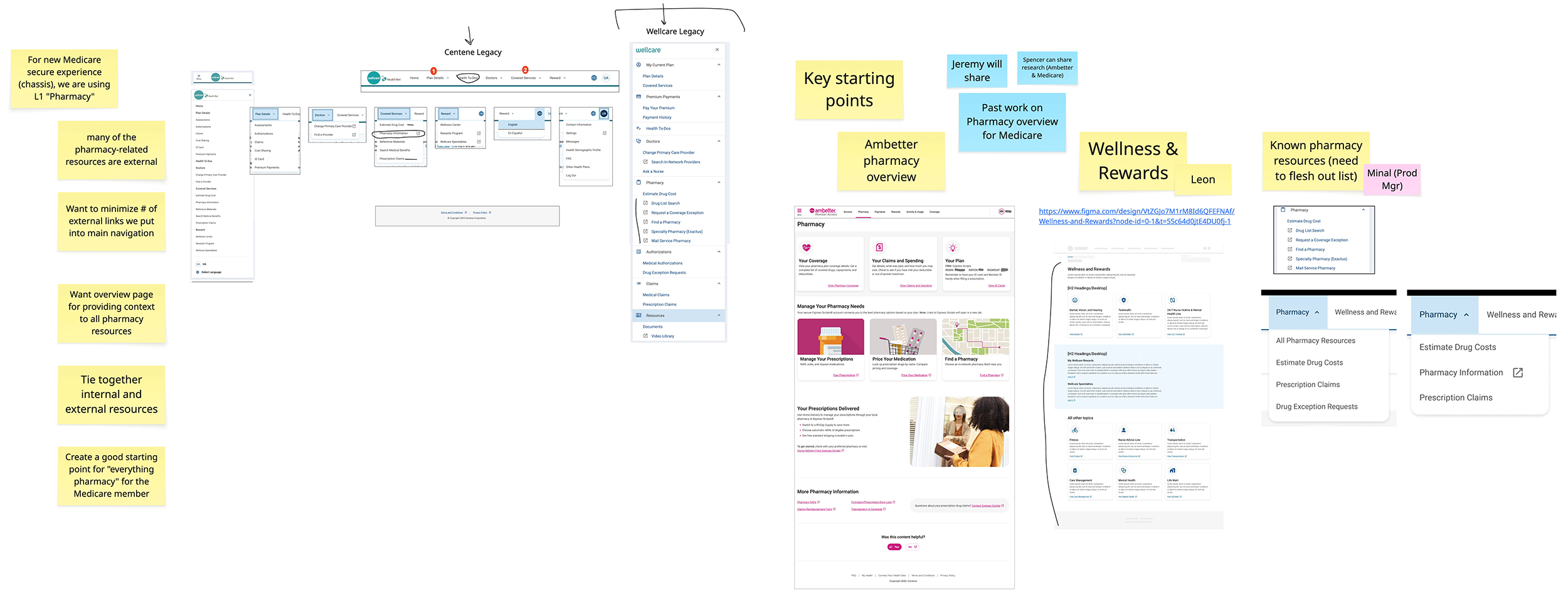
Before this project, pharmacy-related features were scattered across multiple locations within the Medicare portal. Members often struggled to locate tools or understand where to complete tasks, leading to confusion, slower task completion, and increased support calls.
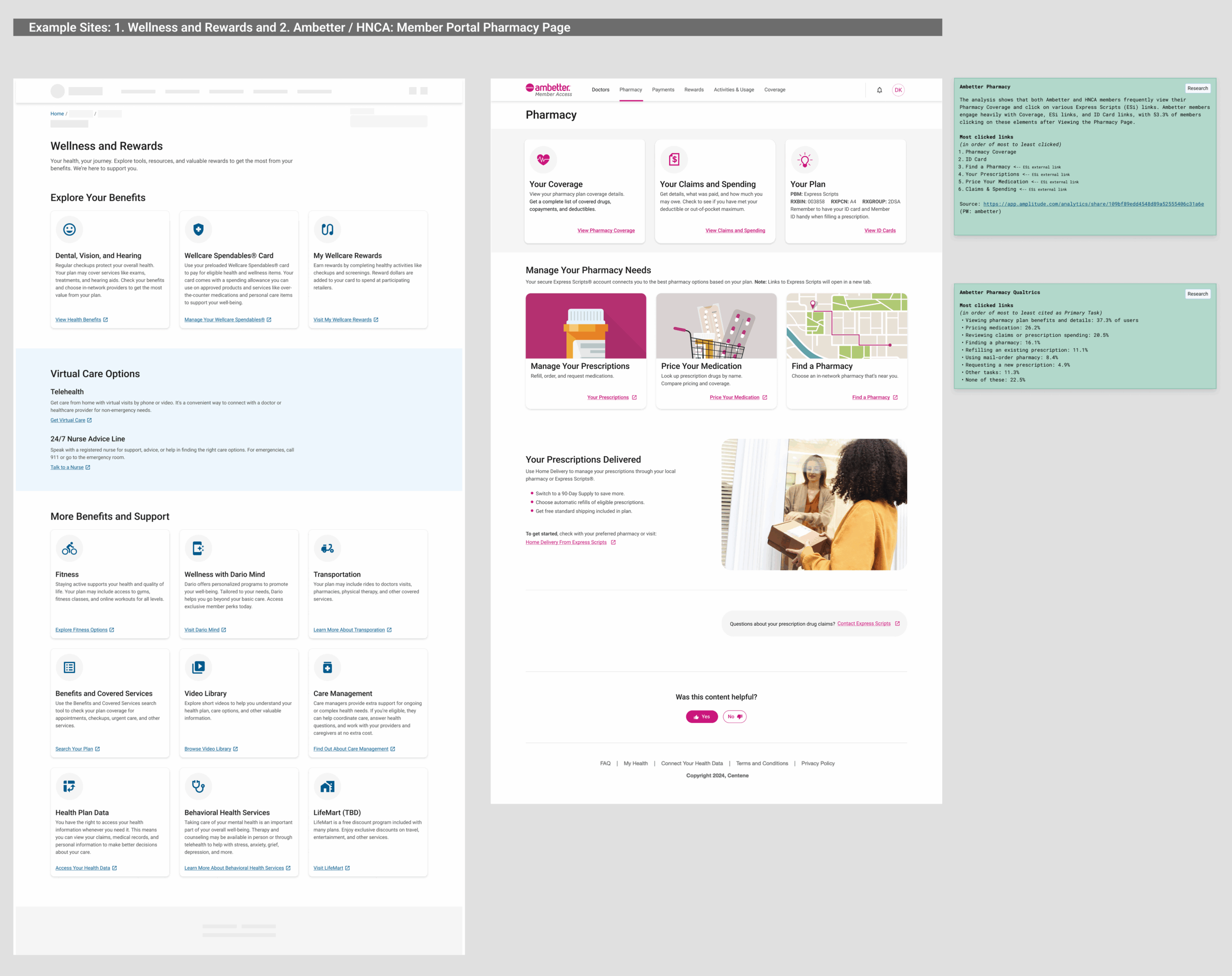
Additionally, the project faced tight timelines and evolving requirements—particularly around Fidelis and Duals — plans involving both Medicare and Medicaid — which lacked finalized pharmacy resources during design. Limited time for fresh research meant relying on previous Ambetter Pharmacy and WellCare customer survey insights to inform key decisions.
Key challenges included:
To create a unified, accessible, and intuitive overview page, I followed a structured approach through multiple design phases:

The Pharmacy Landing Page serves as a foundational experience within the Secure Chassis ecosystem—setting a new precedent for modular, unified healthcare design at Centene.
Beyond simplifying pharmacy navigation, the project also helped establish consistent, scalable UX practices across teams with:
The project also reinforced the value of reusability through the Fondue system, allowing future pharmacy features to be added with minimal redesign.
While this launch was an MVP, the design achieved key business and UX goals:
Established a scalable foundation for personalization and feature expansion post launch
Future phases will include usability testing, personalization improvements, and research-driven updates.
This project emphasized the importance of clarity and collaboration when requirements are fluid; I learned to balance MVP delivery with long-term scalability—designing for what’s essential now, while anticipating what’s next.
Despite the lack of new research, leveraging previous insights and close partnership with product and business teams ensured a strong, user-centered outcome.
It also reinforced how a modular design system accelerates delivery—empowering teams to focus on meaningful UX decisions instead of reinventing visual components.
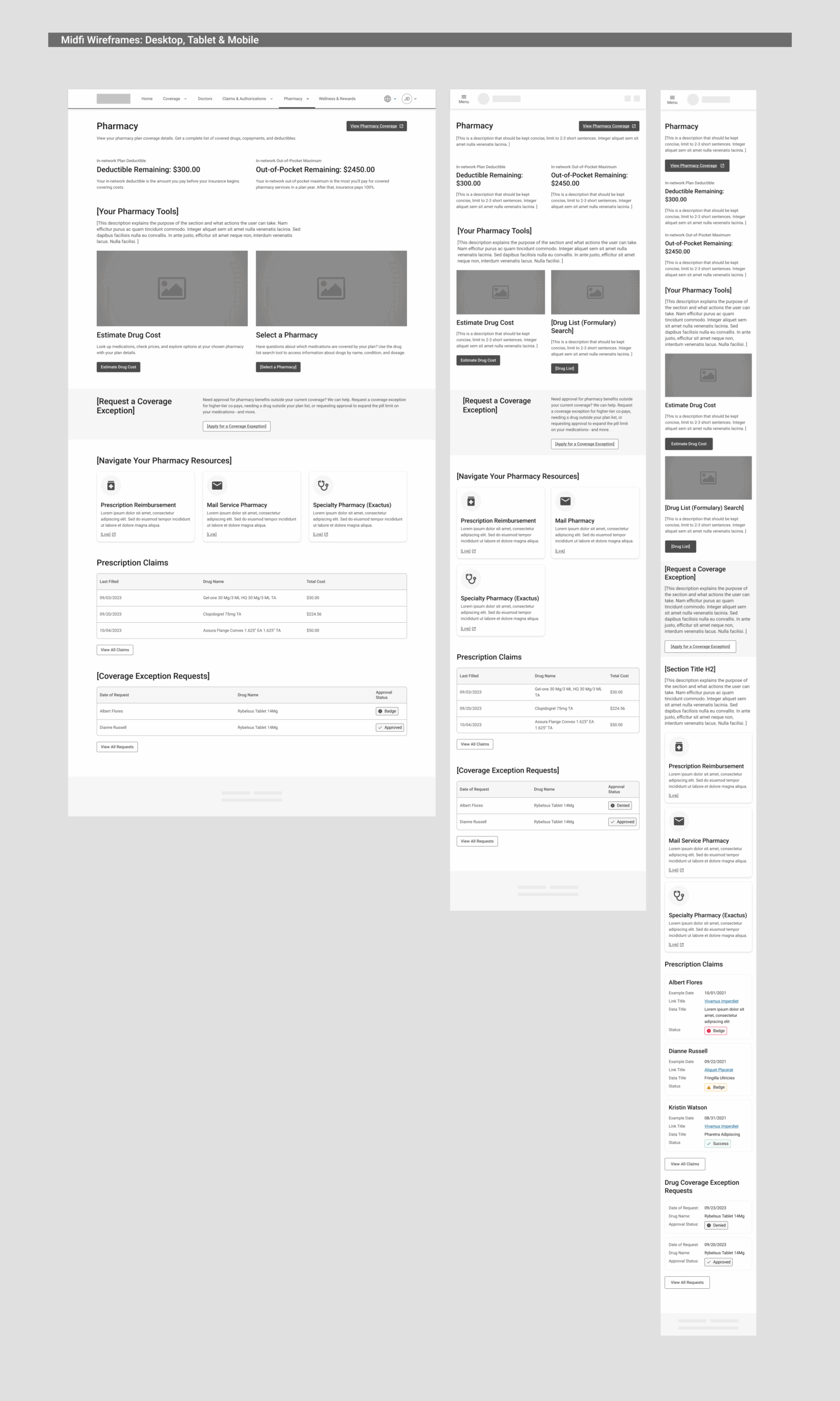
The final design minimized cognitive load by structuring all pharmacy tools visibly on one page, reducing unnecessary clicks and helping users quickly locate what they need.
Designing an intuitive workflow to guide researchers through instrument selection
Thermo Fisher Scientific
Sr. UX/UI Designer
Sketch
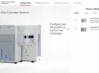
The Attune Flow Cytometer Configurator is a digital tool designed to help researchers customize and configure Thermo Fisher Scientific’s Attune Flow Cytometer to fit their laboratory needs. This project was not a redesign but a net-new experience built to support users in understanding and selecting from a range of product options and accessories.
Flow cytometers are highly technical instruments with multiple configuration paths based on specific research needs, such as laser selection, detector options, and compatible accessories. Many users are experts in their field but may not be familiar with how to configure an instrument online.
To ensure usability and accuracy, I followed a structured process grounded in UX best practices:
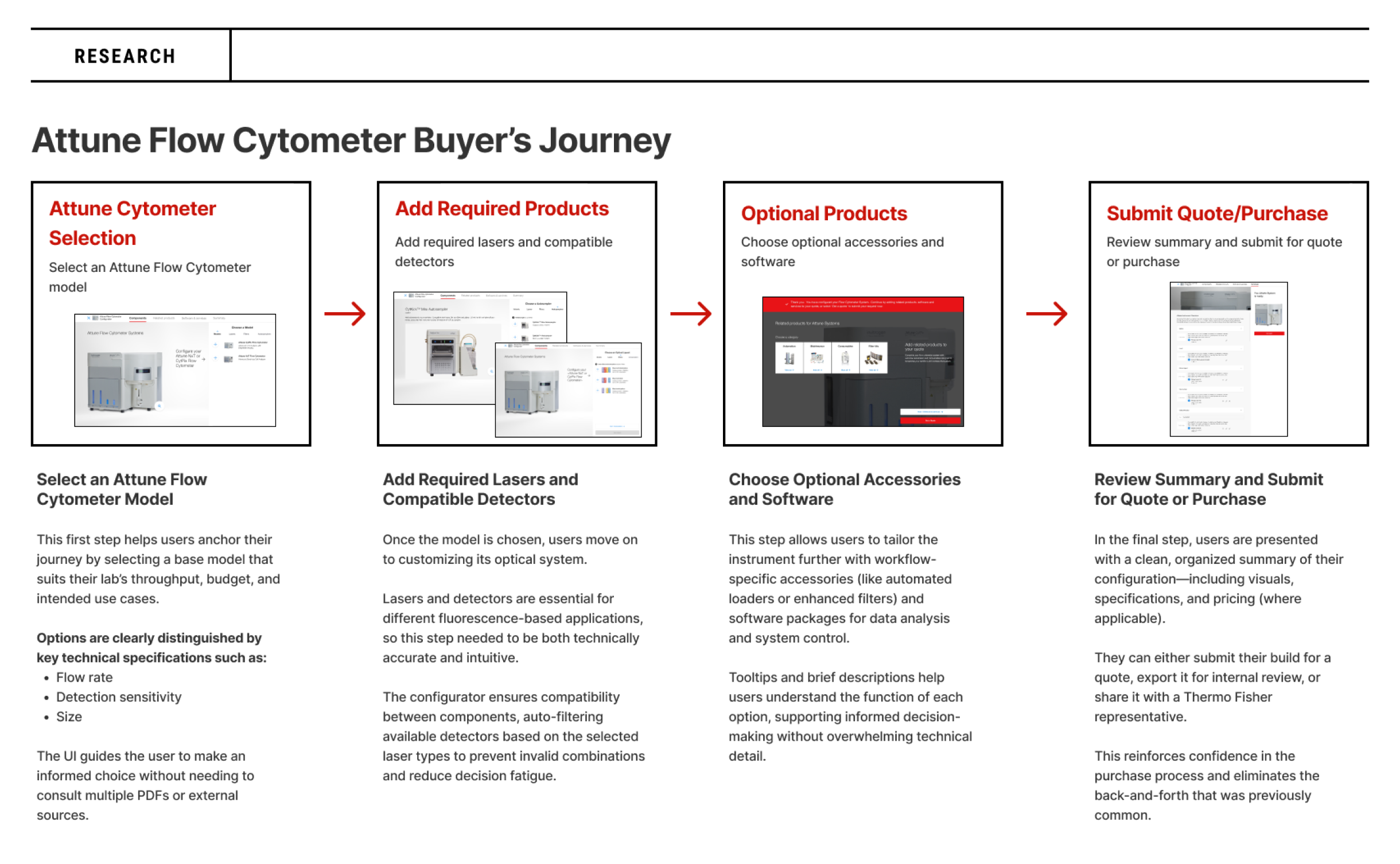
Before designing the interface, I collaborated with product owners to understand the typical flow cytometer buyer’s journey—from initial research to final purchase. Users were often scientists or lab managers who needed to ensure the selected configuration aligned with their experiment types, lab capacity, and budget. Many relied heavily on product documentation or sales representatives in the past.
To align the configurator with real-world behavior, I mapped a step-by-step journey:
The design aimed to support users at each of these stages with embedded guidance and real-time feedback.
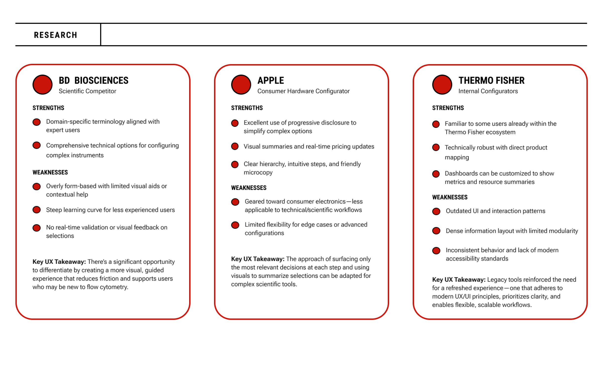
To ensure the configurator met both usability and business goals, I evaluated digital tools from three relevant sources:
These comparisons reinforced the value of progressive guidance, real-time feedback, and a clean, scalable layout tailored to both novice and expert users.
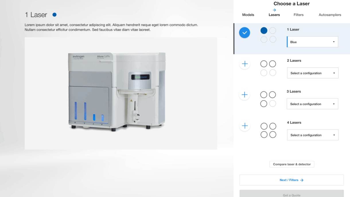
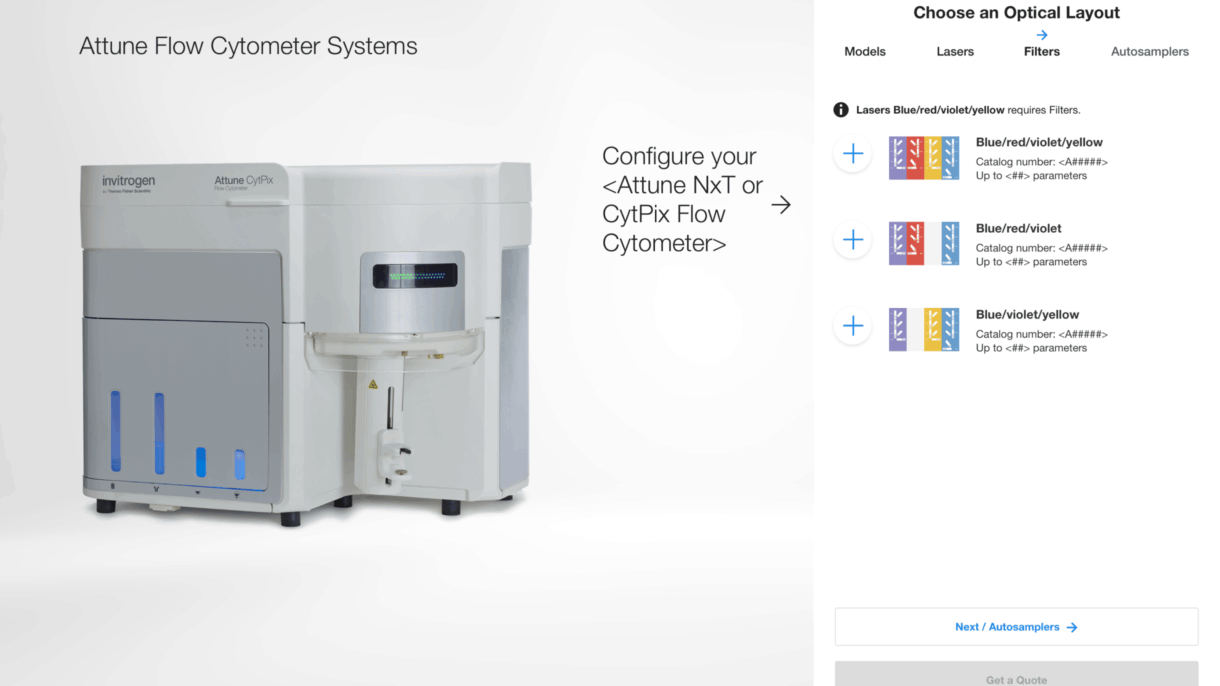
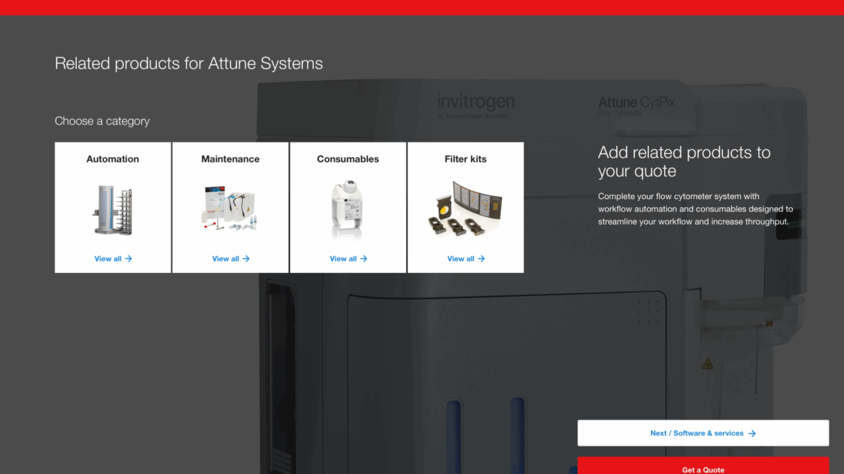
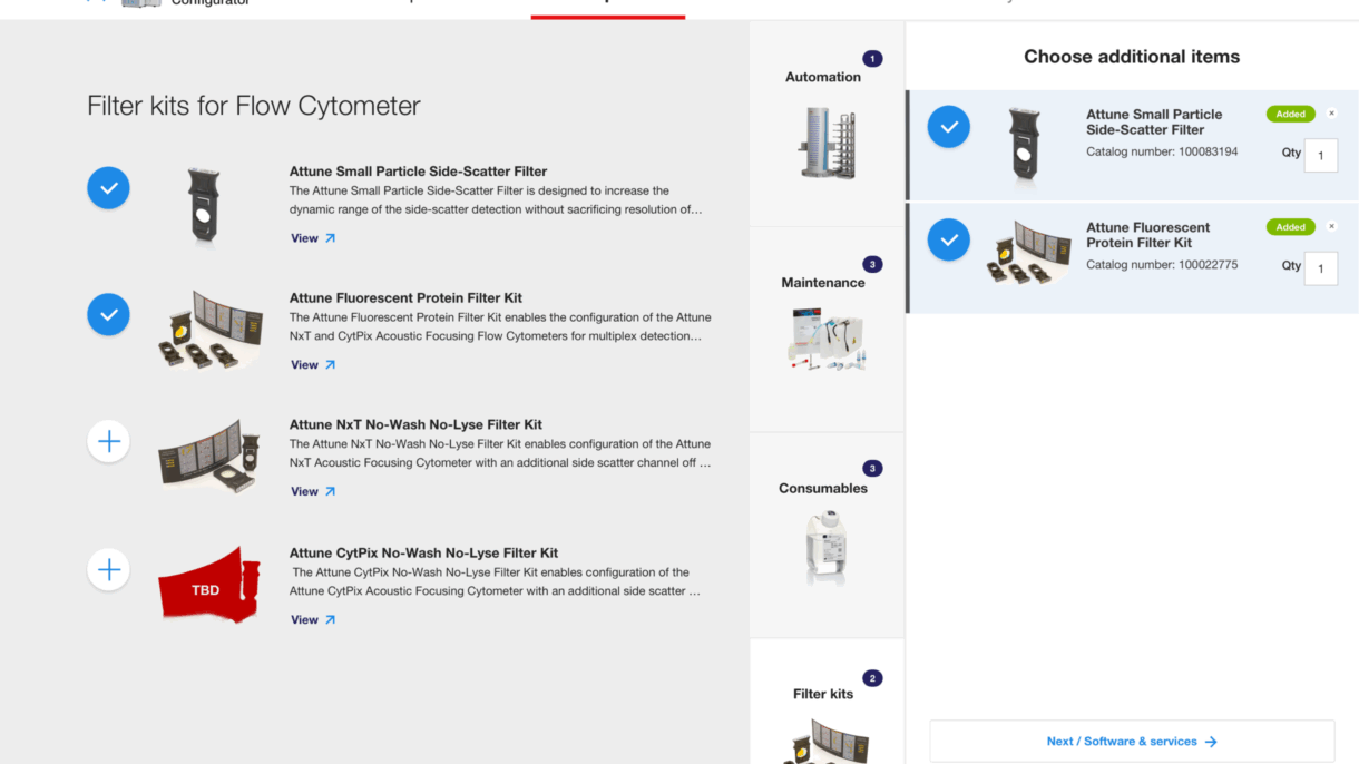
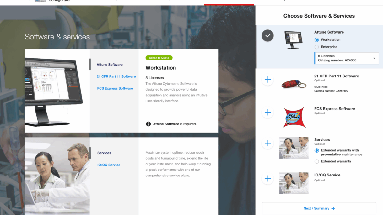
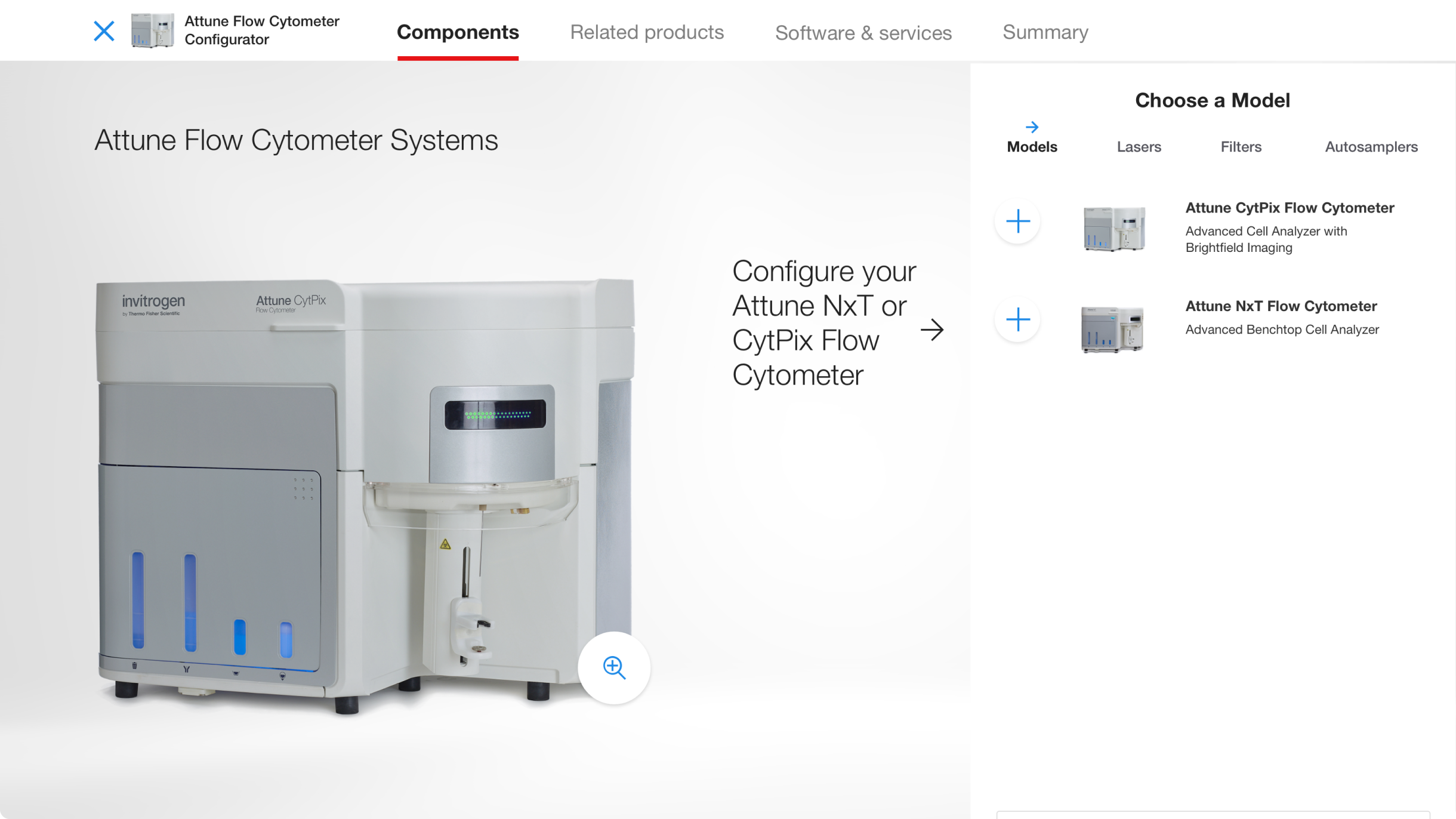
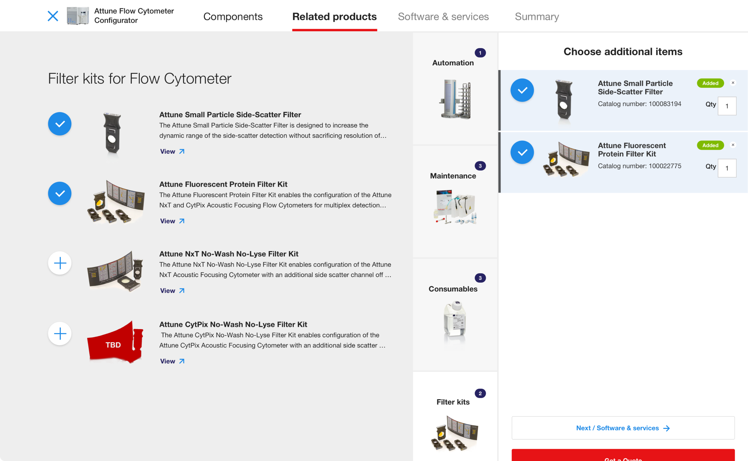
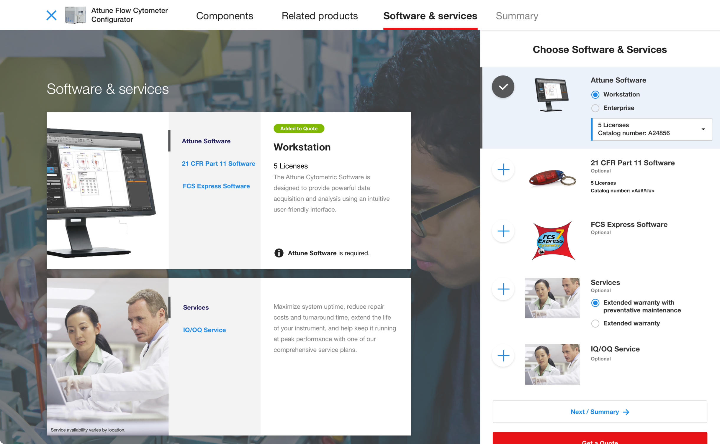
The final configurator design uses a multi-step format with persistent navigation, clear section headers, and smart defaults. Users begin by choosing a core model, then move through laser options, detectors, accessories, and service plans. A summary panel updates in real time, helping users visualize their configuration as they go.
The Attune Flow Cytometer Configurator launched as a key part of Thermo Fisher’s instrument purchasing experience. It has helped simplify what was previously a complex and sales-driven process into a guided, digital-first tool accessible to a wider range of users.
This project highlighted the value of close collaboration between UX, product, and engineering teams in making highly technical systems more accessible. Designing for modularity and progressive disclosure ensured that users weren’t overwhelmed while still retaining full control over their configuration. It also reinforced the importance of domain-specific UX writing to bridge the gap between scientific precision and usability. As the tool’s framework proves successful, it opens the door to scaling the configurator model across Thermo Fisher’s broader portfolio of scientific instruments.
Maintaining Consistency and Standards in user interface design refers to using consistent layouts and interaction patterns across each step to reduce cognitive load.
Creating a streamlined, guided experience for researchers designing and purchasing synthetic genes
Thermo Fisher Scientific
Sr. UX/UI Designer
Sketch
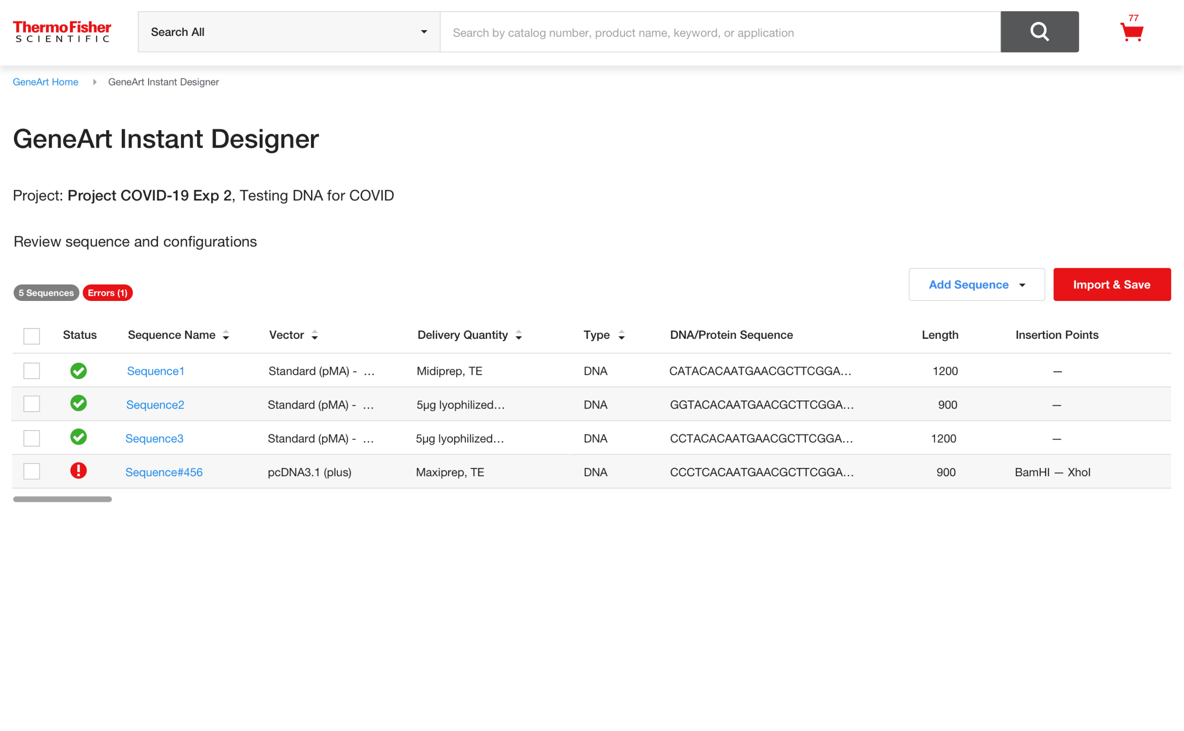
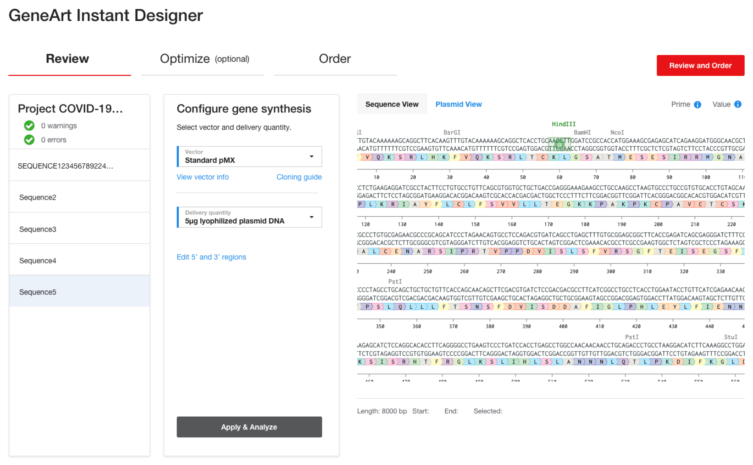
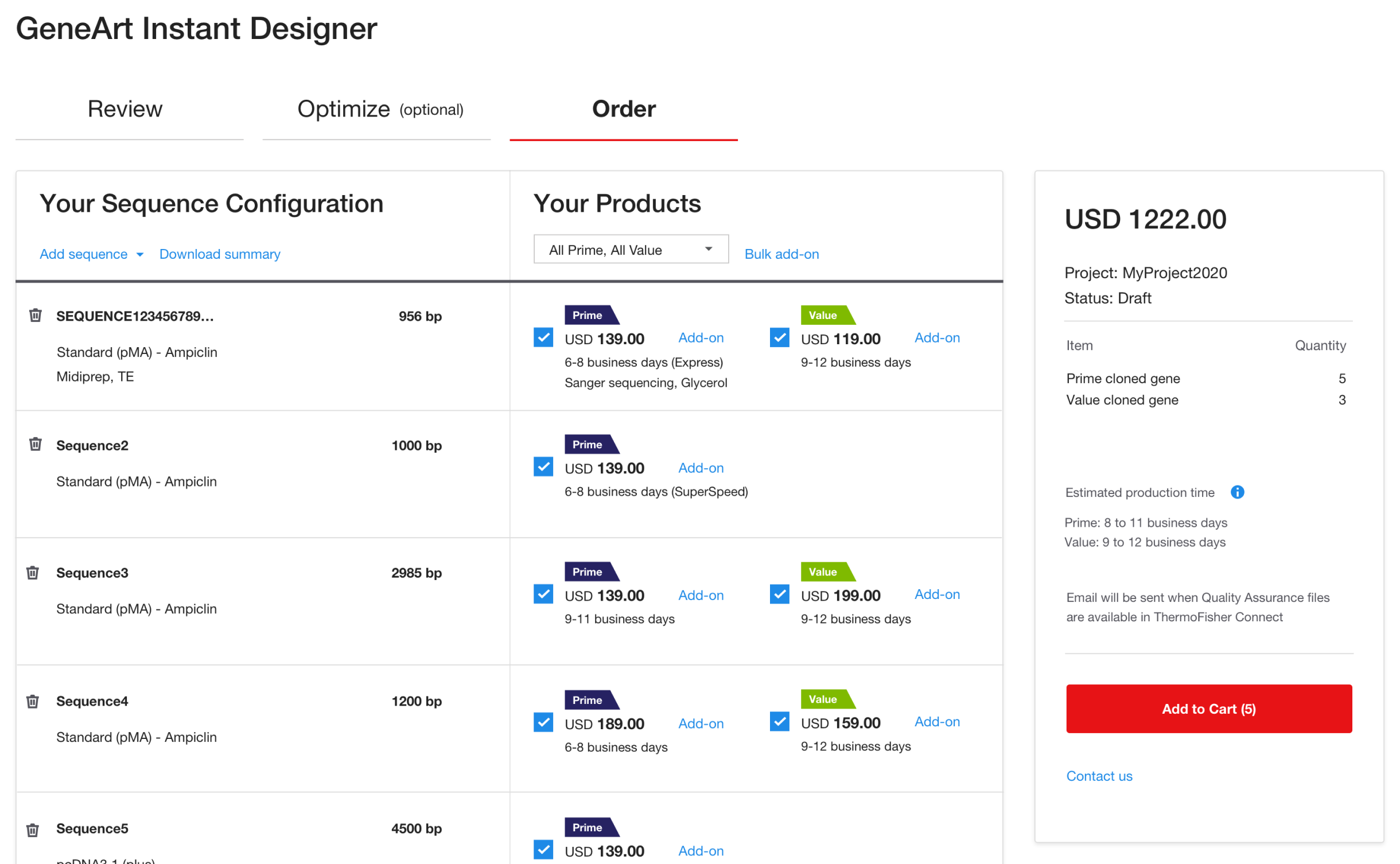
GeneArt Instant Designer is a web-based tool from Thermo Fisher Scientific that enables researchers to design and order synthetic genes with ease. The tool automates codon optimization, cloning vector selection, and validation, helping users streamline their gene synthesis workflows without needing to contact support or use offline tools. As a UX/UI Designer at Thermo Fisher, I partnered with product managers, scientists, and engineering to redesign the tool’s interface—focusing on making complex biological inputs more approachable and reducing friction in the ordering process.
Align the experience with Thermo Fisher’s broader eCommerce and product ecosystem
The legacy version of Instant Designer was functional but overwhelming. It relied heavily on scientific jargon, offered limited feedback on errors, and lacked guidance through critical steps like sequence optimization and cloning. Users—especially those outside of molecular biology specialties—often abandoned the flow or reached out to support, which defeated the tool’s purpose as a self-service solution.
To address the complexity while preserving scientific accuracy, I applied a step-by-step, user-centered design approach:
We focused on reducing cognitive load and offering contextual support at each step. Key improvements included:
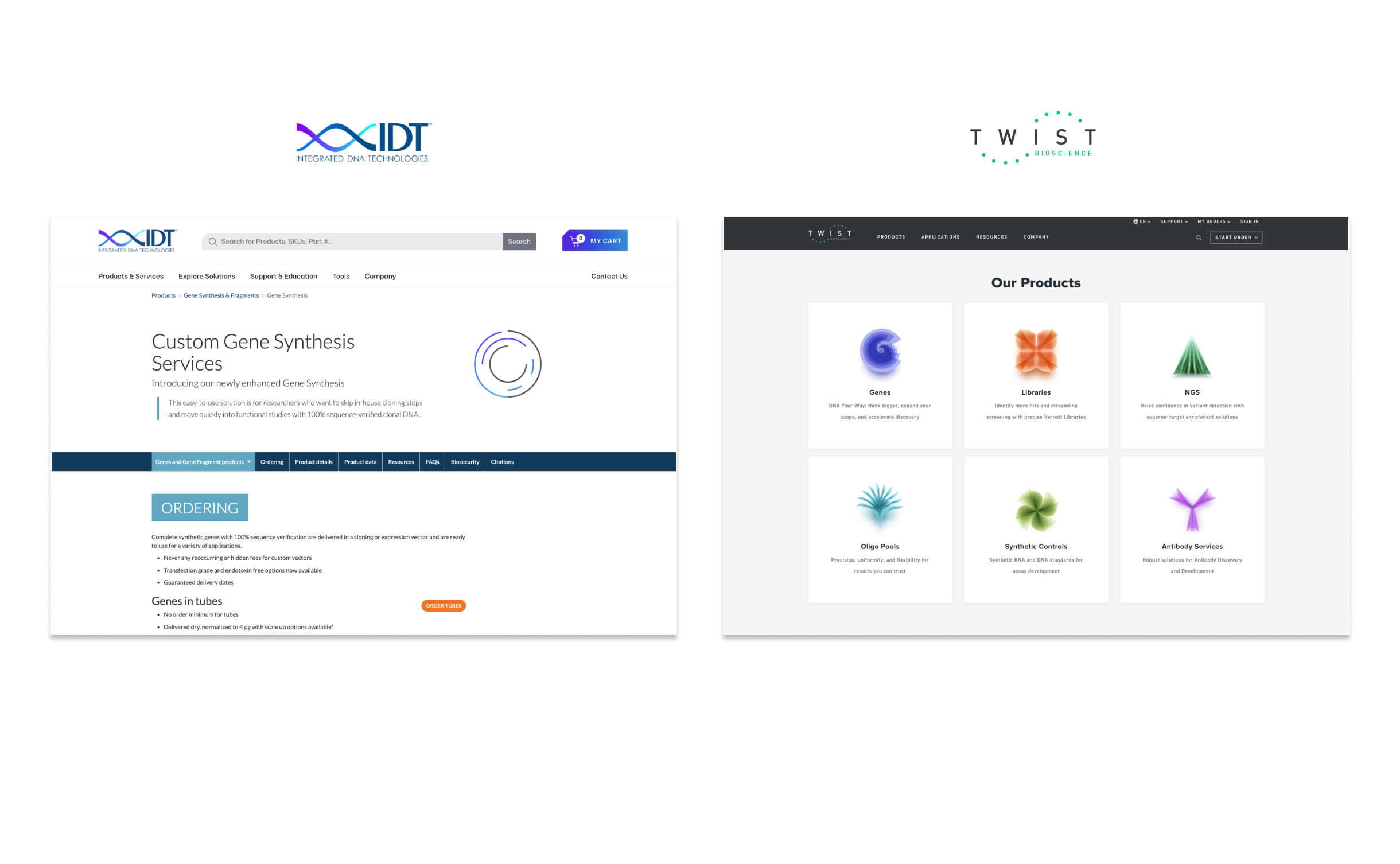
We benchmarked the experience against other gene synthesis tools, like IDT and Twist Bioscience, and surveyed internal tools used by support staff.
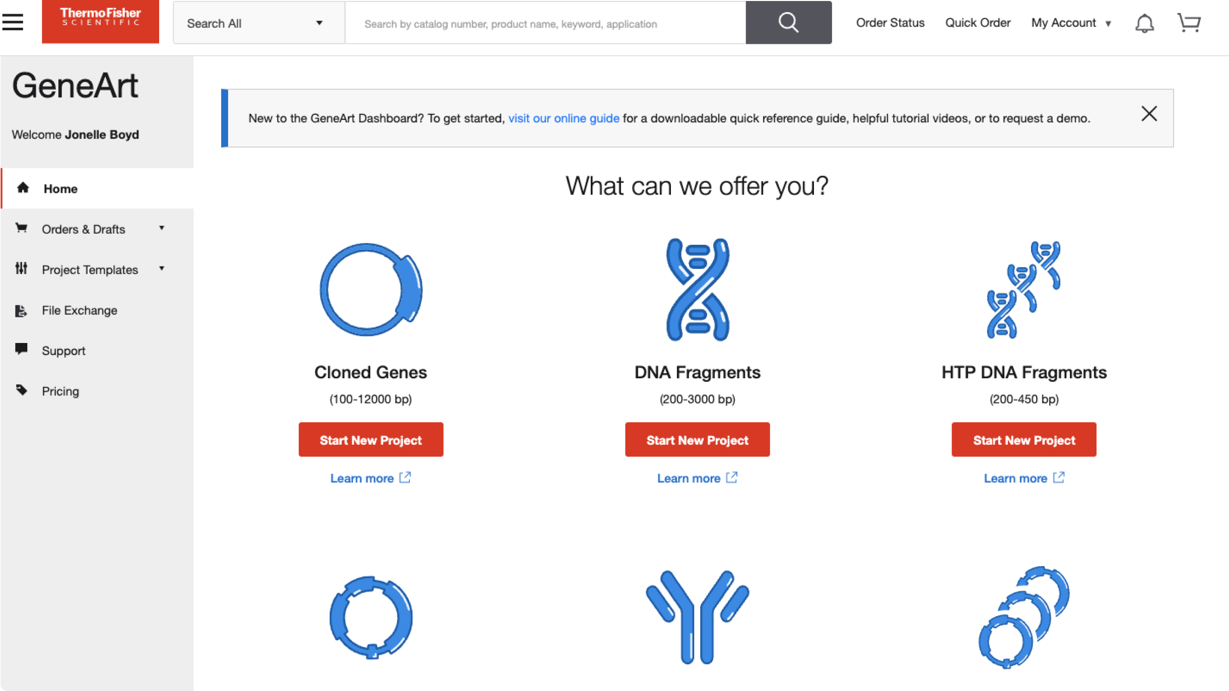
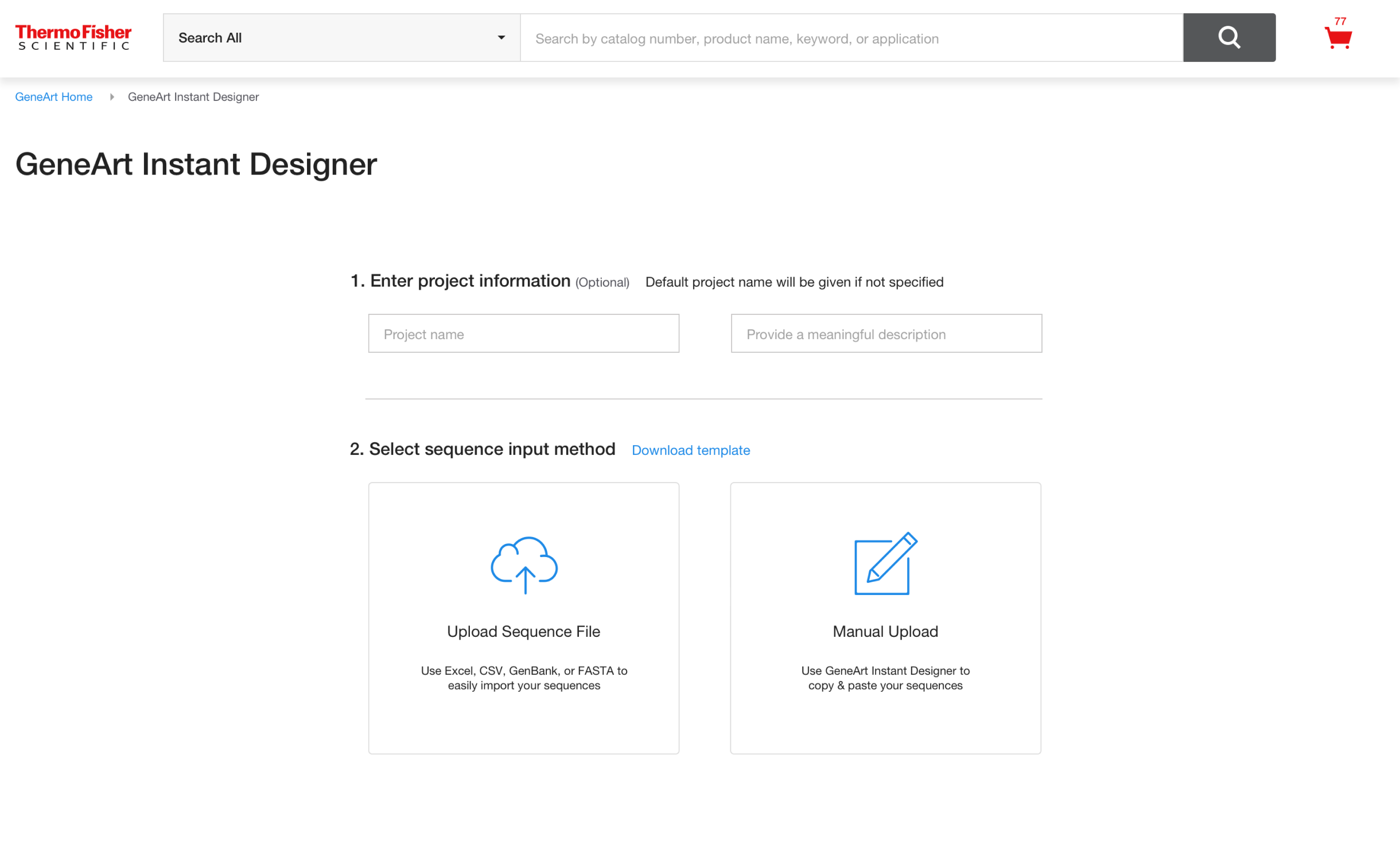
The final design introduced a clean, modular UI with clear progress indicators and contextual help. Key features included:
The redesigned experience significantly improved usability and adoption among researchers. After launch:
While the redesign focused on the core ordering flow, future opportunities include integrating the tool more seamlessly with Thermo Fisher’s broader digital ecosystem—such as enabling batch ordering, user account customization, and real-time order tracking. These additions could further enhance user autonomy and improve the experience for research teams managing high volumes of synthetic gene requests.
This project taught me the importance of balancing scientific precision with intuitive design. Collaborating closely with subject matter experts helped ensure that simplification didn’t come at the cost of functionality. Working within a regulated, enterprise environment also reinforced the value of consistent documentation, stakeholder alignment, and design system adherence. Most importantly, I saw how thoughtful UX can empower researchers to move faster and with more confidence in their work.
Progressive Disclosure is a design principle that involves presenting only the information or options a user needs at a given moment—revealing more complexity or detail gradually as needed.
Flexible, scalable UX for diverse user journeys in cloud environments
Pulumi
Sr. UX/UI Designer
Figma
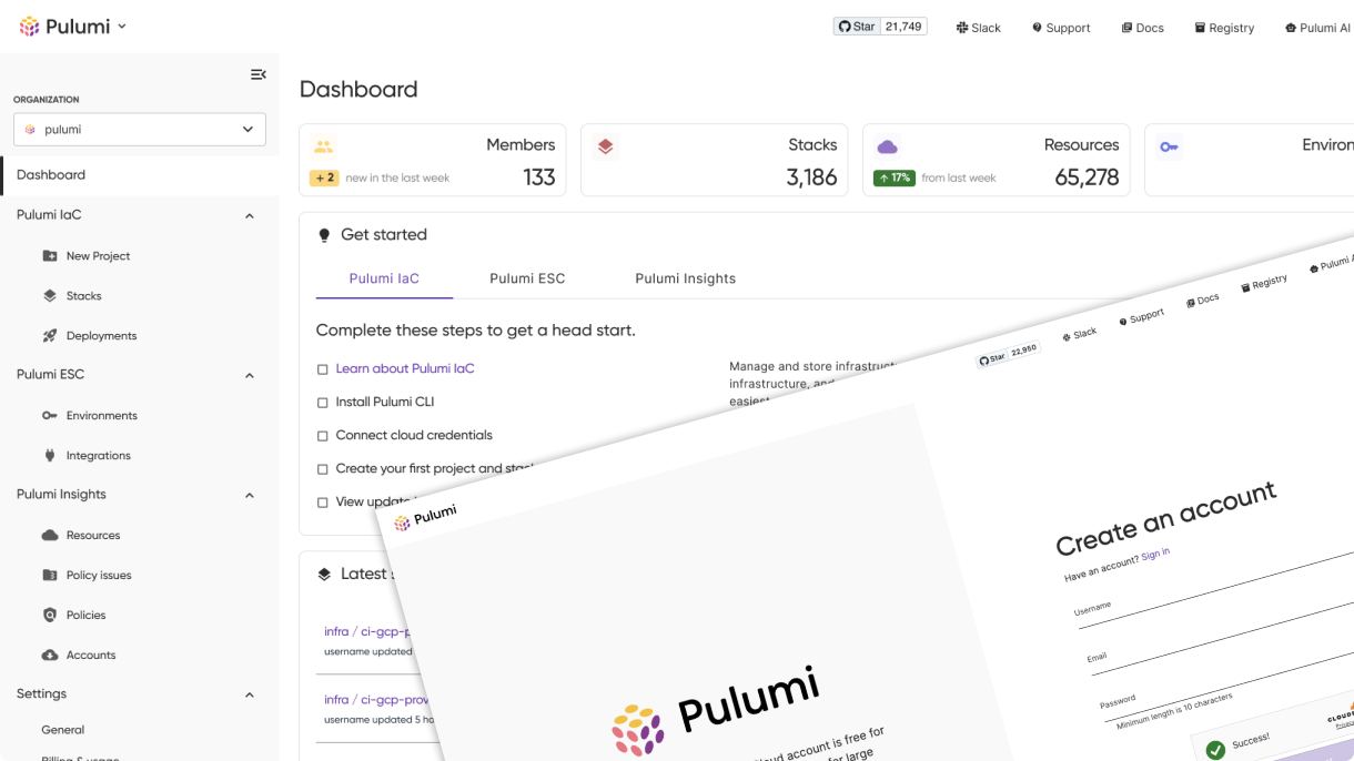
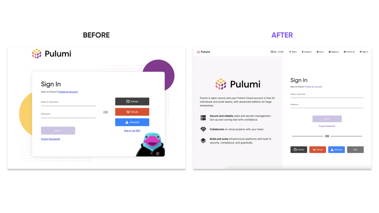
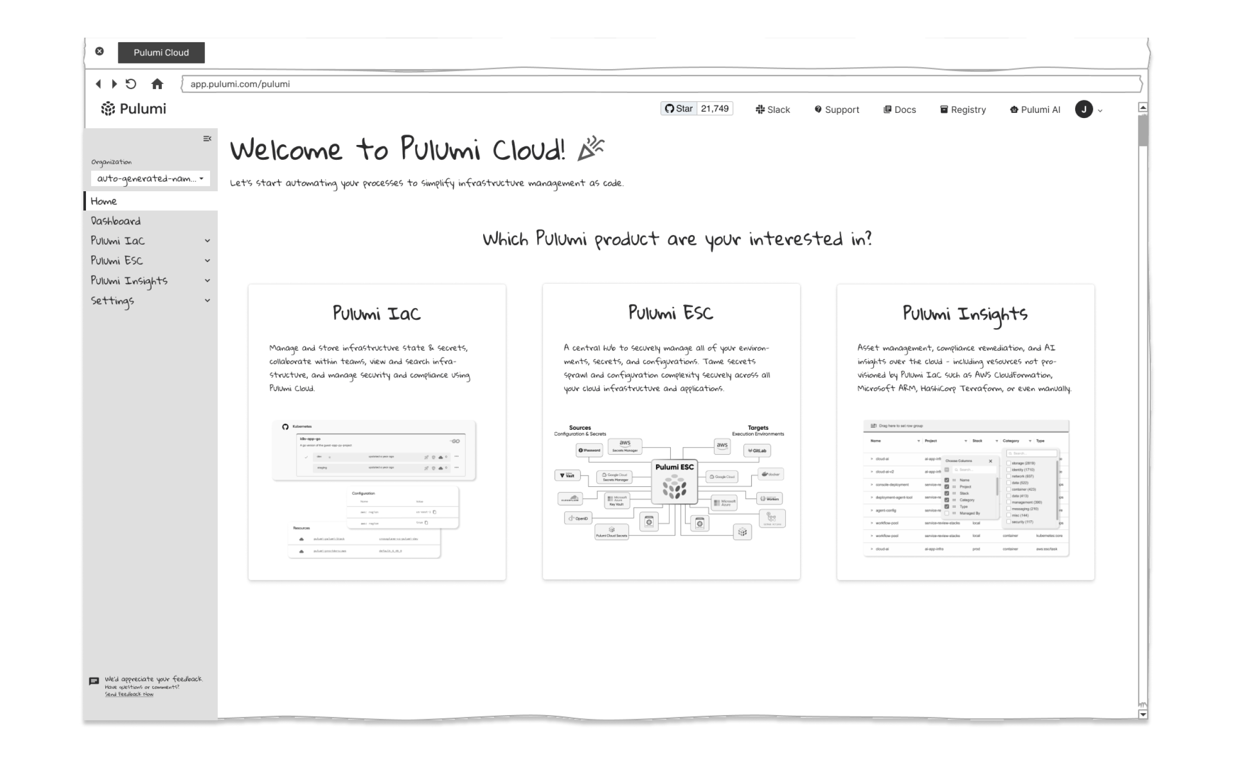
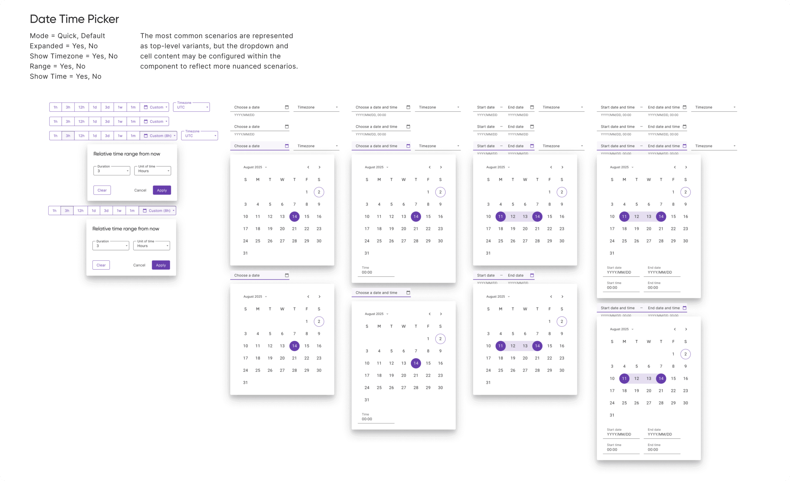
As Pulumi’s user base expanded, it became clear that the Pulumi Cloud Dashboard needed a redesign—one that could guide first-time users while still supporting experienced ones. I partnered with product owners, product managers, and Pulumi’s principal data engineer to create an integrated onboarding experience directly within the dashboard. A/B testing and internal feedback played a key role in shaping the solution. Rather than building a separate onboarding flow, we focused on embedding helpful, contextual guidance into the core product experience—making onboarding feel like a natural part of the platform.
Design for flexibility to accommodate diverse user types and workflows
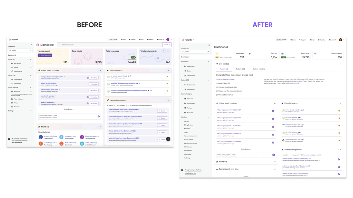
The original dashboard didn’t offer clear direction for new users and lacked flexibility for different onboarding scenarios (e.g., team onboarding, individual projects, different cloud providers). There was also confusion between the Dashboard and Home pages, leading to redundant or missed information.
Opportunities included:
To ensure the system was scalable, consistent, and easy to use, I followed a four-step approach grounded in UX best practices:
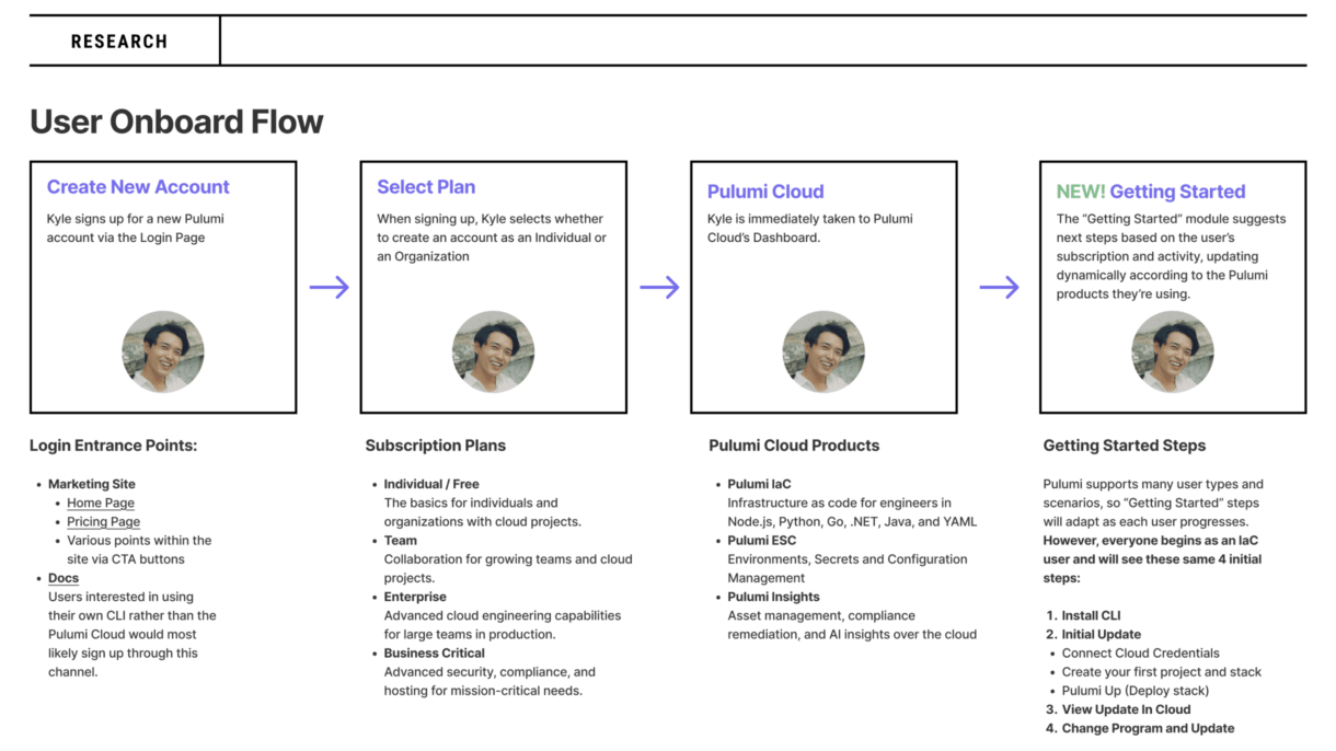
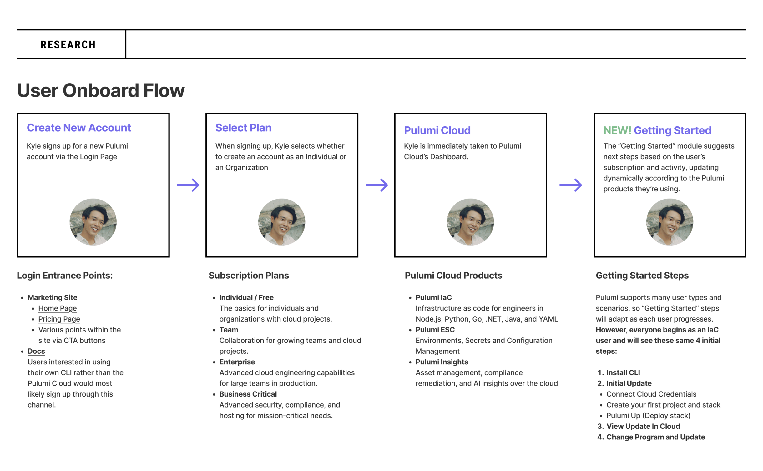
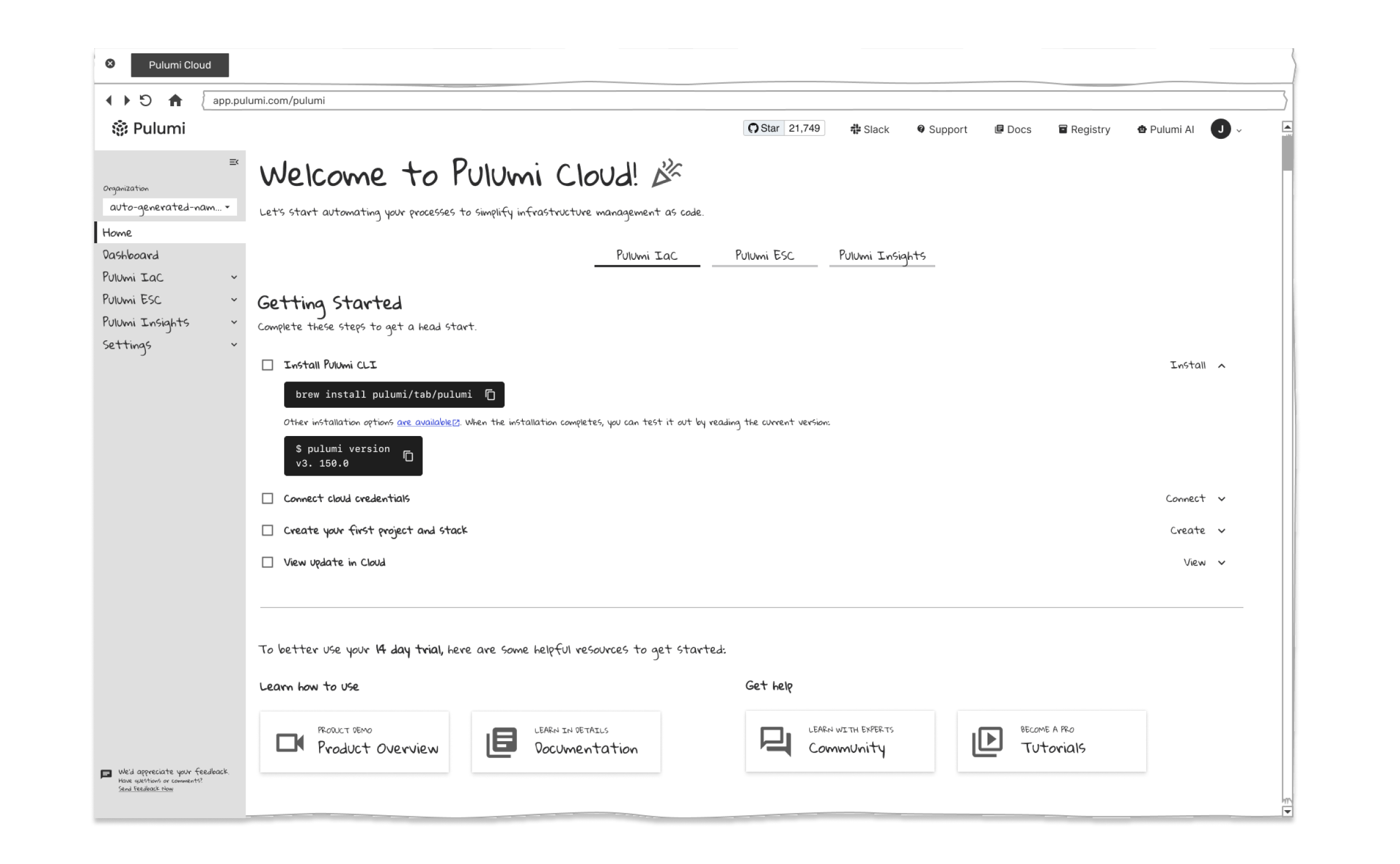
Through collaboration with the team in meetings and brainstorming sessions—as well as reviewing past user research, including defined personas and usability studies conducted by myself and other designers—I analyzed the current onboarding flow and identified areas for improvement. From this, I created a general User Onboarding Flow with the first three steps: Create New Account, Select Plan, and Pulumi Cloud—representing what users experience today. I also introduced a new fourth step: Getting Started, which features a dynamic module that suggests next steps based on the user’s subscription and activity. This module updates automatically according to the Pulumi products the user is actively using.
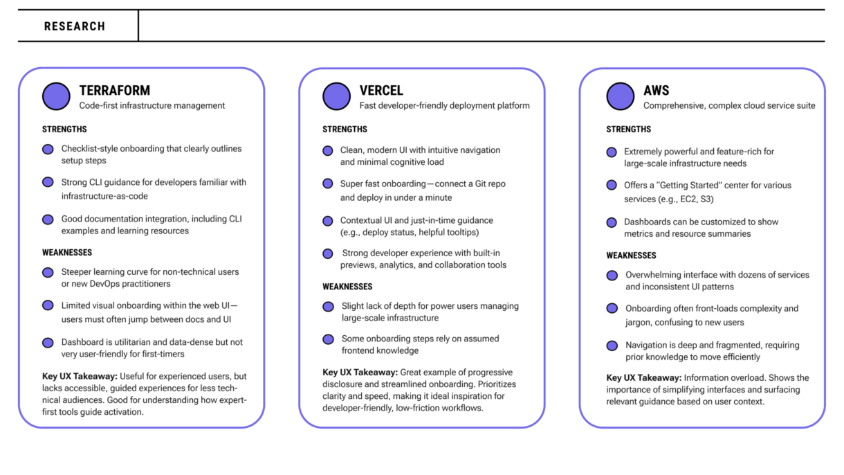
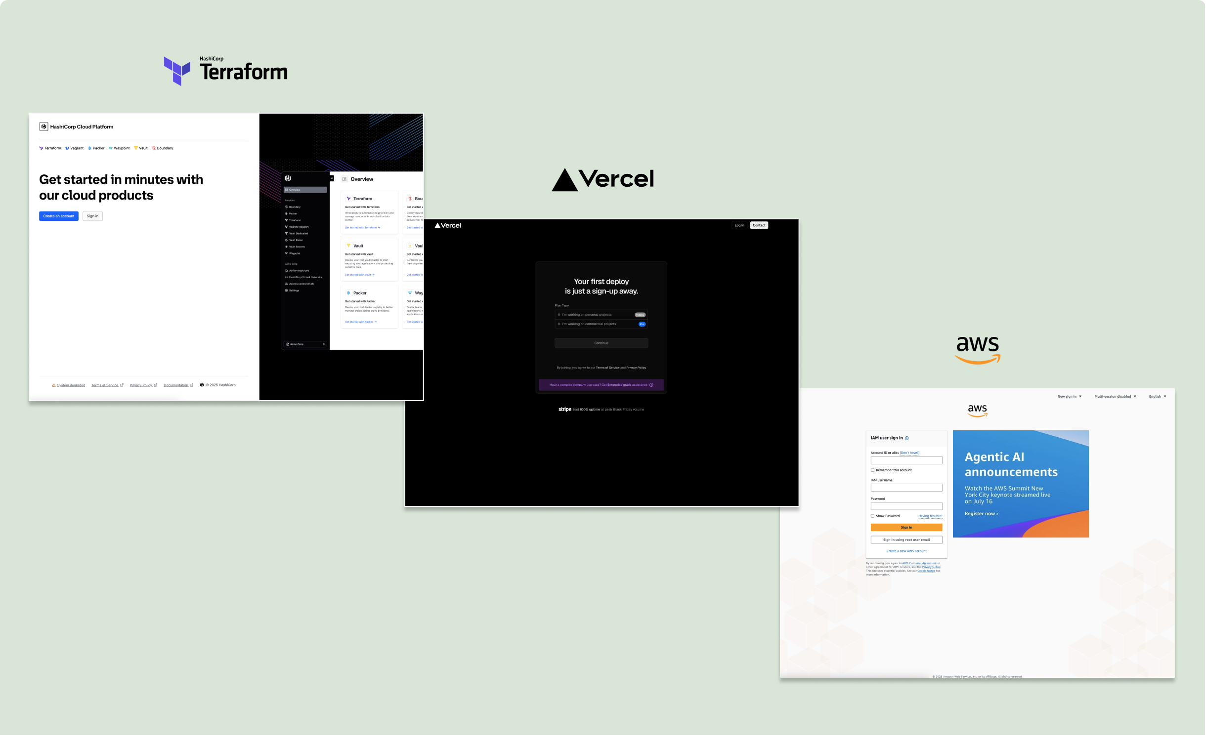
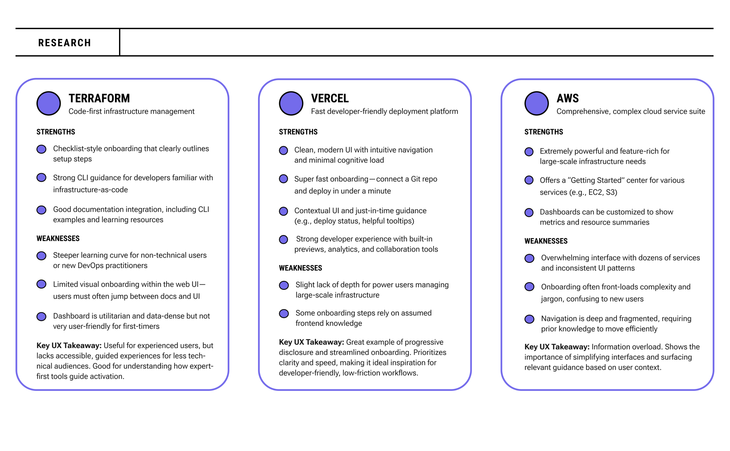
To inform the design direction, I conducted a competitive review of several cloud and infrastructure platforms, including Terraform, AWS, env0, and Vercel. I focused on how these tools onboard new users, present data, and structure their dashboards.
Key takeaways included:
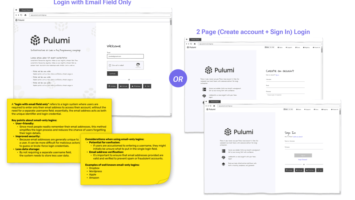
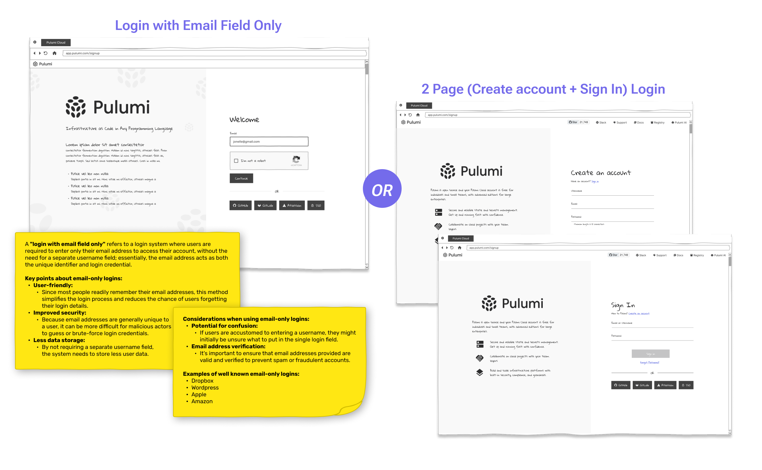
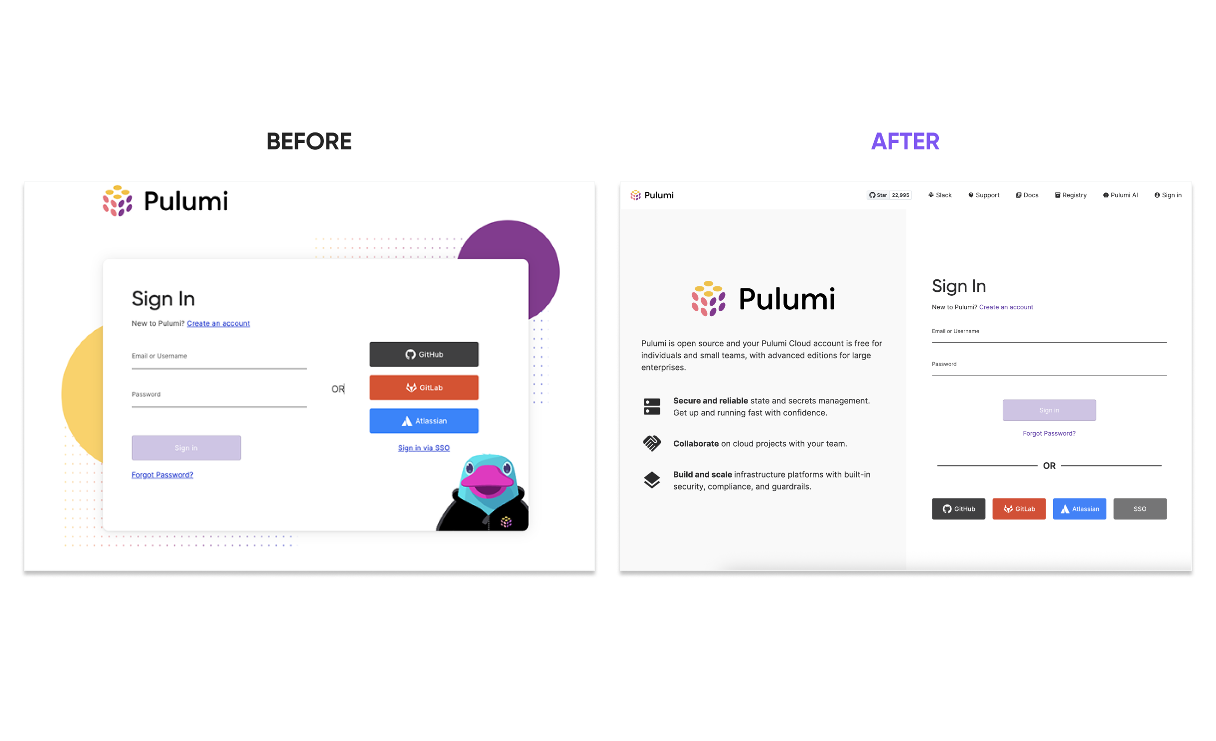
Using insights from research, I created low-fidelity wireframes to explore different login and onboarding strategies—such as a single email-field entry point versus a two-page flow separating Sign In and Create Account—to evaluate which layout best supported ease of use and user clarity.
I initially considered a separate Home page for the “Getting Started” module but ultimately chose to embed it within a modular dashboard for a more seamless experience. The “Getting Started” module provides simple, step-by-step guidance, streamlining the user experience.
As I progressed with the wireframe, I created a low-fidelity interactive prototype to demonstrate interactions and tested it with a few engineers to gather feedback.
After exploring different login and onboarding strategies through low-fidelity wireframes, including a single email-field entry versus a two-page flow, we conducted A/B testing to assess user preferences. The results favored the two-page model, with a split-page design: information about Pulumi on the left and the Sign Up form on the right. This layout provided a clear, focused user experience, allowing users to learn about Pulumi while simultaneously entering their details. It reduced friction by guiding users step by step and keeping the process organized, making it the most effective choice for onboarding.
I developed a modular dashboard with embedded onboarding, including a “Getting Started” module, action-driven cards, and adaptive interface elements. Progressive Disclosure was used to surface onboarding tasks only when relevant, helping users build confidence step by step without cognitive overload.
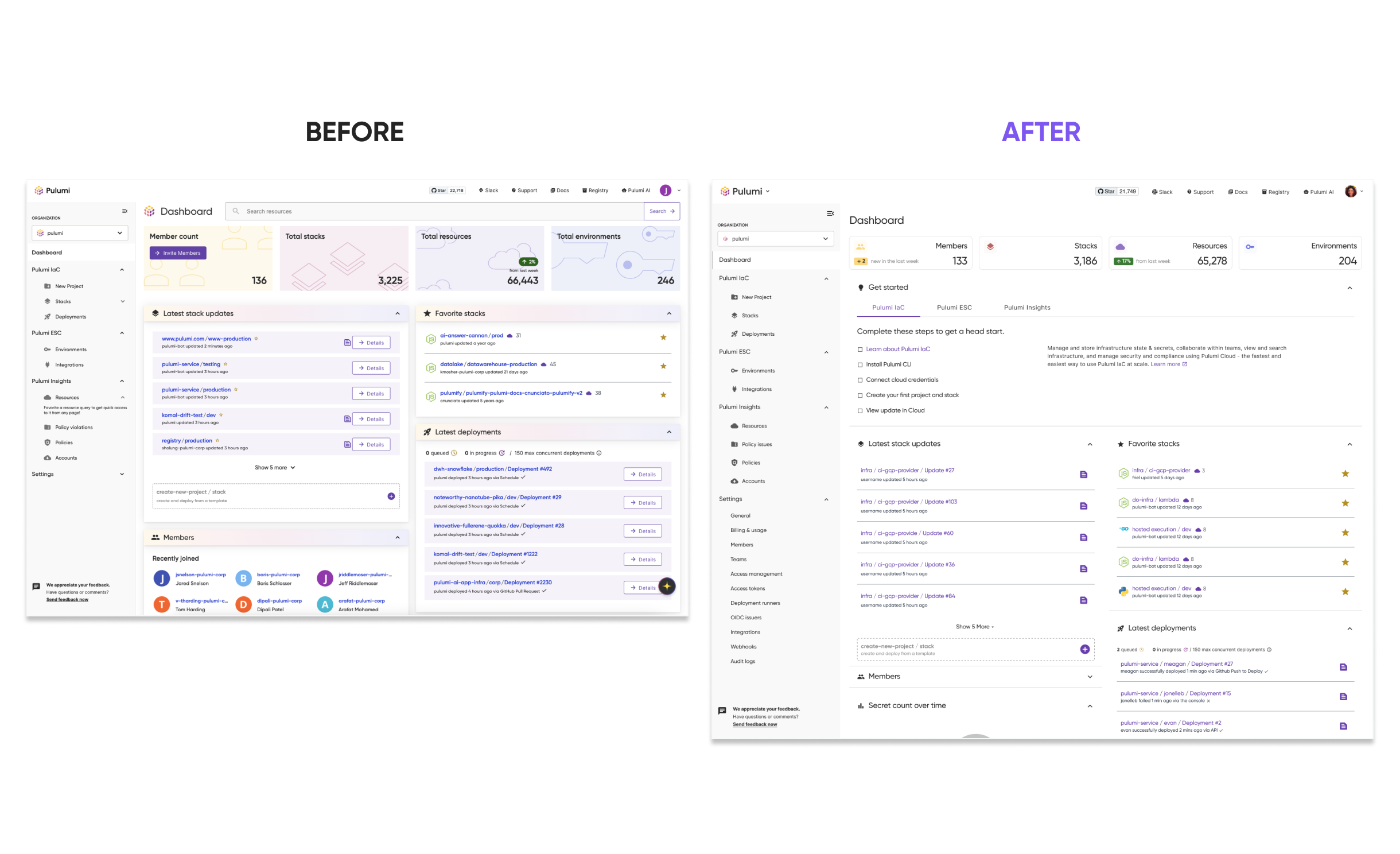
The final redesign delivers an onboarding-friendly, scalable dashboard experience that seamlessly supports all users—from first-timers to power users.
A 30% reduction in onboarding time (based on A/B testing)
Looking ahead, we plan to introduce a customizable dashboard experience (view lo-fi wireframes), enabling users to add charts, remove sections, and personalize their workspace. As we shift toward analytics-focused dashboards, it makes sense to eventually move the onboarding content to a dedicated Home page—fulfilling the original vision while giving users greater control.
This project deepened my understanding of designing flexible systems that adapt to diverse user journeys. Embedding onboarding into the dashboard (rather than separating it) helped reduce friction while still supporting advanced users through progressive disclosure and modular components. I learned how critical it is to validate assumptions with data—A/B testing and cross-functional feedback were key to refining the experience. Collaborating with engineers, product managers, and data experts also reinforced how strong UX comes from aligning user needs with technical realities. Ultimately, the work reminded me that impactful design goes beyond UI—it’s about creating systems that guide users at the right time, in the right way.
Progressive Disclosure is a design principle that involves presenting only the information or options a user needs at a given moment—revealing more complexity or detail gradually as needed.
Simplifying DevOps Workflows with an AI-Powered Chat Interface
Pulumi
Sr. UX/UI Designer
Figma
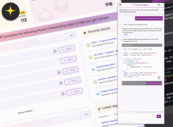
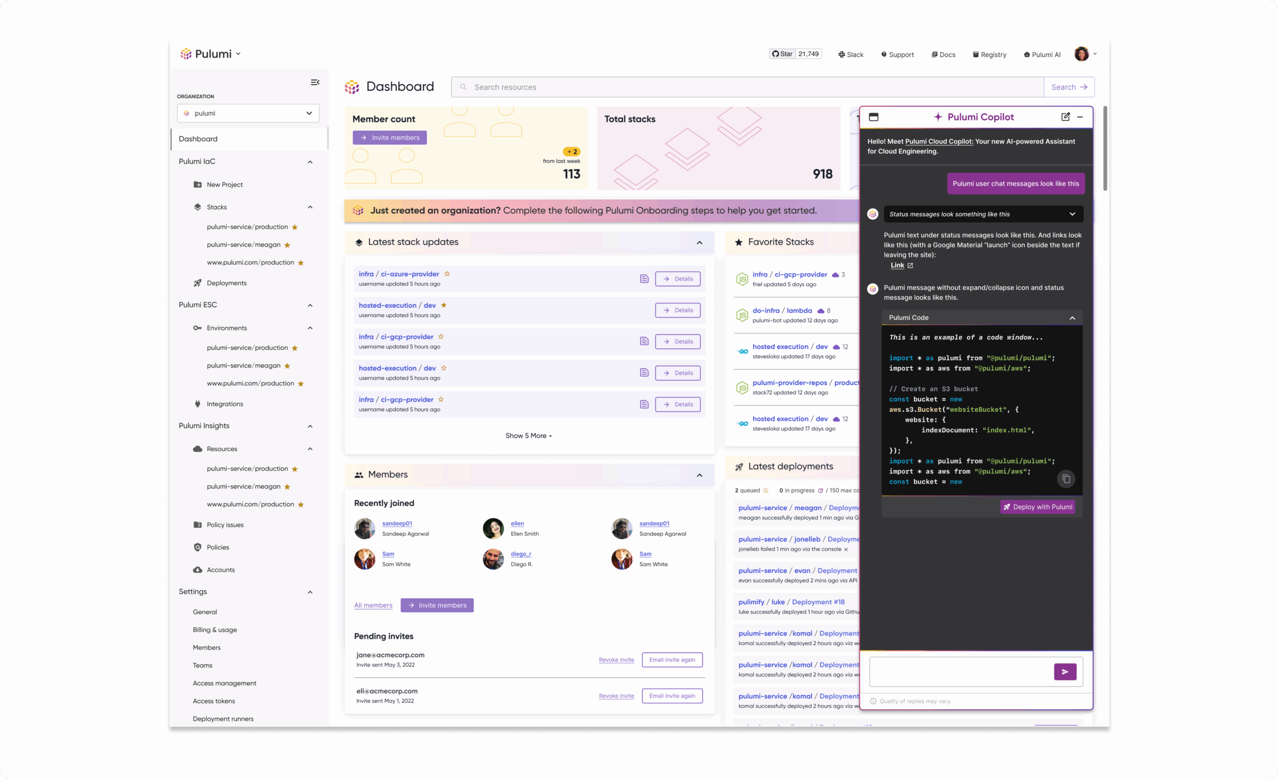
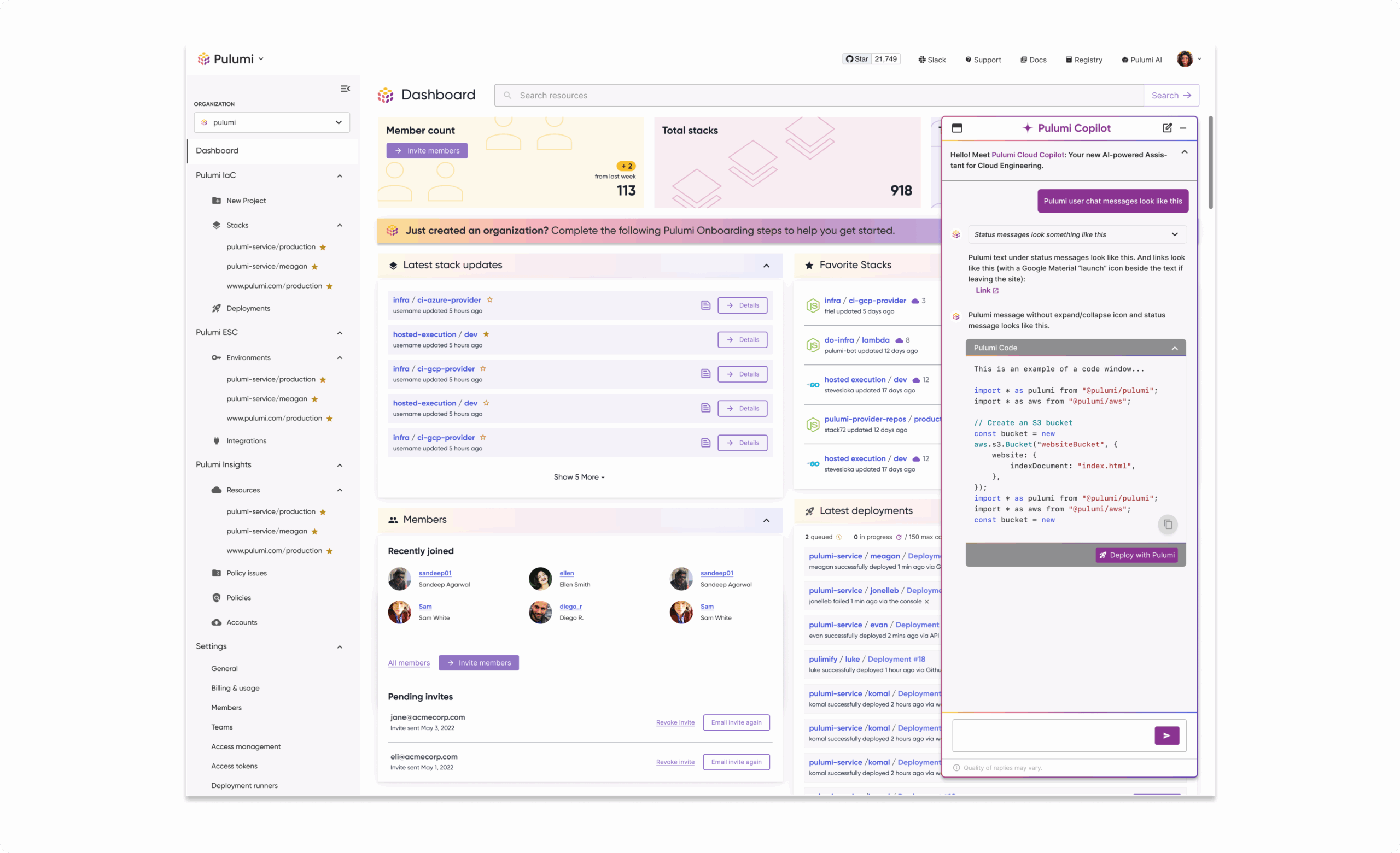
AI is transforming how users interact with technology—and cloud infrastructure is no exception. In 2023, Pulumi launched Pulumi AI, a generative AI tool designed to help developers solve complex cloud problems using Infrastructure-as-Code. Building on that success, Pulumi introduced Pulumi Copilot, a conversational chat interface integrated into Pulumi Cloud. Copilot empowers users to manage infrastructure, troubleshoot issues, and gain insights using natural language—making cloud workflows faster and more accessible.
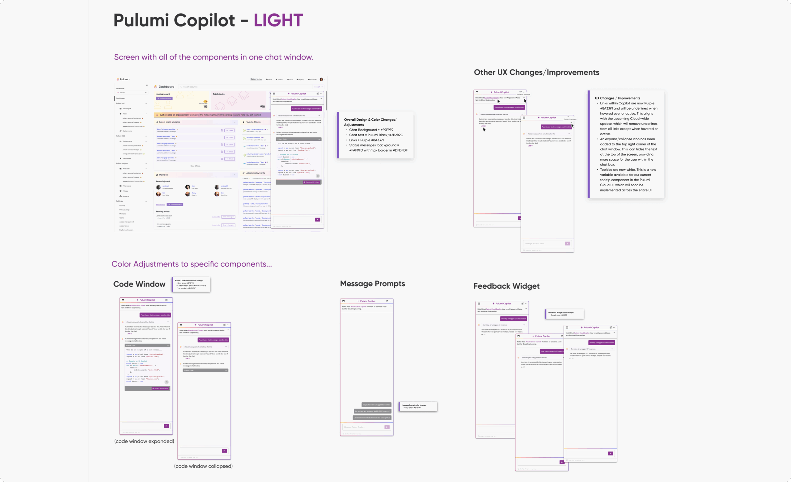
Copilot introduced a new UI paradigm to Pulumi Cloud—one that required rethinking traditional patterns while honoring existing constraints. Key challenges included:
These challenges created a space for thoughtful experimentation, focused iteration, and collaborative problem-solving.
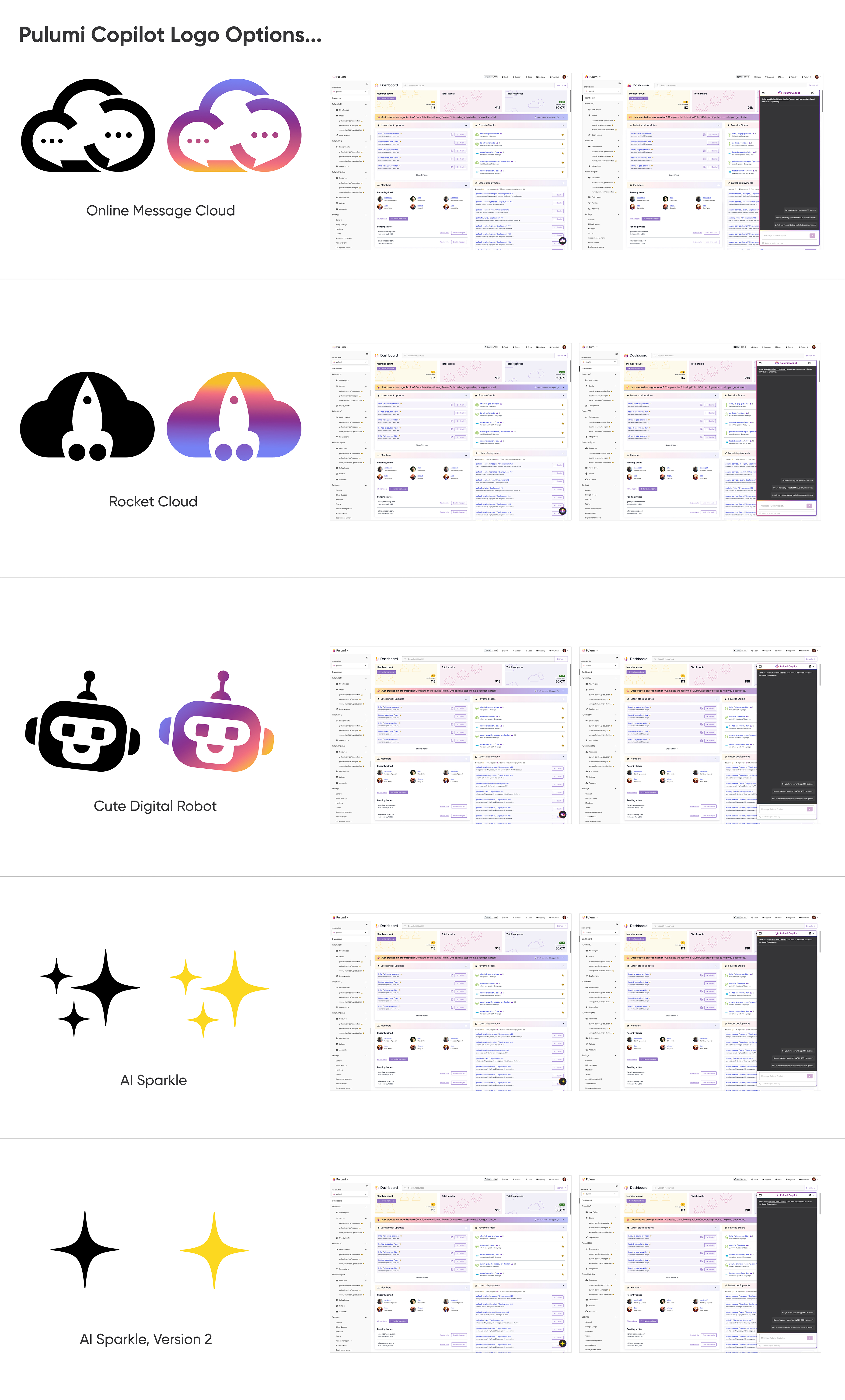
To design a scalable, user-friendly conversational interface, I followed a focused and iterative process:
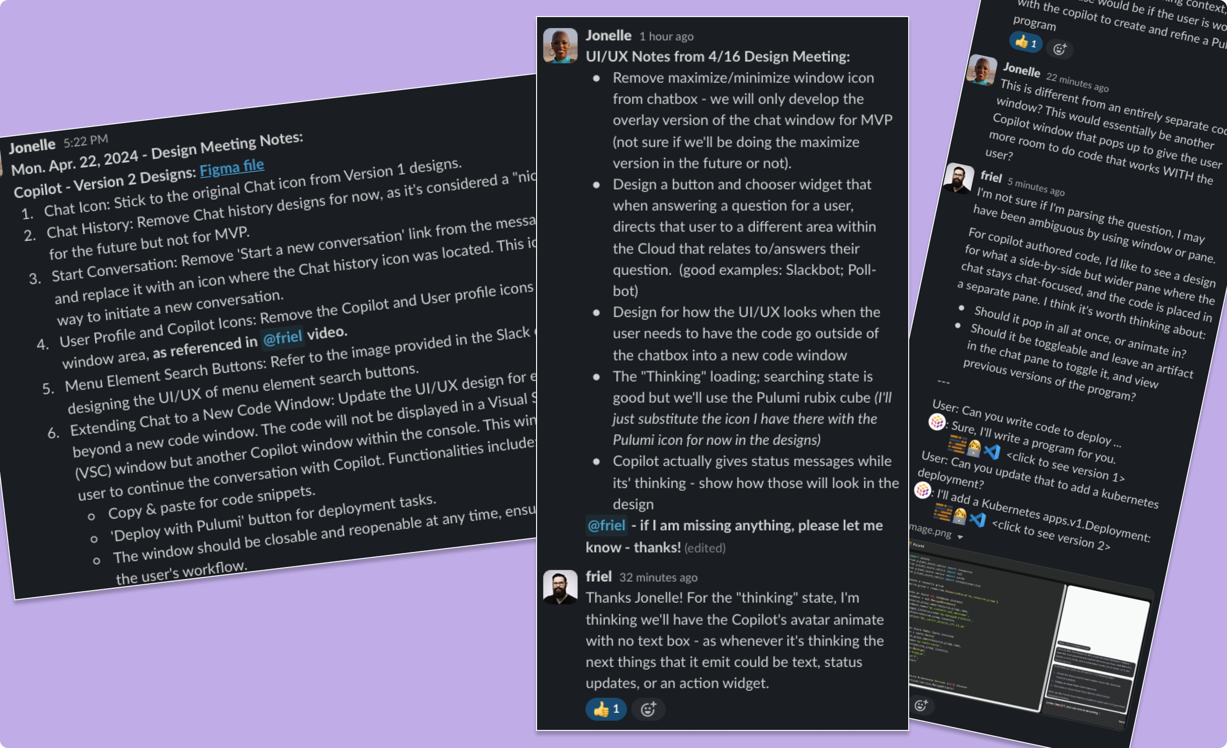
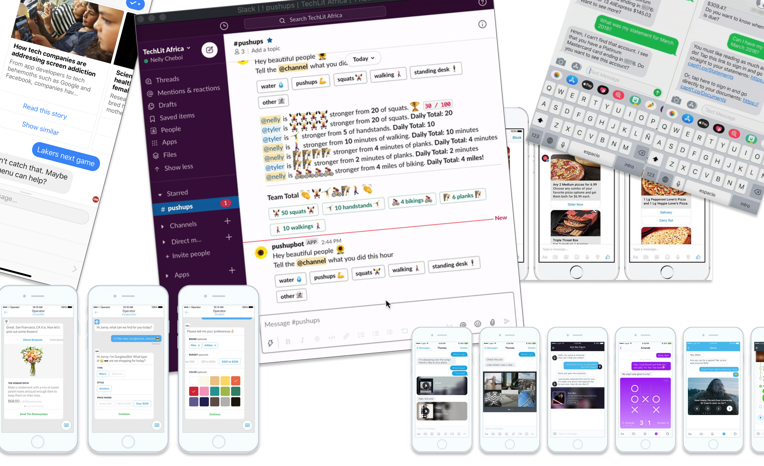
I referenced many different conversational experiences from tools like Slack and ChatGPT, which demonstrated how to balance form and function in AI interfaces. These examples helped inform the pacing of interactions, feedback timing, and conversation formatting. I also drew from Pulumi’s clean UI aesthetic to ensure consistency in typography, spacing, and color. The interface was intentionally minimal—allowing the AI experience to remain the focal point.
Pulumi Copilot is part of the company’s broader mission to simplify infrastructure through AI. By designing a thoughtful conversational experience, we empowered developers to interact with Pulumi Cloud in a more human, accessible way—no matter their experience with Infrastructure-as-Code.
This project also influenced future design efforts by establishing a UI foundation for conversational tools in the platform. It strengthened collaboration between product, design, and engineering and set the stage for more integrated, AI-driven features across the developer experience.
The redesigned Copilot interface made conversational AI feel like a native part of Pulumi Cloud, driving early engagement and setting the foundation for future growth. Initial feedback from internal users and early adopters was positive, highlighting improvements in clarity, usability, and visual integration.
(with noted components and guidelines)
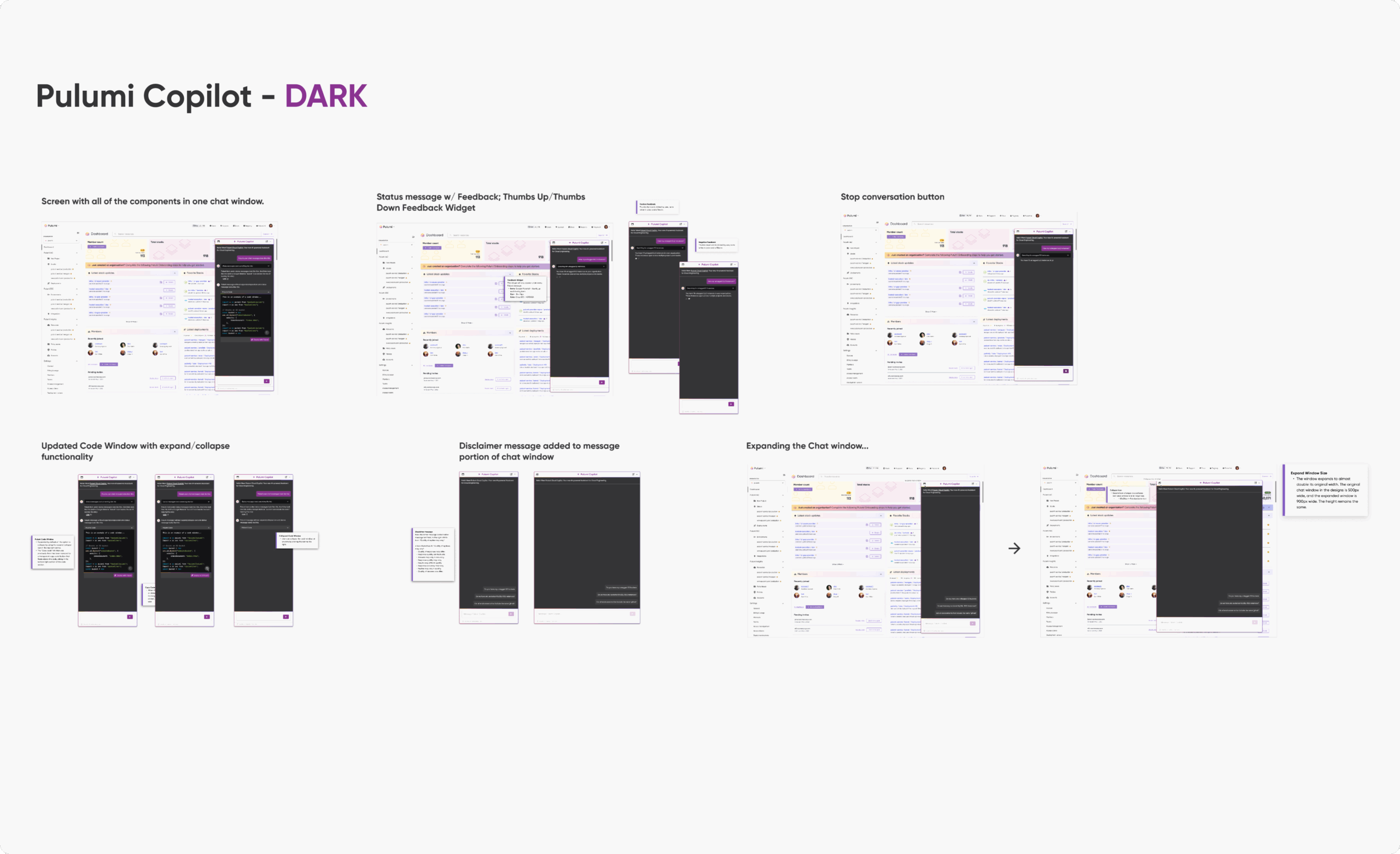
(with noted updates and changes from the alternate Dark Theme)
30% increase in Copilot usage within the first 4 weeks of launch, indicating strong initial adoption.
25% reduction in time-to-resolution for common infrastructure issues, based on user interactions logged through Copilot.
Zero critical usability issues reported during QA testing after implementation of the new UI components.
15% boost in daily active users interacting with Pulumi Cloud’s AI features.
Expand Design Patterns: Evolve the design system to formally include conversational UI components for reuse across other AI features.
This project pushed me to explore a new interaction model, while working within a mature design system. It taught me how to introduce innovative UX patterns in a way that feels native to an existing product.
Fitts’s Law states that the time required to move to a target is a function of the distance to and size of the target. This principle helped guide the design by ensuring key elements, like the input field and prompts, were large and easily accessible, reducing interaction time and making the interface more intuitive and responsive.
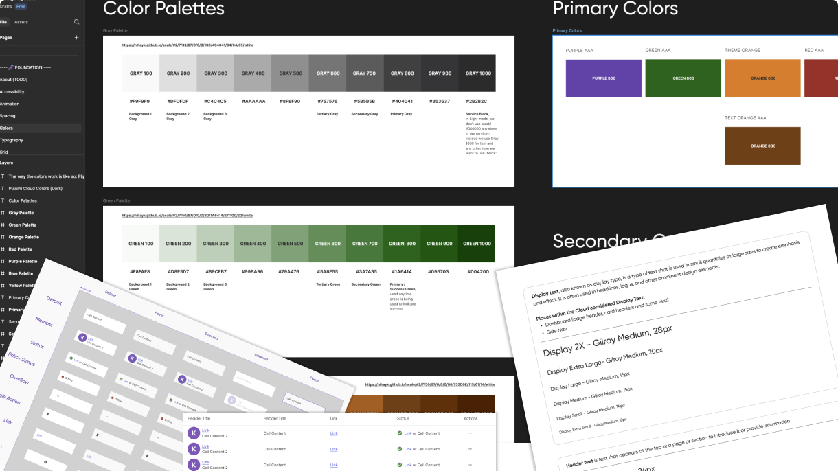
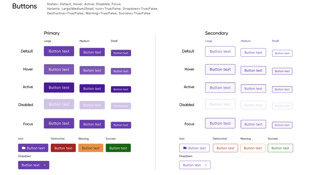
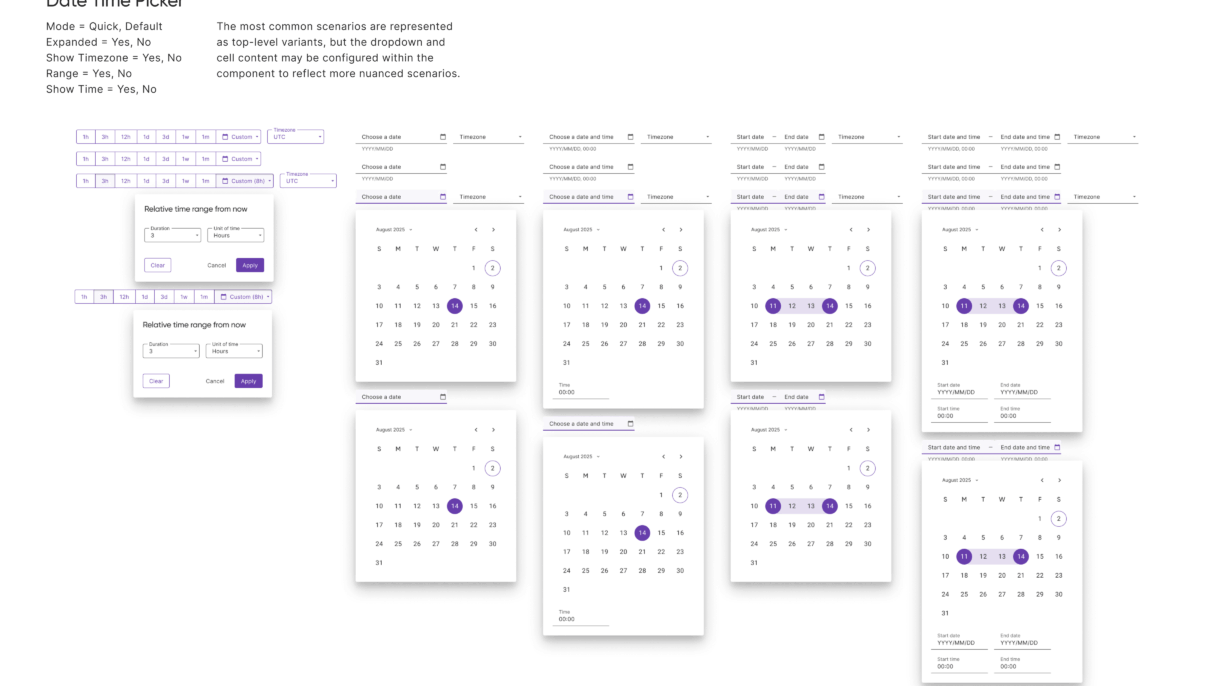
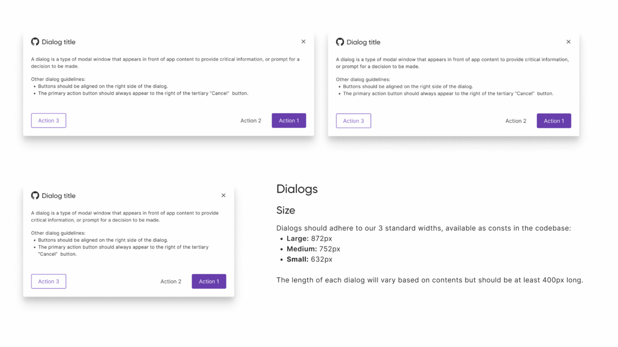
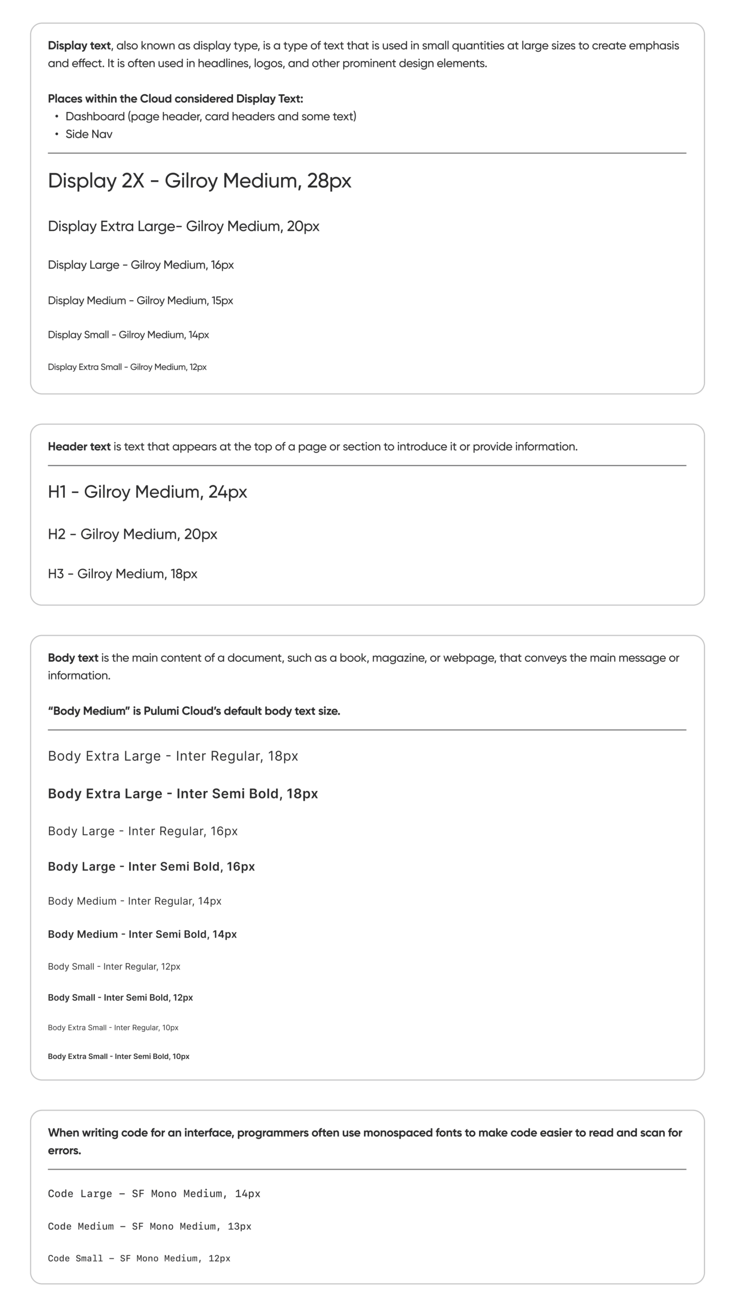
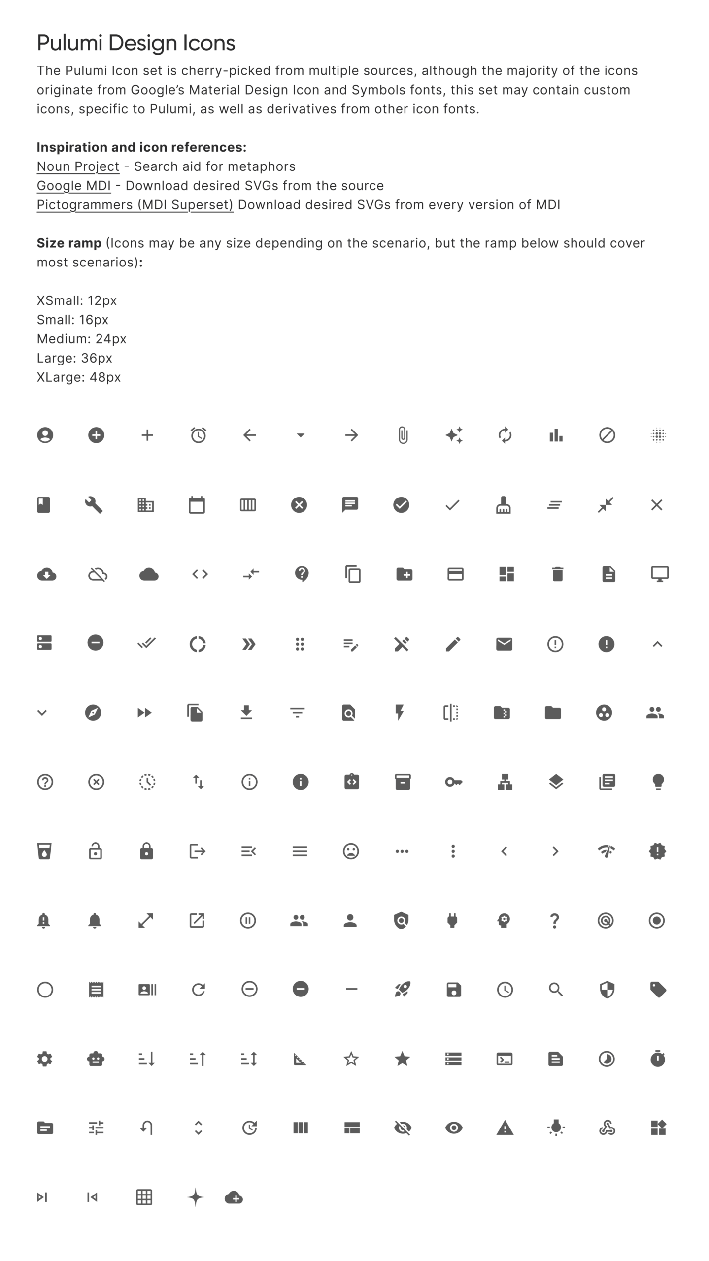
Pulumi’s first UI library, built to bring consistency, scalability, and efficiency to the design and development of the Pulumi Cloud Console.
The Pulumi UX team lacked a formal UI library, which led to inconsistencies across the product and inefficiencies in both design and development. As Pulumi Cloud and the team grew, the need for a unified visual language became clear. The focus was on building reusable components and establishing foundational styles to support a more consistent and scalable user experience.
Before the UI library existed, our design and development workflows were fragmented. Designers frequently recreated components from scratch or worked from outdated files, while developers implemented UI without clear guidance or consistency. This led to duplicated work, visual drift, accessibility issues, and a fragmented user experience. We saw an opportunity not only to fix inconsistencies but to build a system that would support scalability and streamline collaboration across teams.
To ensure the system was scalable, consistent, and easy to use, I followed a four-step approach grounded in UX best practices:
1. Audit & Align (Consistency)
I started with a UI audit to identify inconsistencies and redundant patterns. This gave us a clear picture of what needed to be standardized and where to consolidate design efforts.
2. Define Foundations (Usability)
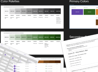
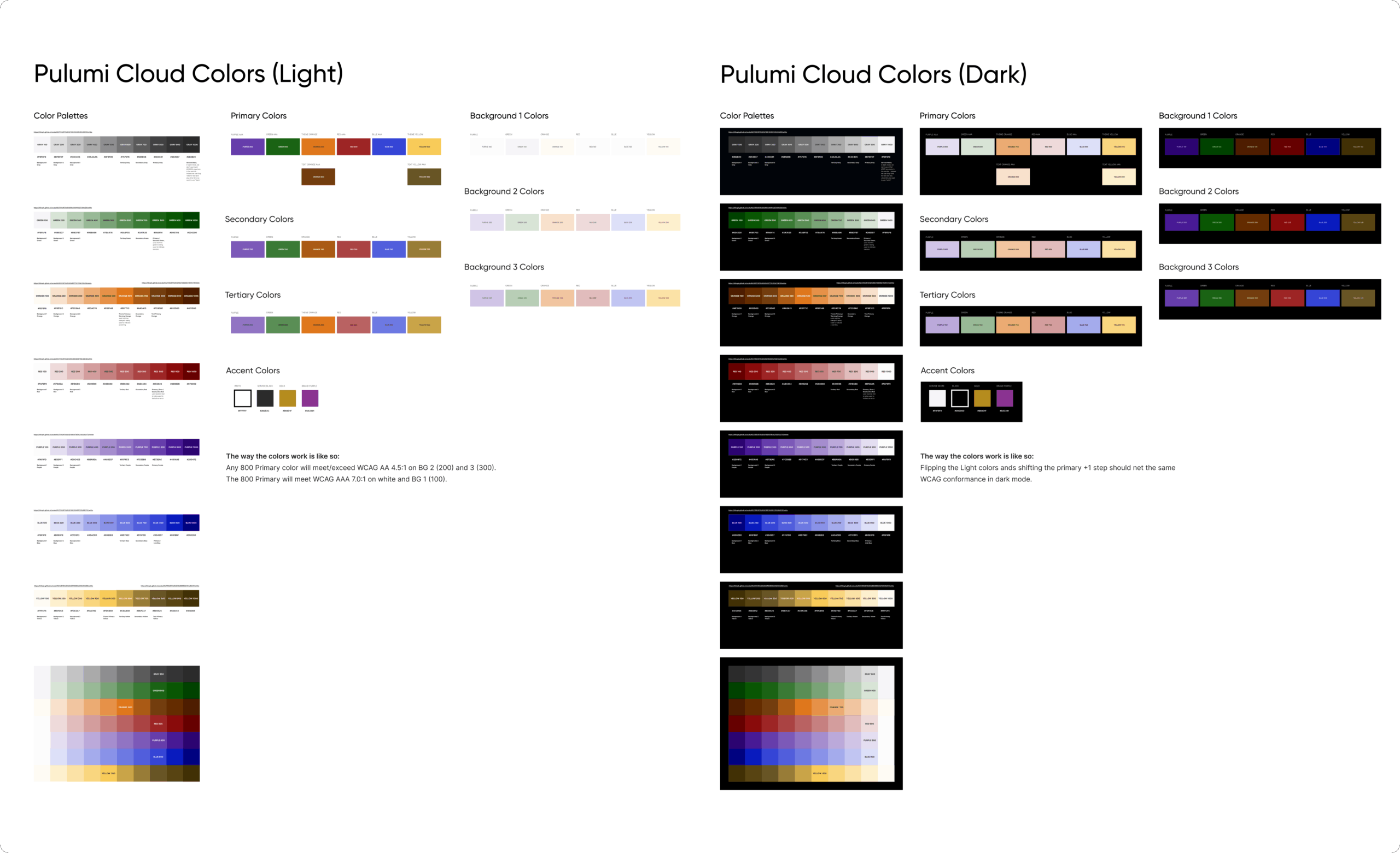
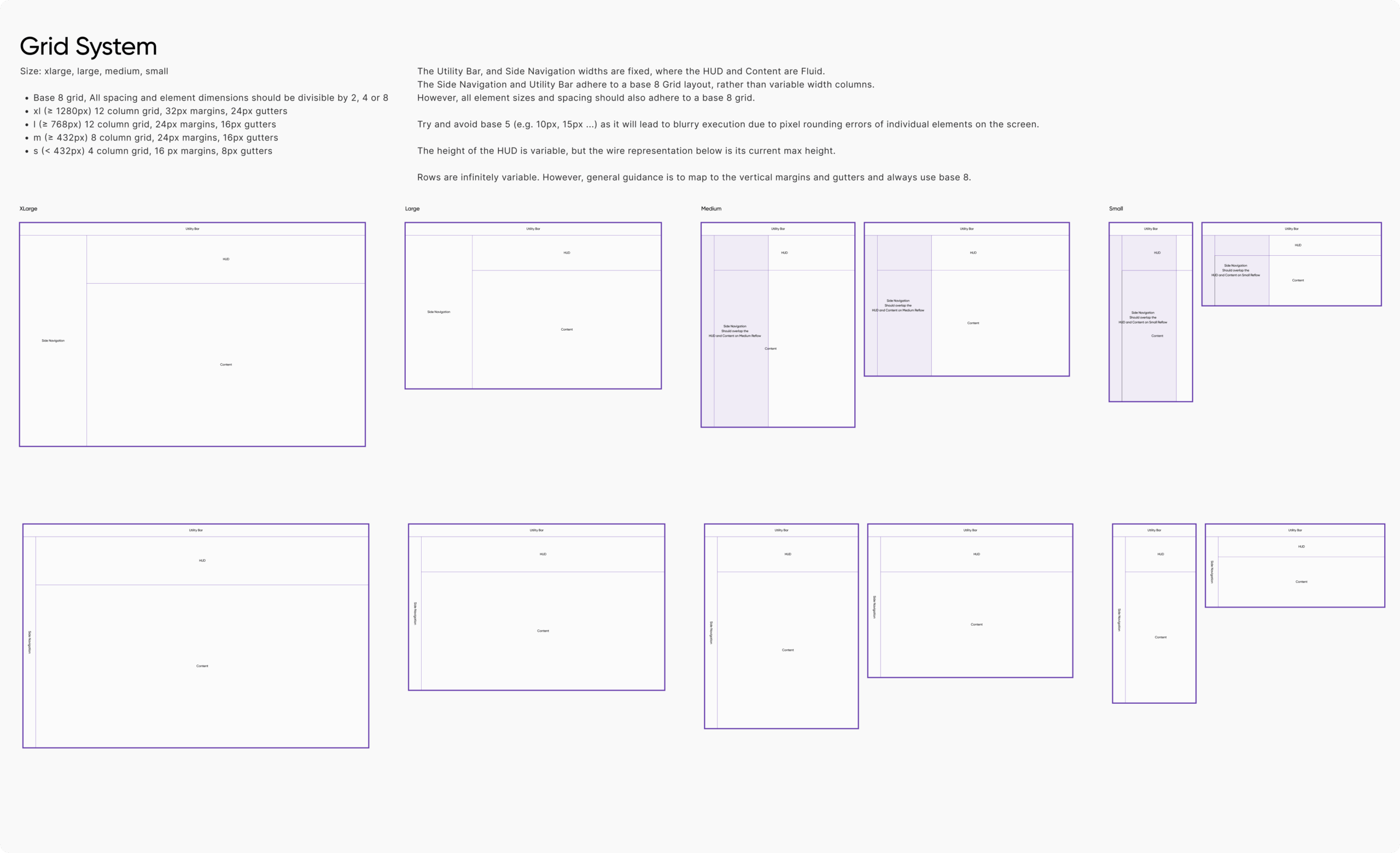
We established core design tokens—typography, color, spacing, and elevation—to create a consistent and reusable visual language that could guide both design and development.
3. Build Modular Components (Scalability)
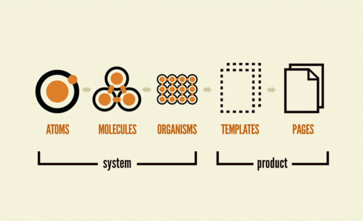
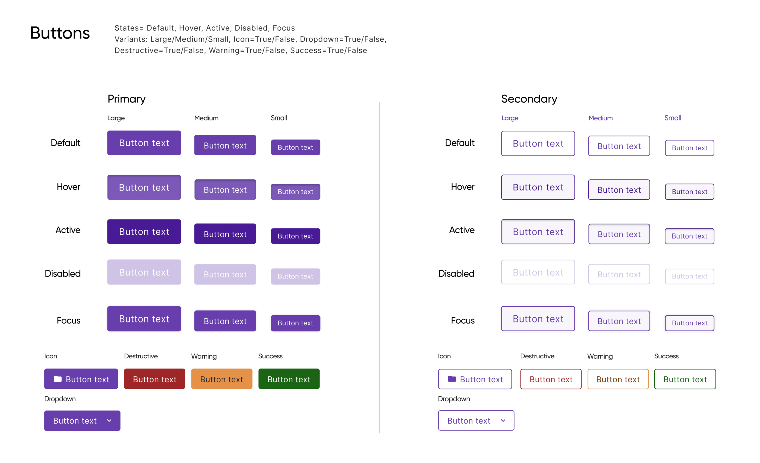
Following atomic design principles, I built flexible, reusable components in Figma, progressing from simple elements to more complex UI structures to support evolving product needs.
4. Document & Collaborate (Accessibility)
I created usage guidelines covering behavior, accessibility, and edge cases, and worked closely with engineering to ensure long-term maintainability and alignment between design and implementation.
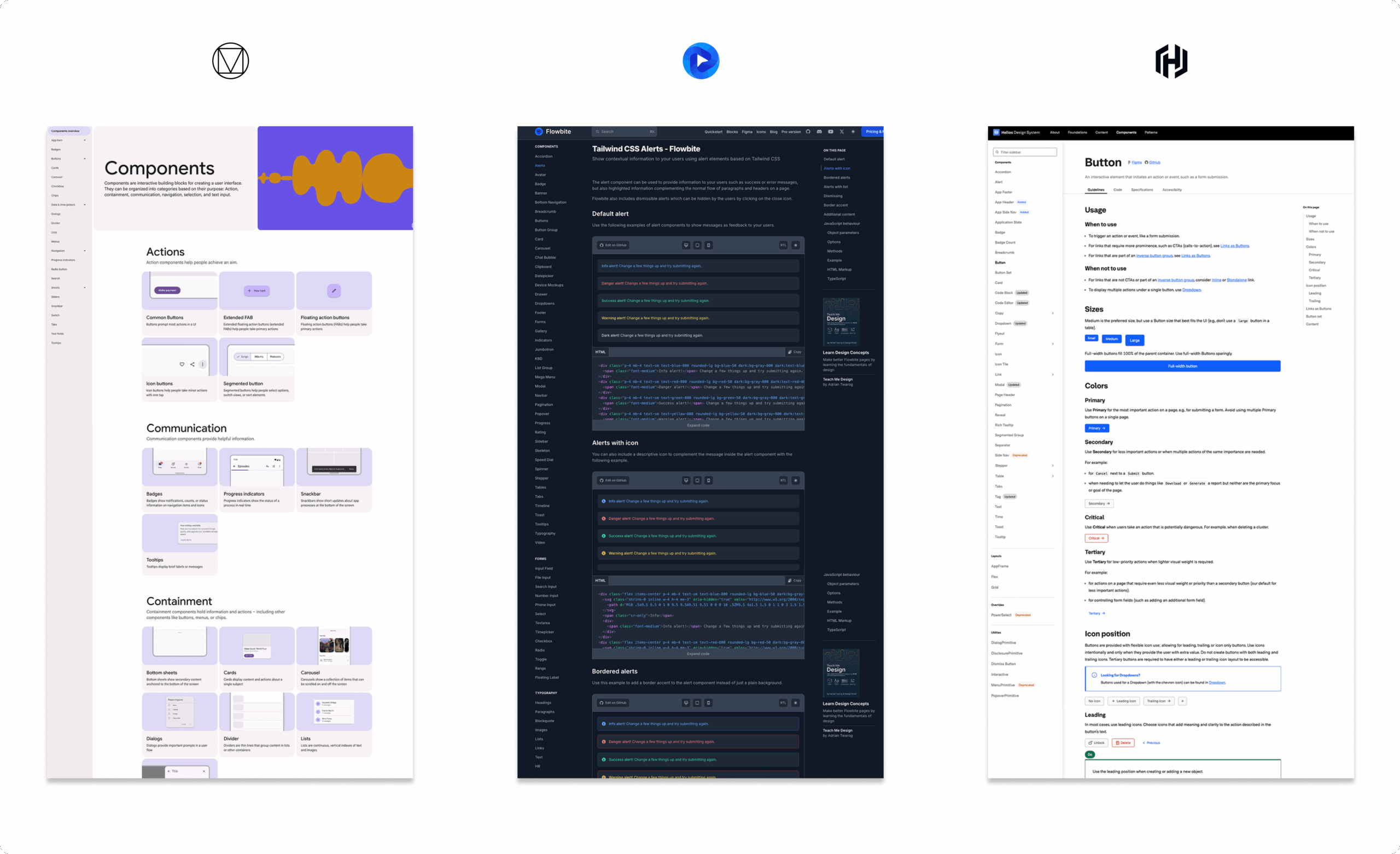
We drew inspiration from established systems like Google Material, Flowbite (a.k.a – Tailwind Figma), and Helios libraries. These systems demonstrated the value of a well-structured, documented, and extensible approach to UI. Their clarity and scalability helped shape our thinking around how to define tokens, components, and usage patterns in a way that would be both practical for our team and aligned with best practices.
We built the UI library in Figma, where we created atomic components, established design tokens, and documented properties and use cases. I also contributed to writing guidelines that covered behavior, accessibility, and edge cases—ensuring our system was not only consistent but also inclusive and functional. Collaboration with our front-end developer was key: we regularly synced on implementation details, reviewed GitHub PRs, and maintained a feedback loop to keep the design and code in sync.
The design system is still a work in progress, with the long-term goal of building a public-facing website similar to Google Material’s—something that can serve as a shared resource internally and eventually externally. For now, documentation lives in a working Google Docs file titled UI Design System Guidelines, which serves as a living guide for how to create or update components within the Pulumi Cloud Console. This document is actively maintained and intended to evolve alongside the system until the full site is ready to launch.
The design system has improved consistency across Pulumi Cloud and reduced the time designers and developers spend on repeat work. Feedback from internal teams has been positive, especially around shared patterns and accessibility support. The next milestone is launching a public-facing documentation site to better support onboarding, cross-team adoption, and external contributors.
80% reduction in time spent designing repeat UI components, thanks to reusable assets in the Figma library.
4× faster onboarding for new designers and developers, due to centralized documentation and clear component usage.
100% adoption rate among Pulumi UX designers for the new Figma component set within the first quarter.
20+ documented components and growing, each with usage guidelines, accessibility notes, and edge case considerations.
Building Pulumi’s first design system taught me how foundational consistency and clarity are to scaling UX. I deepened my understanding of atomic design, accessibility standards, and cross-functional documentation. Most importantly, I saw how a well-structured system can bridge gaps between design and development, enabling teams to move faster while staying aligned.
A methodology that breaks interfaces into five hierarchical stages—atoms, molecules, organisms, templates, and pages—for scalable and modular UI development.
Improving Messaging, Layout, and Visual Design to Reflect a Growing SaaS Brand
Pulumi
Sr. UX/UI Designer
Figma
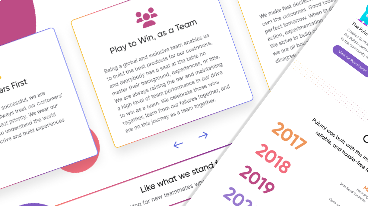
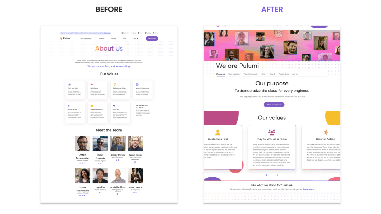
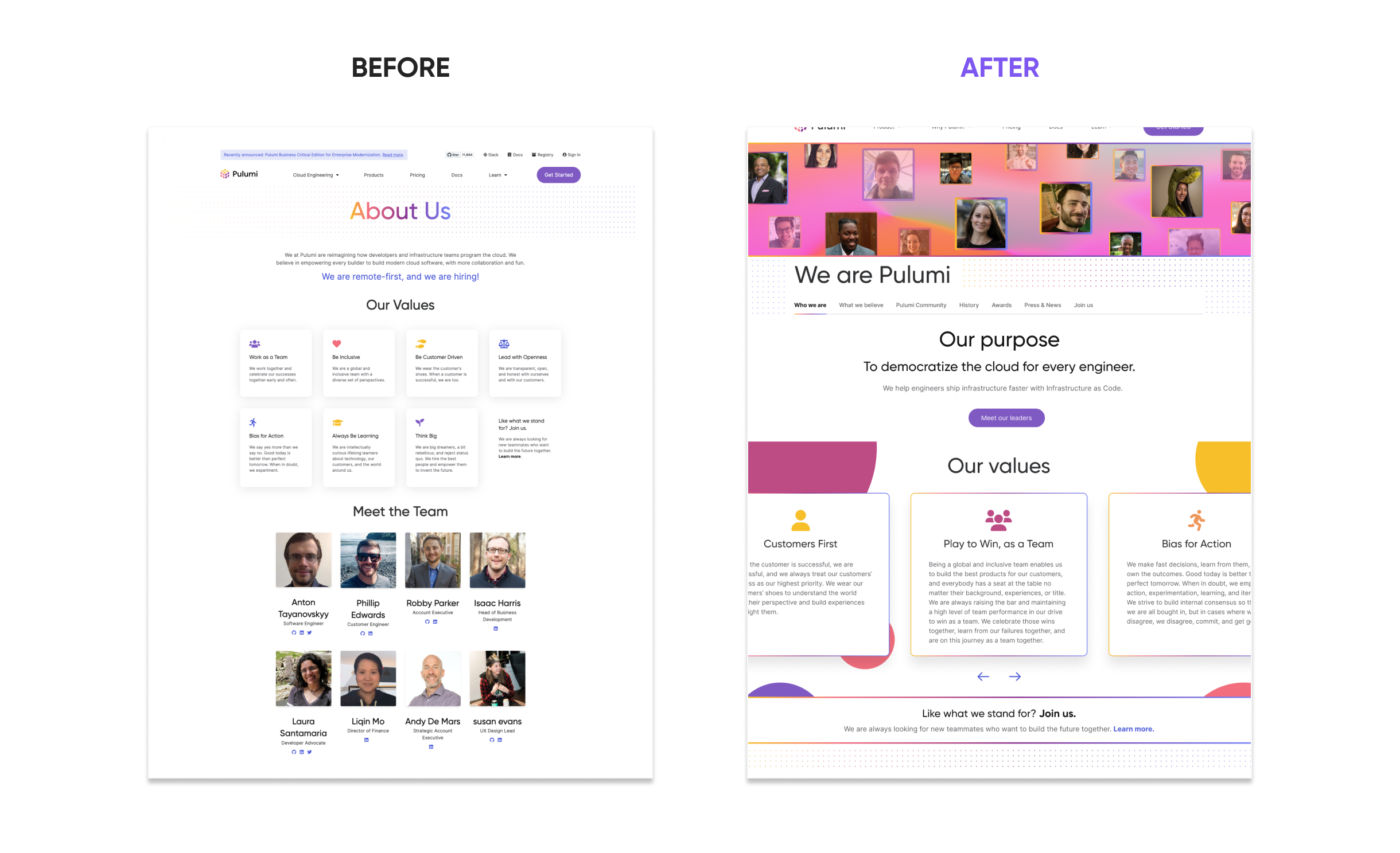
In Q4 2022, Pulumi set out to redesign its “About” page—transforming it from a static, generic section into a more authentic and engaging representation of the company’s mission, culture, and people. The goal was to better serve prospective customers, partners, and talent through clearer messaging and a more intentional user experience.
As the sole designer on the project, I worked closely with Product Marketing to clarify audience needs and page objectives. From there, I led content strategy, information architecture, wireframing, and prototyping—shaping a layout scalable with the company that effectively guides users through Pulumi’s story.
The original About page lacked essential storytelling. It didn’t communicate Pulumi’s mission, values, or history—and the visual presentation failed to reflect the personality of the company. Employee photos, once used to humanize the brand, had become unsustainable to maintain as the team scaled.
Additionally, the site had technical shortcomings:
These gaps presented a clear opportunity to rethink not just the content, but how it was structured and delivered to end users.
I focused on creating a clear, engaging, and scalable About page by following these core steps:
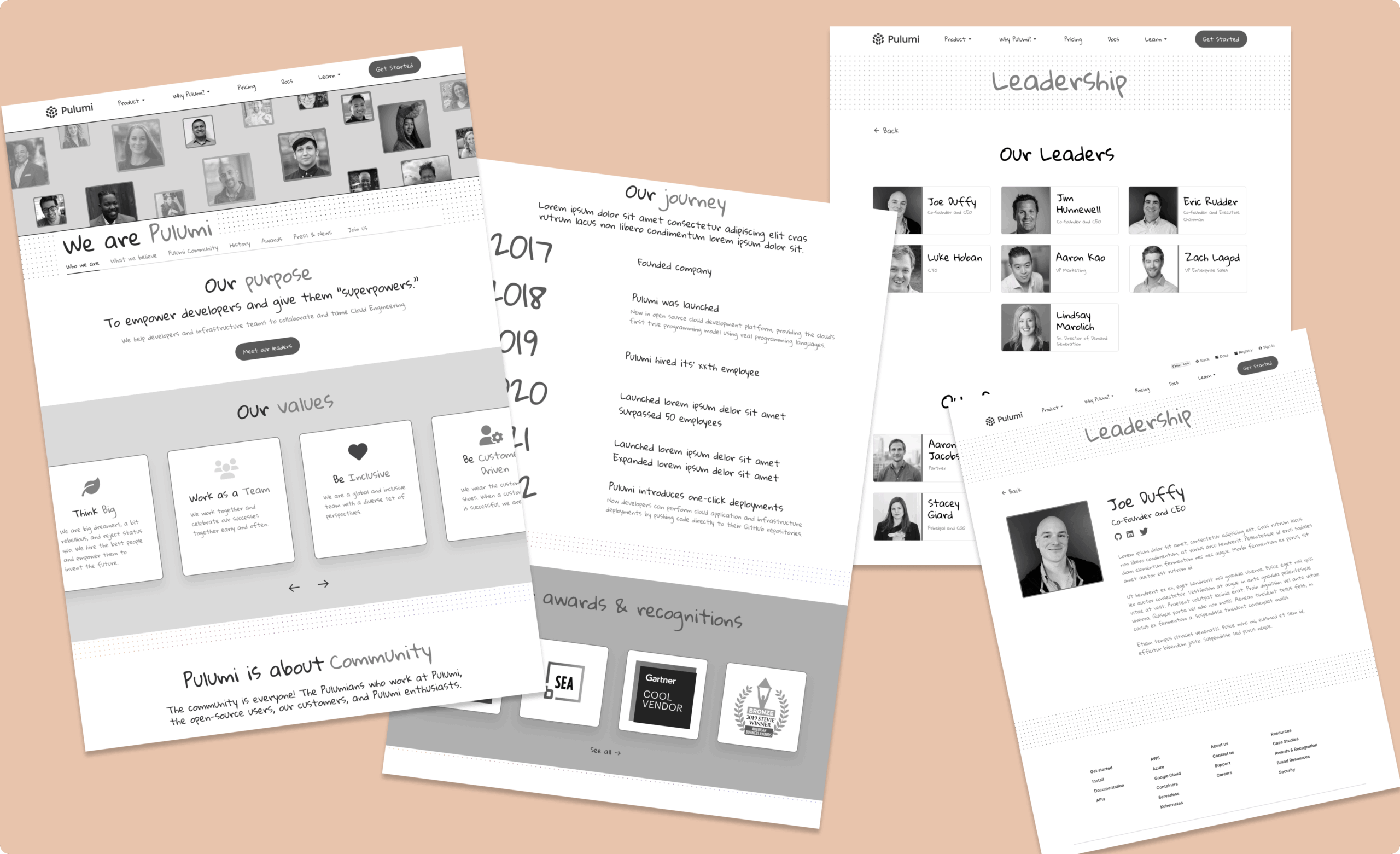
To ground the redesign in proven design principles, I referenced best-in-class About pages and storytelling patterns from companies like HubSpot, Kickstarter and Accenture. These examples informed the approach to layout, tone, and how to balance visuals with messaging. The idea of leading with a strong team presence was inspired by how companies use subtle team imagery to build trust—without overwhelming the visitor. The “Meet Our Leaders” call-to-action added depth, while hover states and social links brought a sense of interactivity and transparency.

This redesign played a key role in Pulumi’s broader effort to evolve its brand expression and unify product and marketing experiences across channels. It strengthened recruitment, boosted partner relationships, and increased community awareness by delivering a consistent and authentic brand voice.
Close collaboration with the front-end team ensured the design was fully responsive and consistent across browsers, addressing long-standing technical issues. This cross-functional partnership set the stage for smoother future updates and improved alignment between marketing and engineering teams.
By combining improved messaging, streamlined layout, and technical optimizations, the new About page has delivered clear, quantifiable gains across multiple metrics:
2.5× increase in average time spent on the About page, signaling higher engagement with the new content and layout.
+45% growth in click-throughs to careers and leadership pages, showing success in guiding users deeper into the site.
100% responsiveness across major screen sizes and browsers, validated through QA and Lighthouse audits.
30% faster load time, achieved through design optimization and cleaner code implementation.
This project highlighted the power of storytelling in UX. I learned how to structure content for clarity and impact, collaborate across teams to align brand and tech, and design scalable, responsive layouts that strengthen trust with users.
The redesign applied Hick’s Law, which highlights that the more choices a user faces, the longer it takes to make a decision. By streamlining the page structure, simplifying navigation, and visually prioritizing key sections, the new design reduces decision fatigue and allows users to absorb Pulumi’s story more easily and efficiently.