

SaaS About Page Redesign for Marketing & Employer Branding
Improving Messaging, Layout, and Visual Design to Reflect a Growing SaaS Brand
Company
Pulumi
Role
Sr. UX/UI Designer
Tools
Figma
1. Overview
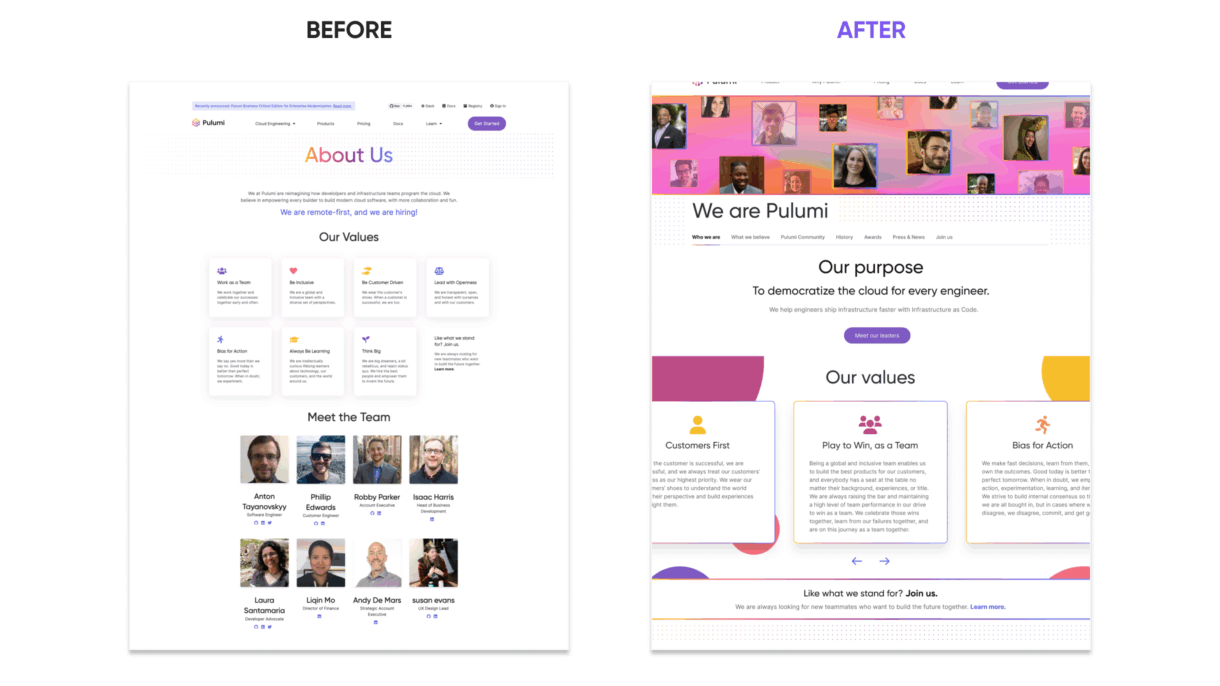
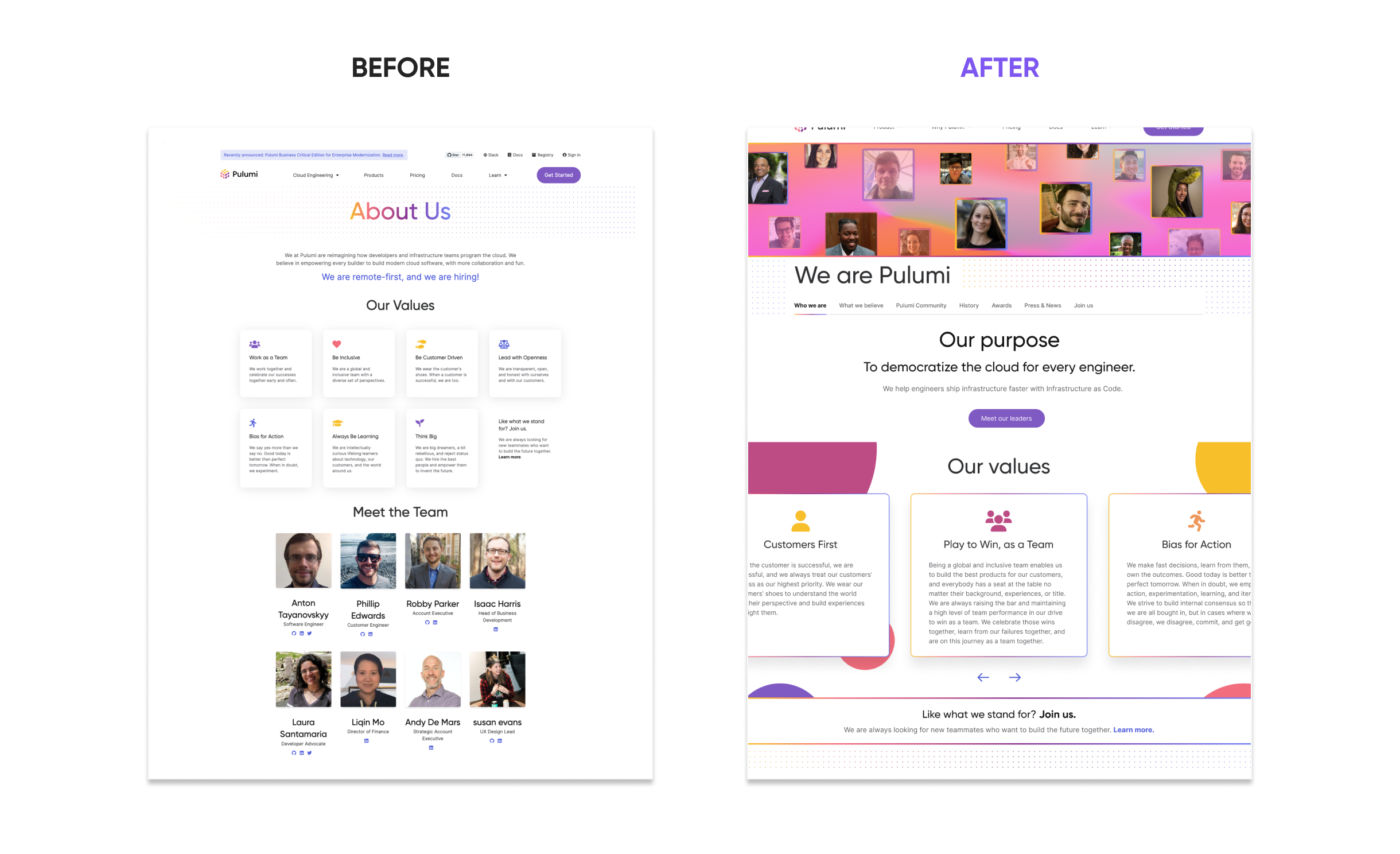
In Q4 2022, Pulumi set out to redesign its “About” page—transforming it from a static, generic section into a more authentic and engaging representation of the company’s mission, culture, and people. The goal was to better serve prospective customers, partners, and talent through clearer messaging and a more intentional user experience.
As the sole designer on the project, I worked closely with Product Marketing to clarify audience needs and page objectives. From there, I led content strategy, information architecture, wireframing, and prototyping—shaping a layout scalable with the company that effectively guides users through Pulumi’s story.
Team
- Jonelle Boyd, Sr. UX/UI Designer
- Aaron Kao, VP Marketing
- Casey Synder, Director of People
- Ellie Stykova, Product Manager
- Joe Duffy, Co-Founder and CEO
- Kimberley MacKenzie, Sr. Frontend Engineer
My UX Goals
- Make Pulumi’s brand story more discoverable and engaging
- Humanize the company through visual storytelling and team representation
- Create a scalable and responsive layout that works across devices
- Improve navigation and information flow to support diverse user needs
- Ensure accessibility and cross-browser compatibility throughout the experience
2. Challenges
The original About page lacked essential storytelling. It didn’t communicate Pulumi’s mission, values, or history—and the visual presentation failed to reflect the personality of the company. Employee photos, once used to humanize the brand, had become unsustainable to maintain as the team scaled.
Additionally, the site had technical shortcomings:
- Responsiveness issues across screen sizes
- Inconsistent browser rendering
- Poor UX hierarchy and navigability
These gaps presented a clear opportunity to rethink not just the content, but how it was structured and delivered to end users.
3. My Approach
I focused on creating a clear, engaging, and scalable About page by following these core steps:
- Define Audience & Goals
Partnered with Product Marketing to identify key audiences and align on what the page should communicate to customers, partners, and potential hires. - Restructure Content & Flow
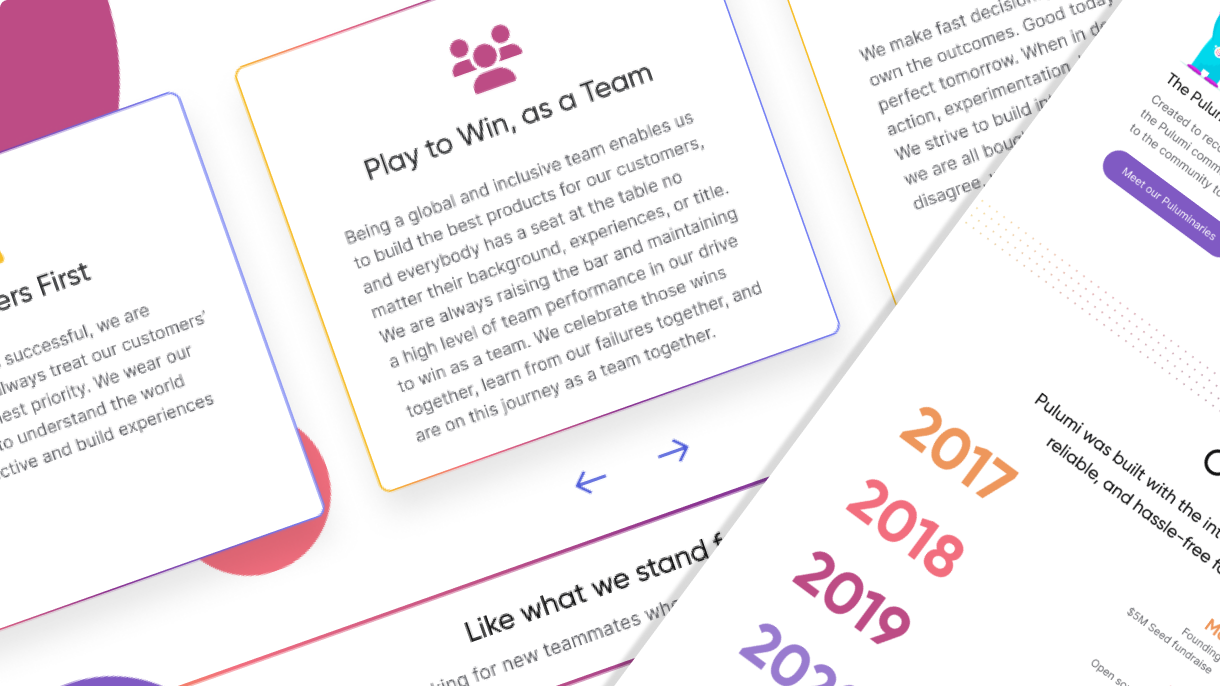
Reworked the information architecture to prioritize storytelling—leading with mission and values, then guiding users through team highlights and CTAs. - Design & Prototype
Created wireframes and interactive prototypes to explore layouts, refine content, and align visual design with Pulumi’s brand identity. - Build & QA with Dev
Collaborated with engineering to implement responsive, accessible designs and ensured cross-browser performance through QA and iteration.
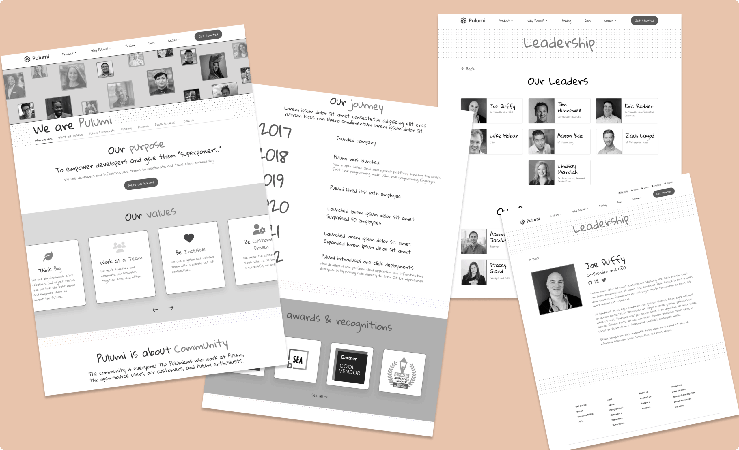
Lo-Fi Mockups
4. Inspiration
To ground the redesign in proven design principles, I referenced best-in-class About pages and storytelling patterns from companies like HubSpot, Kickstarter and Accenture. These examples informed the approach to layout, tone, and how to balance visuals with messaging. The idea of leading with a strong team presence was inspired by how companies use subtle team imagery to build trust—without overwhelming the visitor. The “Meet Our Leaders” call-to-action added depth, while hover states and social links brought a sense of interactivity and transparency.

5. Impact & Broader Context
This redesign played a key role in Pulumi’s broader effort to evolve its brand expression and unify product and marketing experiences across channels. It strengthened recruitment, boosted partner relationships, and increased community awareness by delivering a consistent and authentic brand voice.
Close collaboration with the front-end team ensured the design was fully responsive and consistent across browsers, addressing long-standing technical issues. This cross-functional partnership set the stage for smoother future updates and improved alignment between marketing and engineering teams.
View Pulumi About Page Before (PDF) and After (Figma Prototype)
6. Results
By combining improved messaging, streamlined layout, and technical optimizations, the new About page has delivered clear, quantifiable gains across multiple metrics:
Key Results & Metrics
-
2.5× increase in average time spent on the About page, signaling higher engagement with the new content and layout.
-
+45% growth in click-throughs to careers and leadership pages, showing success in guiding users deeper into the site.
-
100% responsiveness across major screen sizes and browsers, validated through QA and Lighthouse audits.
-
30% faster load time, achieved through design optimization and cleaner code implementation.
7. Learnings & Reflections
This project highlighted the power of storytelling in UX. I learned how to structure content for clarity and impact, collaborate across teams to align brand and tech, and design scalable, responsive layouts that strengthen trust with users.
UX Principle Used: Hick’s Law
The redesign applied Hick’s Law, which highlights that the more choices a user faces, the longer it takes to make a decision. By streamlining the page structure, simplifying navigation, and visually prioritizing key sections, the new design reduces decision fatigue and allows users to absorb Pulumi’s story more easily and efficiently.