
Pharmacy Overview Page for Health Plan Members
Consolidating scattered pharmacy tools into one clear, consistent experience.
Company
Centene
Role
Sr. UX/UI Designer
Tools
Figma, Miro, Fondue Design System, Adobe Experience Manager (AEM)
1. Overview
In 2025, Centene initiated the design of its new Secure Chassis member portal—a unified digital hub that brings together all health plan information for Medicare and Medicaid members, previously scattered across multiple sites and pages.
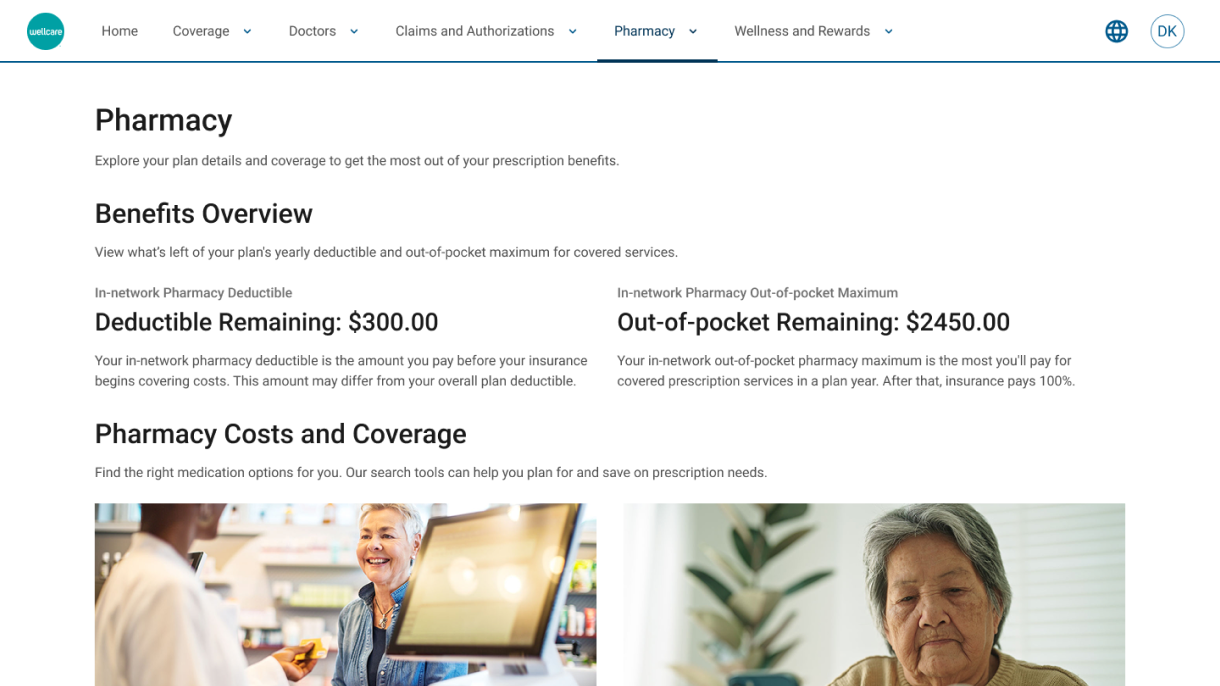
Within this new portal, the Pharmacy Overview page was created to streamline how members and caregivers access essential pharmacy resources—such as drug cost estimators, prescription claims, medication history, and coverage details—while ensuring consistency, accessibility, and long-term scalability across all Centene brands (WellCare, Fidelis, and Centene Legacy).
As the lead product designer, I partnered closely with product managers, business stakeholders, and the UX content and research teams to define requirements, align on user needs, and design a scalable, modular experience grounded in Centene’s Fondue design system.
Team
- Jonelle Boyd, Sr. UX/UI Designer
- Weston Thompson, Sr. UX Architect
- Spencer Gray, Sr. UX Researcher
- Joanna Lamb, Sr. UX Content Designer
- Minal Shah, Product Manager
-
Kristy Castro, Pharmacy SME
My UX Goals
- Simplify the member experience by consolidating pharmacy tools in one place
- Prioritize high-value tasks (e.g., Estimate Drug Cost, Prescription Claims)
- Ensure WCAG-compliant, responsive design across brands
- Establish modular patterns for scalable future enhancements
- Align with Secure Chassis and Fondue design standards
2. Challenges
Before this project, pharmacy-related features were scattered across multiple locations within the Medicare portal. Members often struggled to locate tools or understand where to complete tasks, leading to confusion, slower task completion, and increased support calls.
Additionally, the project faced tight timelines and evolving requirements—particularly around Fidelis and Duals — plans involving both Medicare and Medicaid — which lacked finalized pharmacy resources during design. Limited time for fresh research meant relying on previous Ambetter Pharmacy and WellCare customer survey insights to inform key decisions.
Key challenges included:
- Unclear early requirements and evolving stakeholder feedback
- Maintaining design consistency across multiple health plan variations
- Building a scalable structure without confirmed final content
3. My Approach
To create a unified, accessible, and intuitive overview page, I followed a structured approach through multiple design phases:
- Define the Problem & Requirements
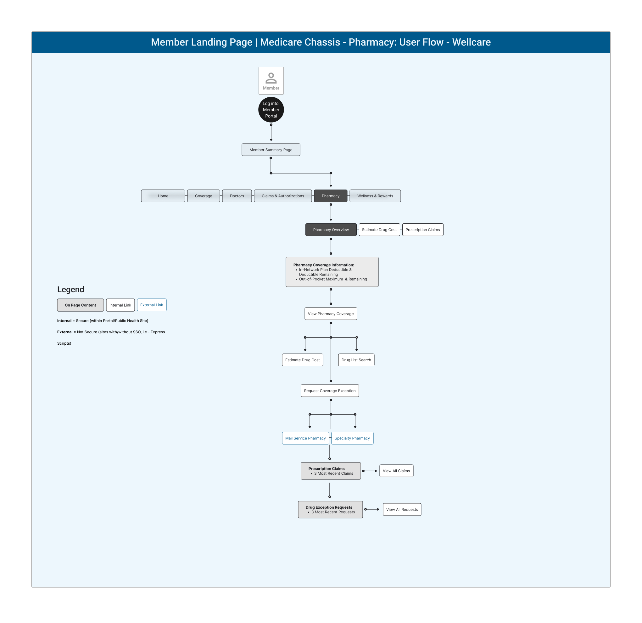
Collaborated with product and business stakeholders to gather and clarify requirements through kickoff meetings and Q&A sessions. Defined key pharmacy resources (Estimate Drug Cost, Prescription Claims, Find a Pharmacy, Specialty Pharmacy, etc.) and established design scope using the Secure Chassis framework.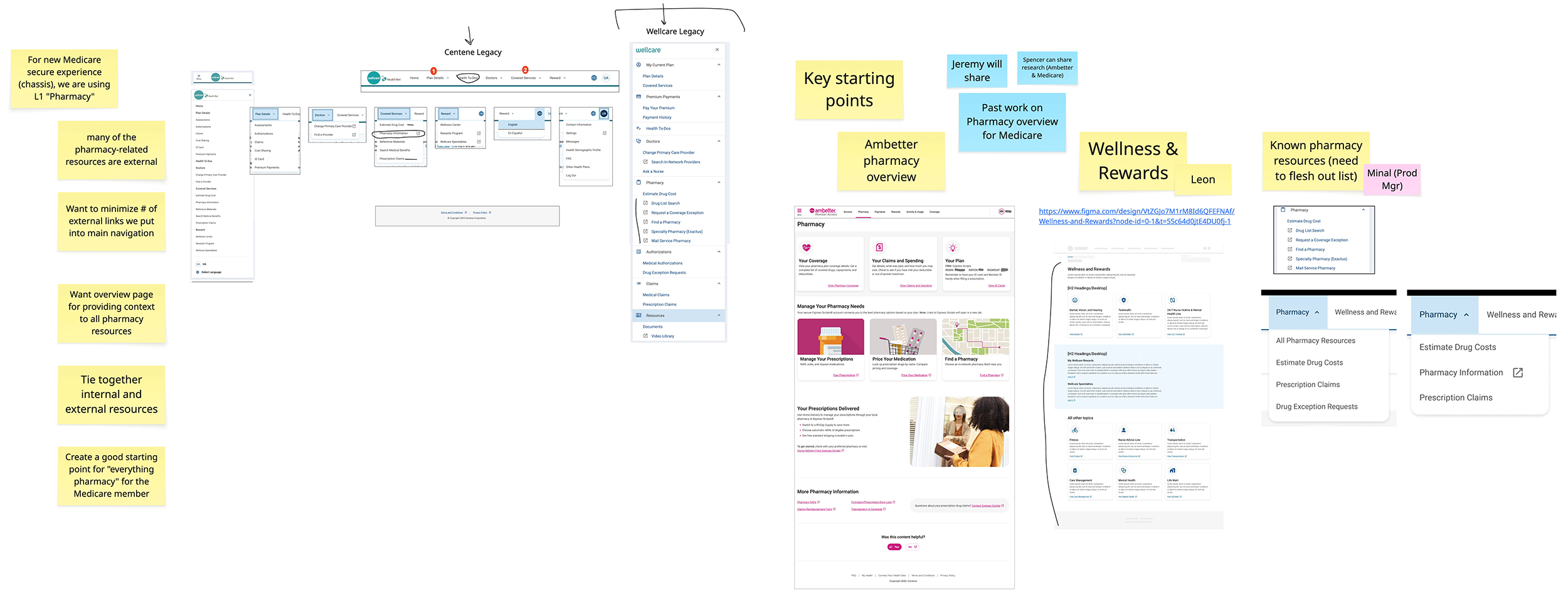
- Research & Reference Analysis
Partnered with UX researchers to review data from Ambetter and Wellcare pharmacy landing pages, identifying the most-clicked links and behaviors.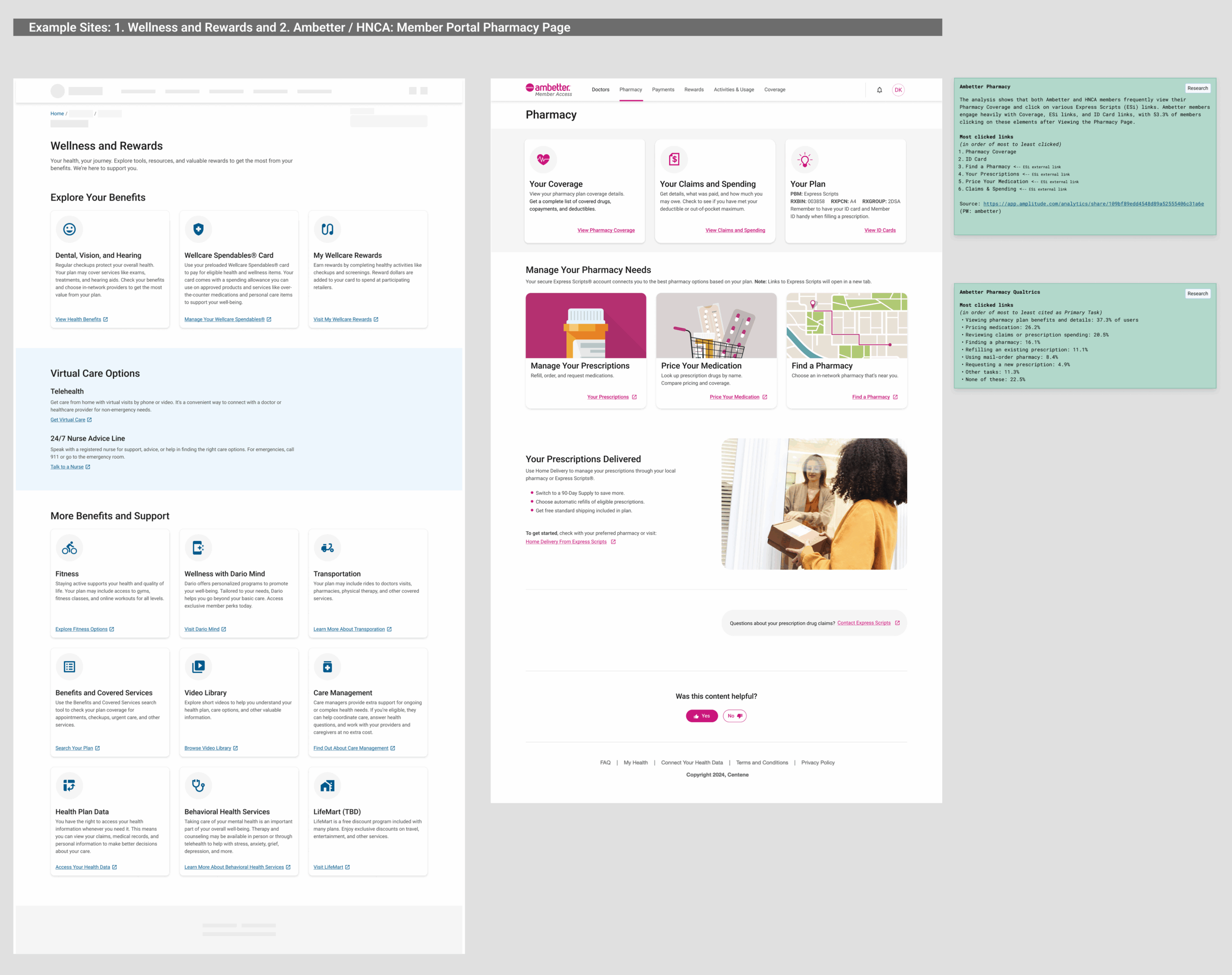
- Wireframing & Modular Architecture
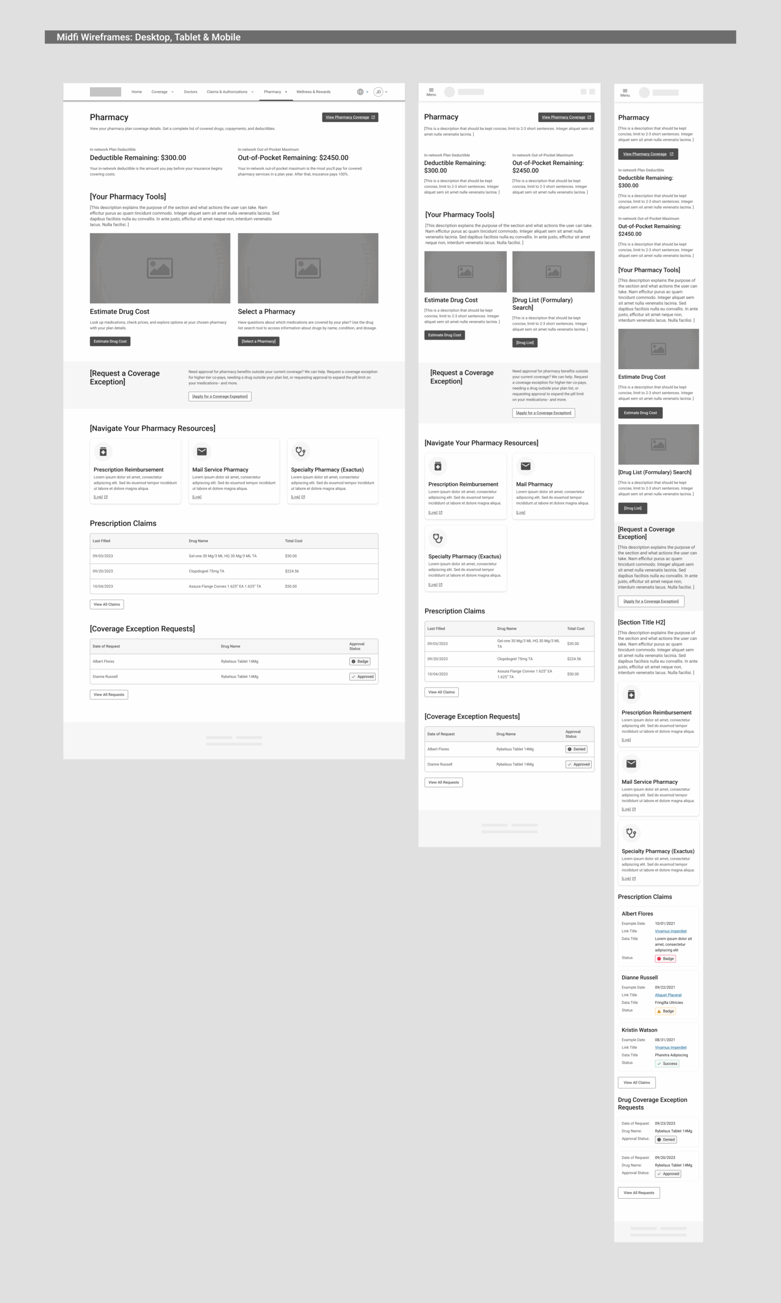
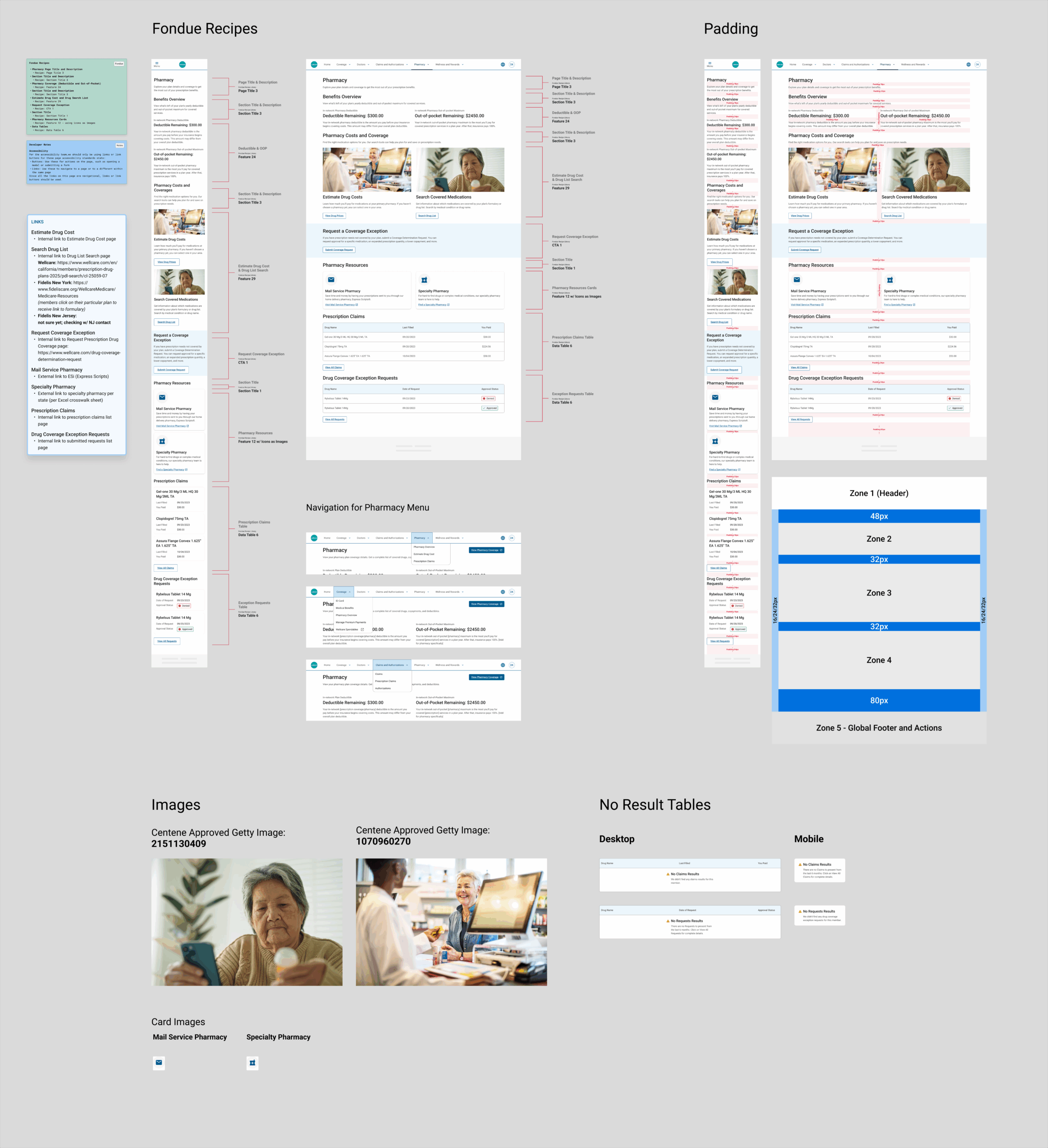
Created low- and mid-fidelity wireframes that explored layout options, prioritization, and interaction models. The team selected a visible, non-collapsible layout—showing all resources upfront for quick scanning—consistent with pharmacy patterns observed in prior portals.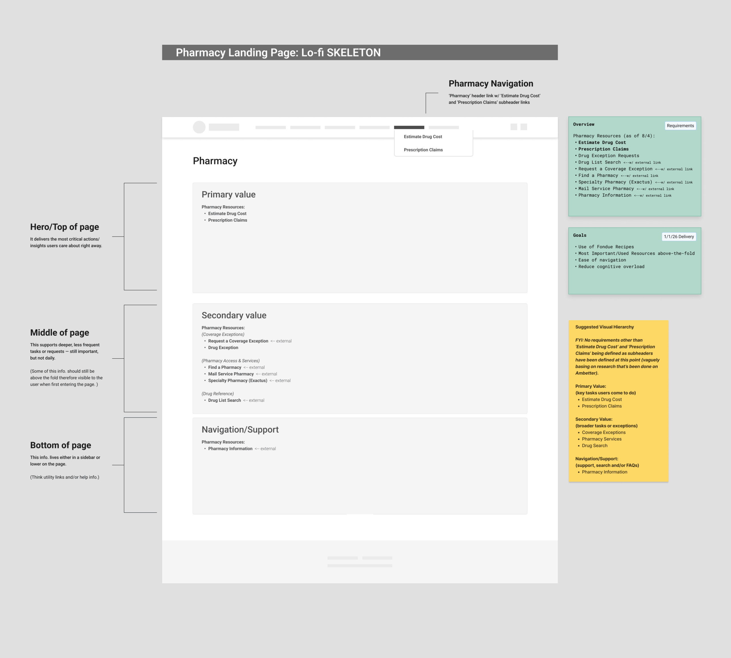

- Collaboration & Iteration
Worked in Figma using branching and versioning to streamline collaboration across design, content, and research. Conducted multiple internal reviews through Chassis Design Review meetings to align with system teams and maintain consistency across product groups. - Design & Accessibility
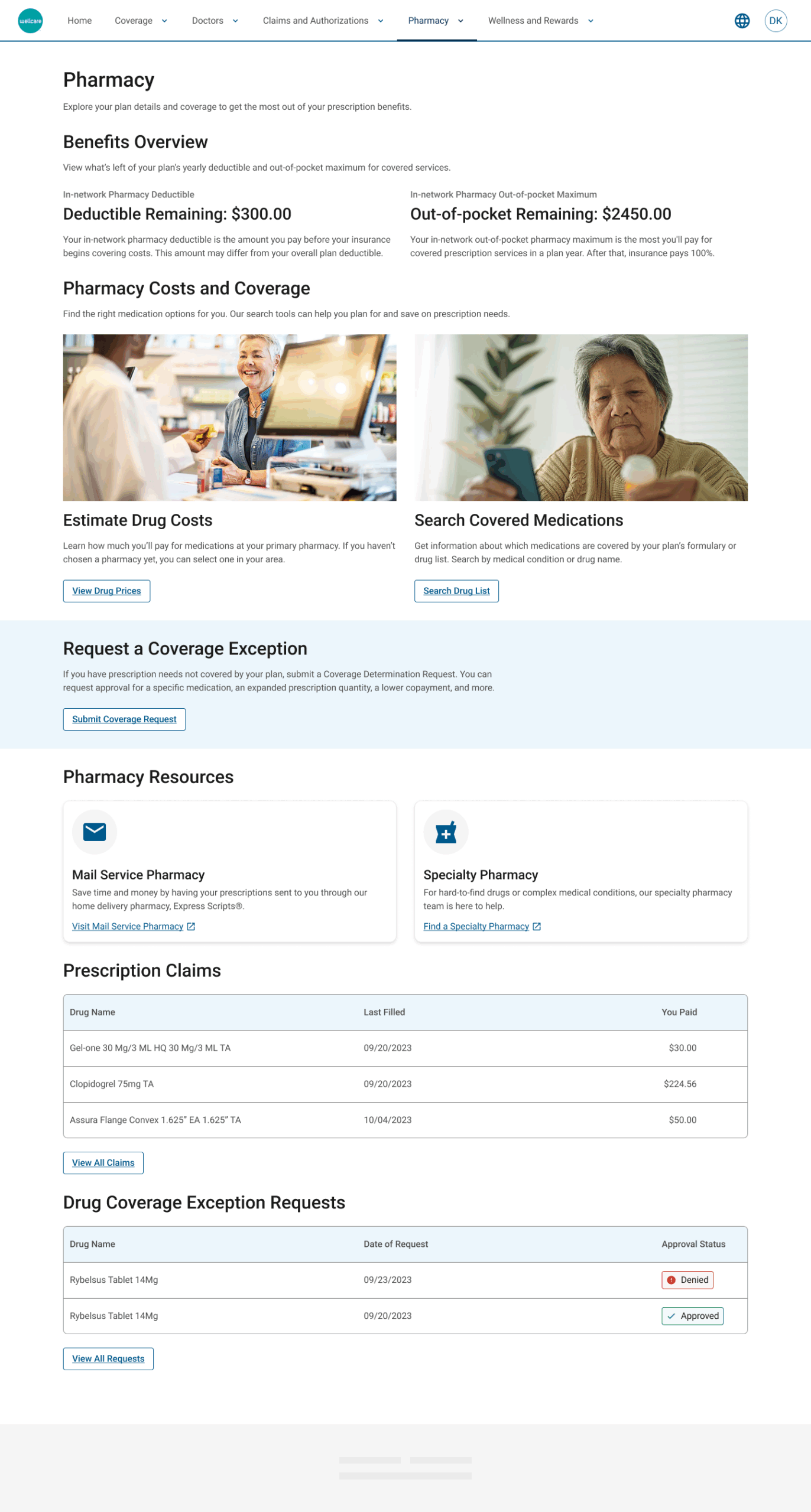
Developed high-fidelity designs using Fondue recipes (a set of structured components for Centene’s Fondue Design System that are built specifically for Adobe Experience Manager) for visual and functional cohesion with the Secure Chassis ecosystem. Applied accessibility-first principles to meet WCAG standards, ensuring the layout adapted seamlessly for desktop, tablet, and mobile. - Final Approval & Developer Handoff
Incorporated leadership feedback to improve hierarchy, typographic contrast, and conversational tone before handoff to engineering.
4. Impact & Broader Context
The Pharmacy Landing Page serves as a foundational experience within the Secure Chassis ecosystem—setting a new precedent for modular, unified healthcare design at Centene.
Beyond simplifying pharmacy navigation, the project also helped establish consistent, scalable UX practices across teams with:
- A repeatable layout pattern for other portal sections
- Stronger cross-team collaboration between design, product, and engineering
- Improved consistency across Centene’s fragmented health plan experiences
The project also reinforced the value of reusability through the Fondue system, allowing future pharmacy features to be added with minimal redesign.
5. Results
While this launch was an MVP, the design achieved key business and UX goals:
Key Results & Metrics
- Pharmacy essentials consolidated into one central hub—reducing member navigation time
- Strong stakeholder and leadership feedback, praising cohesion and accessibility
- Fully responsive, WCAG-compliant design across multiple health plans
-
Established a scalable foundation for personalization and feature expansion post launch
Future phases will include usability testing, personalization improvements, and research-driven updates.
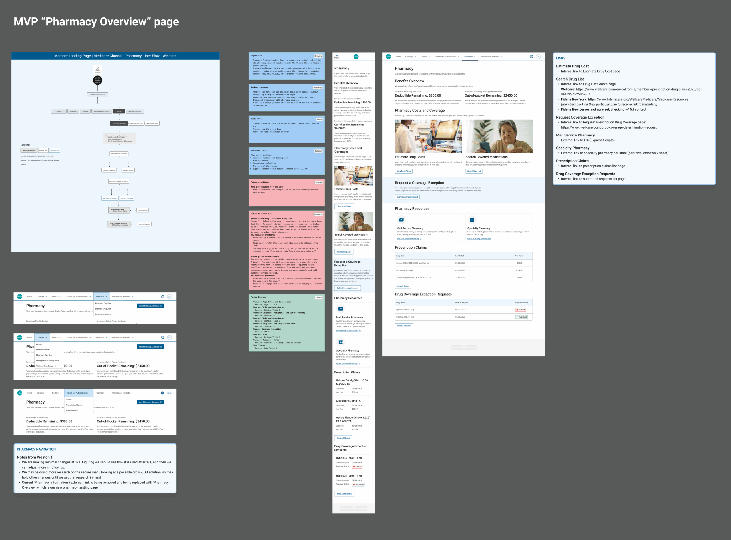
Specs for engineer team, using Fondue Design System’s “Recipe” system:
7. Learnings & Reflections
This project emphasized the importance of clarity and collaboration when requirements are fluid; I learned to balance MVP delivery with long-term scalability—designing for what’s essential now, while anticipating what’s next.
Despite the lack of new research, leveraging previous insights and close partnership with product and business teams ensured a strong, user-centered outcome.
It also reinforced how a modular design system accelerates delivery—empowering teams to focus on meaningful UX decisions instead of reinventing visual components.
UX Principle Used: Cognitive Load Theory
The final design minimized cognitive load by structuring all pharmacy tools visibly on one page, reducing unnecessary clicks and helping users quickly locate what they need.