
Design System & UI Library for a SaaS Cloud Console
Pulumi’s first UI library, built to bring consistency, scalability, and efficiency to the design and development of the Pulumi Cloud Console.
1. Overview
The Pulumi UX team lacked a formal UI library, which led to inconsistencies across the product and inefficiencies in both design and development. As Pulumi Cloud and the team grew, the need for a unified visual language became clear. The focus was on building reusable components and establishing foundational styles to support a more consistent and scalable user experience.
Team
- Jonelle Boyd, Sr. UX/UI Designer
- Dylan Kilgore, Sr. UX/UI Designer
- Vic Fernandez, Sr. UX/UI Designer
- Kimberley MacKenzie, Sr. Frontend Engineer
My UX Goals
- Establish visual and functional consistency across teams and features
- Reduce design and development debt by creating reusable, standardized components
- Improve accessibility through built-in patterns and usage guidelines
- Foster cross-functional alignment between design and engineering through shared systems and documentation
2. Challenges
Before the UI library existed, our design and development workflows were fragmented. Designers frequently recreated components from scratch or worked from outdated files, while developers implemented UI without clear guidance or consistency. This led to duplicated work, visual drift, accessibility issues, and a fragmented user experience. We saw an opportunity not only to fix inconsistencies but to build a system that would support scalability and streamline collaboration across teams.
3. My Approach
To ensure the system was scalable, consistent, and easy to use, I followed a four-step approach grounded in UX best practices:
1. Audit & Align (Consistency)
I started with a UI audit to identify inconsistencies and redundant patterns. This gave us a clear picture of what needed to be standardized and where to consolidate design efforts.
2. Define Foundations (Usability)
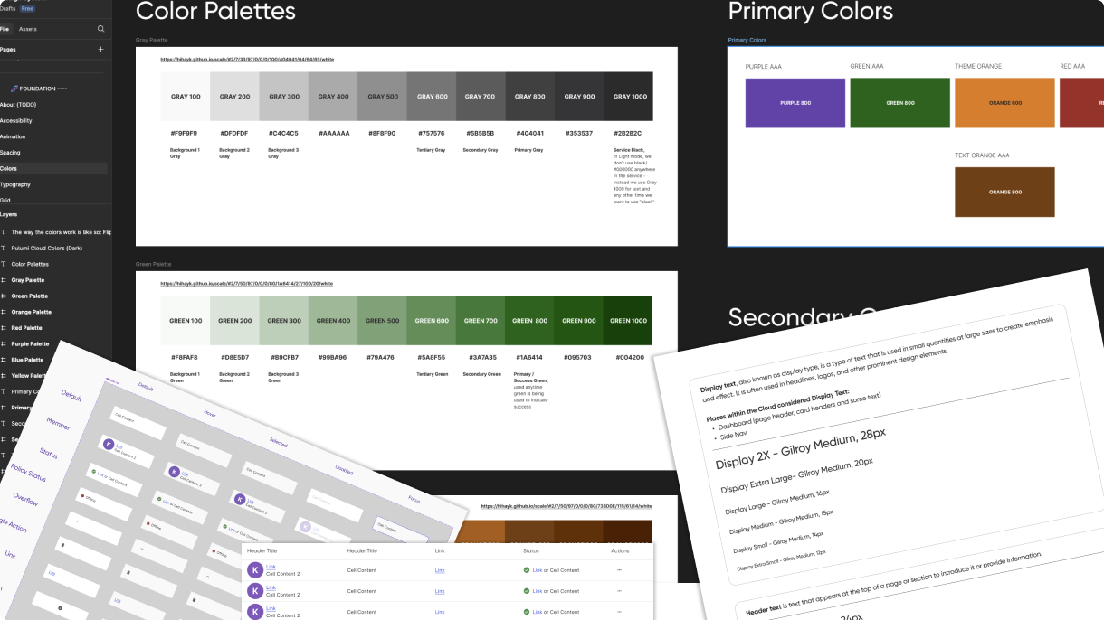
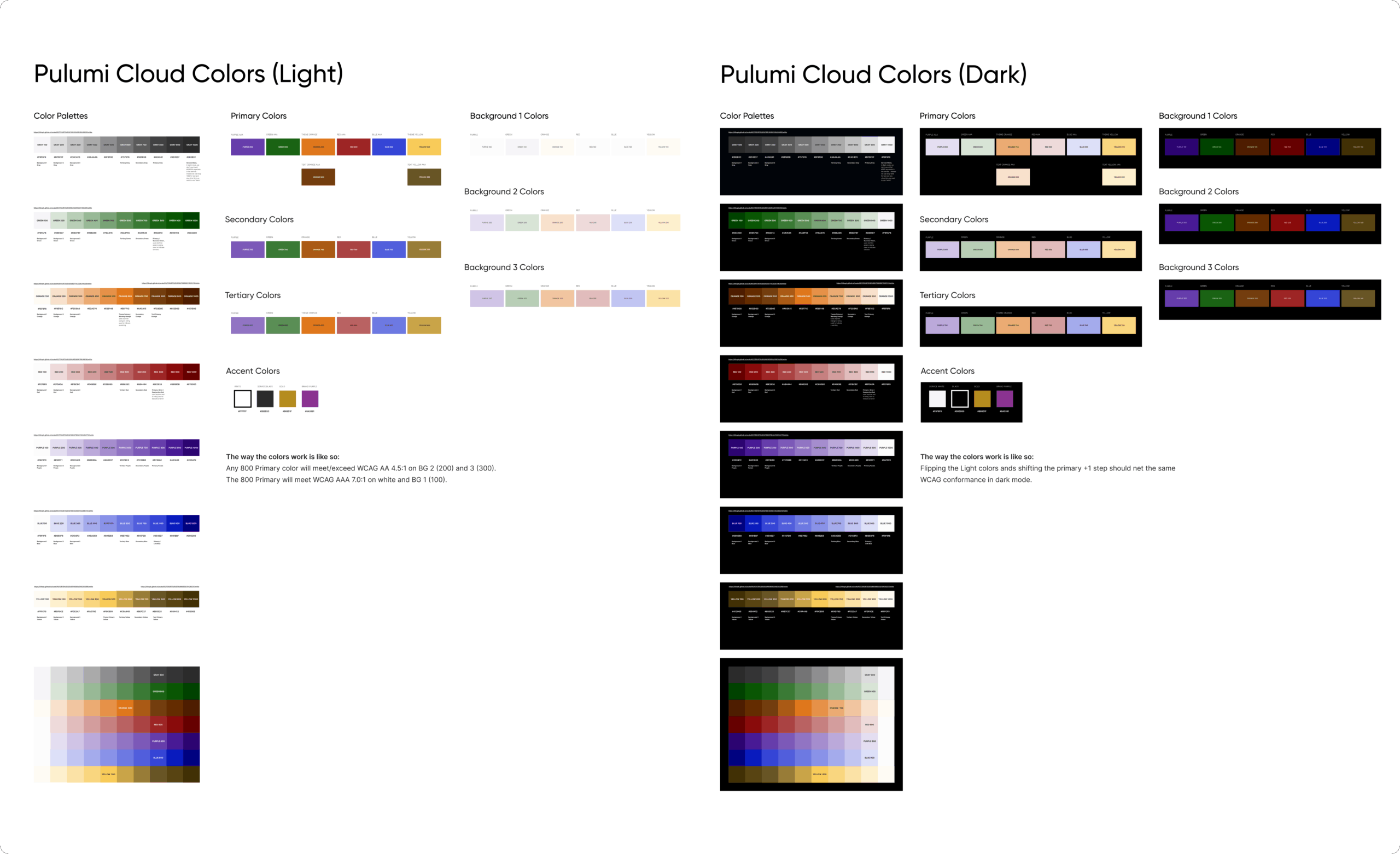
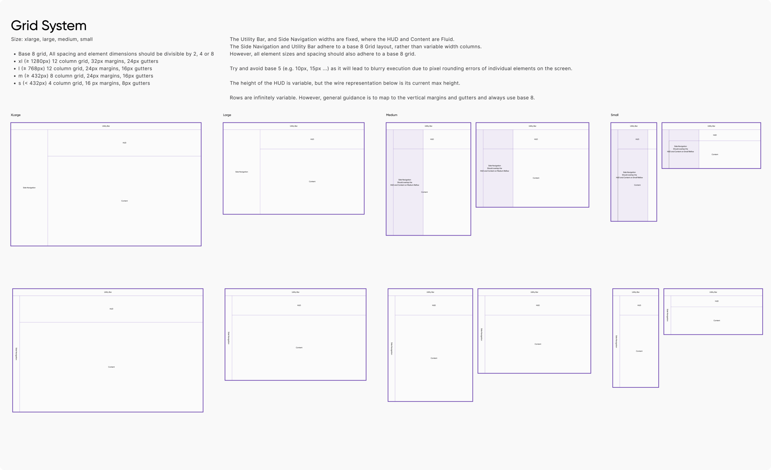
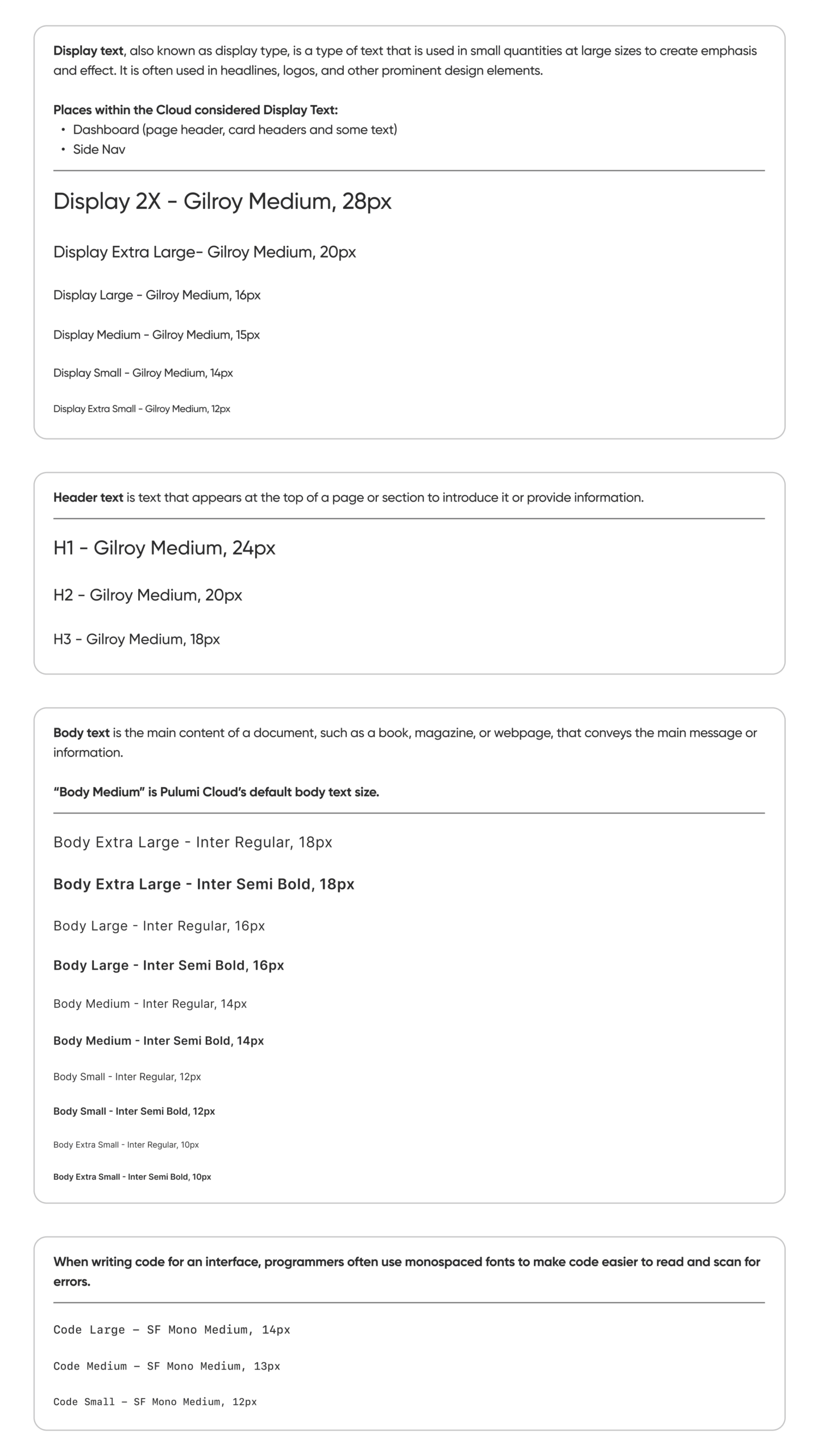
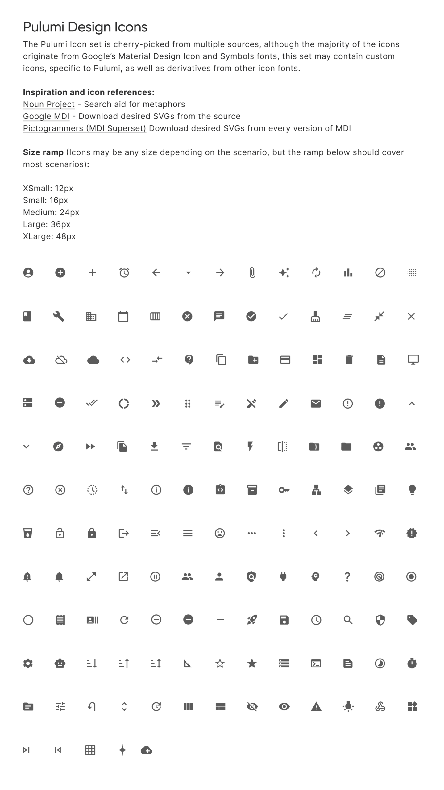
We established core design tokens—typography, color, spacing, and elevation—to create a consistent and reusable visual language that could guide both design and development.
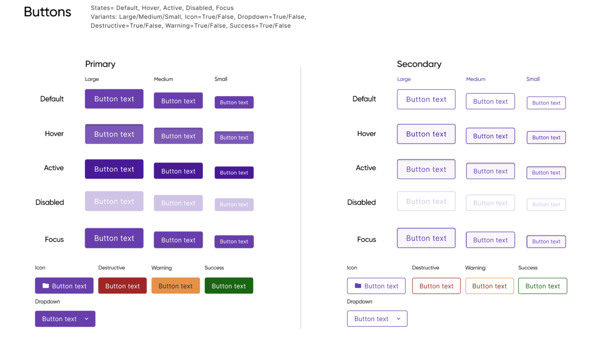
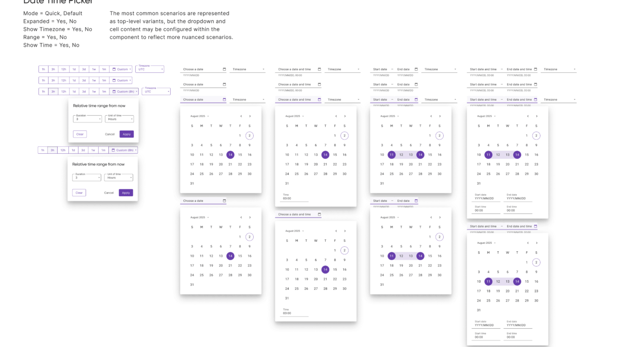
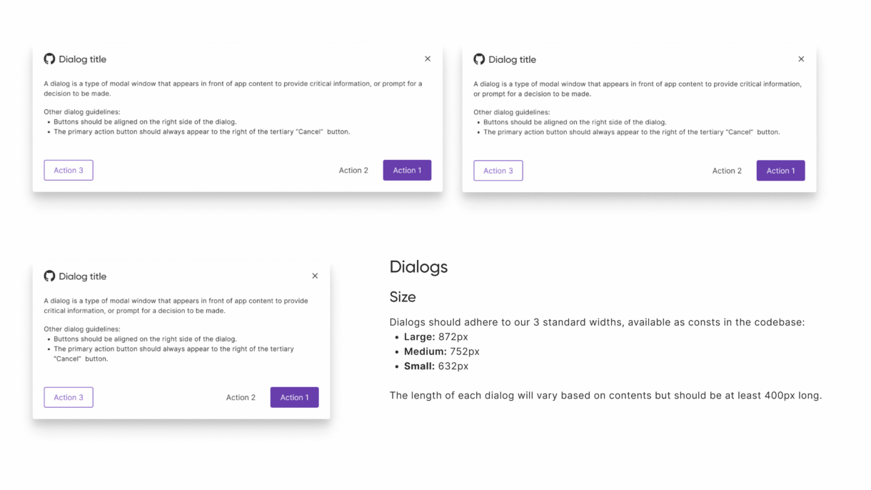
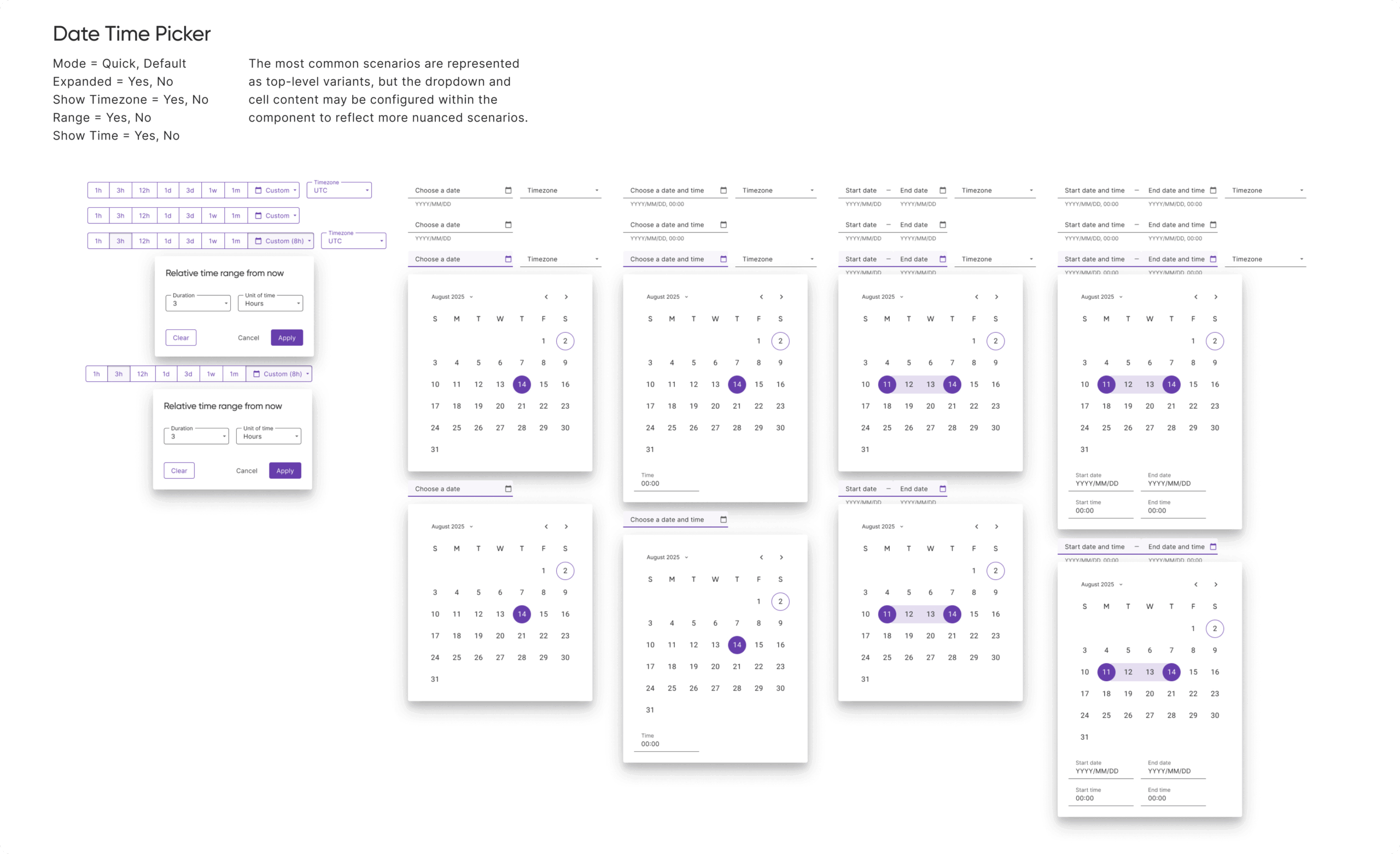
3. Build Modular Components (Scalability)
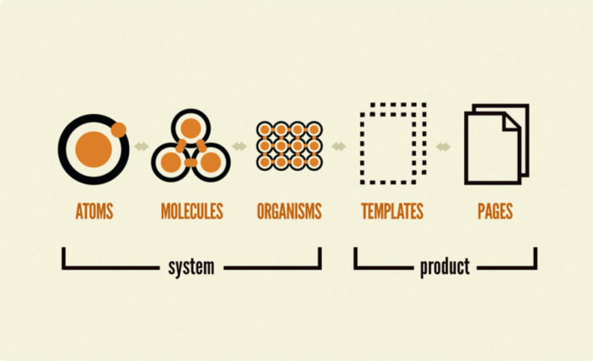
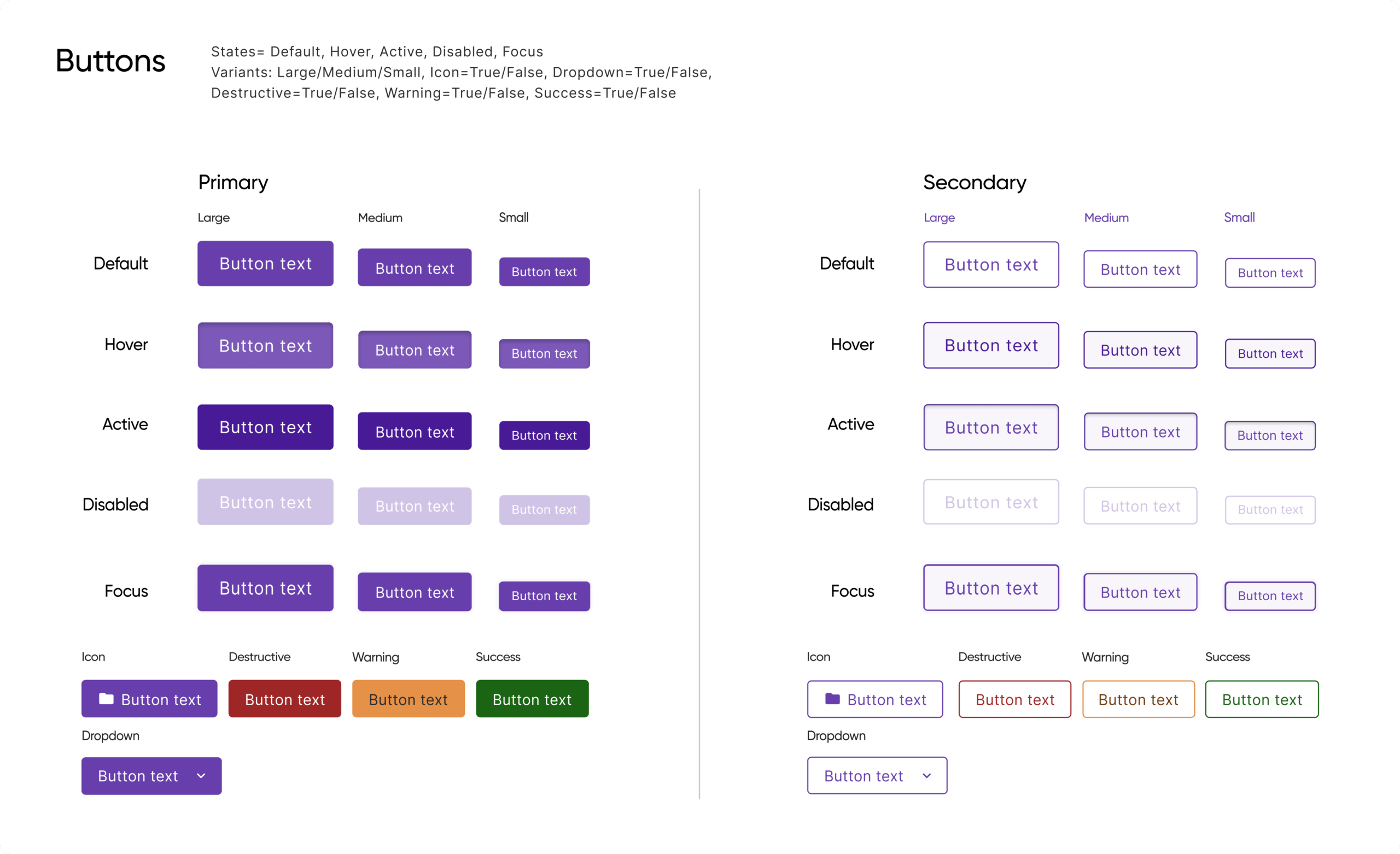
Following atomic design principles, I built flexible, reusable components in Figma, progressing from simple elements to more complex UI structures to support evolving product needs.
4. Document & Collaborate (Accessibility)
I created usage guidelines covering behavior, accessibility, and edge cases, and worked closely with engineering to ensure long-term maintainability and alignment between design and implementation.
4. Inspiration
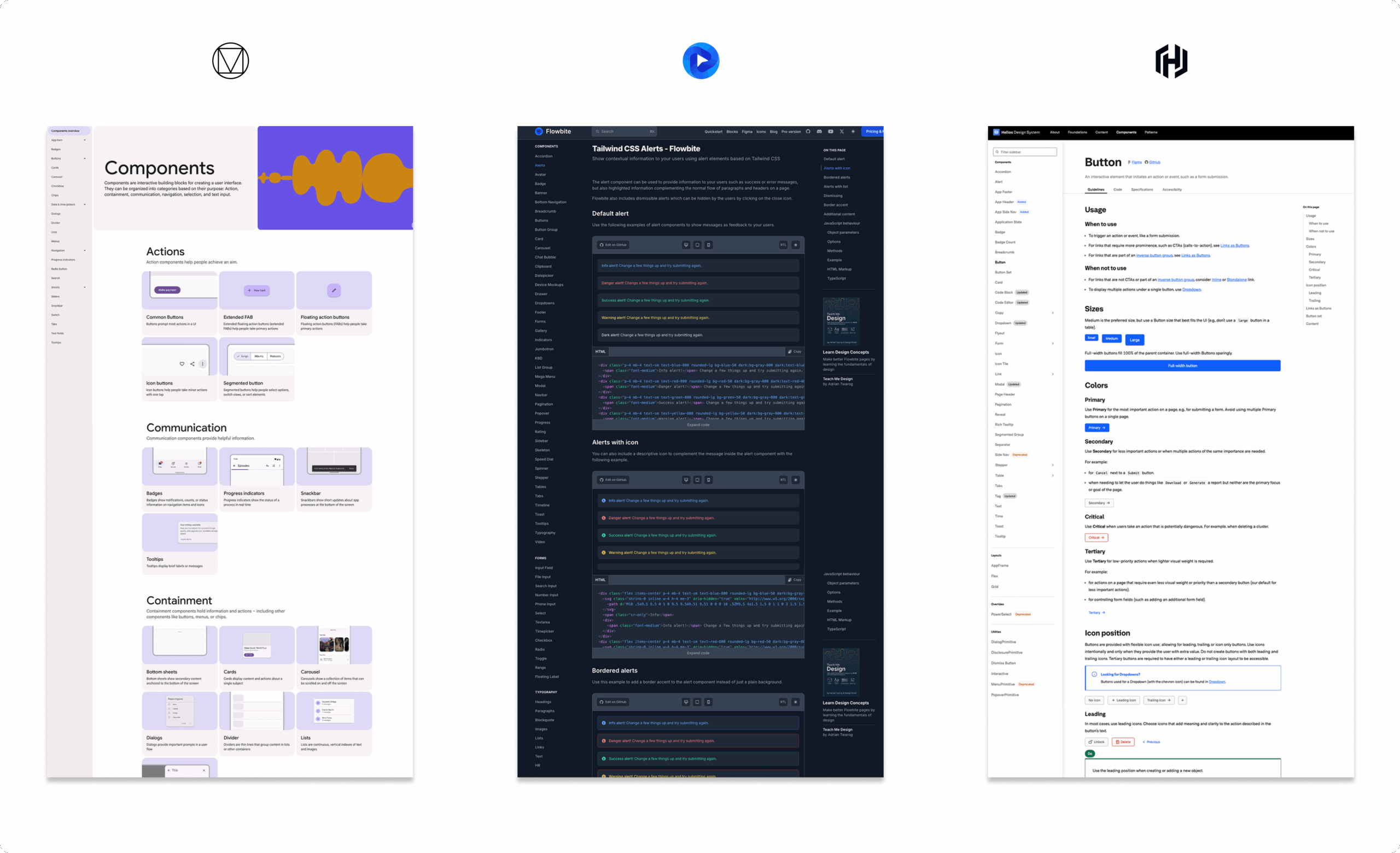
We drew inspiration from established systems like Google Material, Flowbite (a.k.a – Tailwind Figma), and Helios libraries. These systems demonstrated the value of a well-structured, documented, and extensible approach to UI. Their clarity and scalability helped shape our thinking around how to define tokens, components, and usage patterns in a way that would be both practical for our team and aligned with best practices.
5. Execution & Collaboration
We built the UI library in Figma, where we created atomic components, established design tokens, and documented properties and use cases. I also contributed to writing guidelines that covered behavior, accessibility, and edge cases—ensuring our system was not only consistent but also inclusive and functional. Collaboration with our front-end developer was key: we regularly synced on implementation details, reviewed GitHub PRs, and maintained a feedback loop to keep the design and code in sync.
The design system is still a work in progress, with the long-term goal of building a public-facing website similar to Google Material’s—something that can serve as a shared resource internally and eventually externally. For now, documentation lives in a working Google Docs file titled UI Design System Guidelines, which serves as a living guide for how to create or update components within the Pulumi Cloud Console. This document is actively maintained and intended to evolve alongside the system until the full site is ready to launch.
6. Results & Next Steps
The design system has improved consistency across Pulumi Cloud and reduced the time designers and developers spend on repeat work. Feedback from internal teams has been positive, especially around shared patterns and accessibility support. The next milestone is launching a public-facing documentation site to better support onboarding, cross-team adoption, and external contributors.
Key Results & Metrics
-
80% reduction in time spent designing repeat UI components, thanks to reusable assets in the Figma library.
-
4× faster onboarding for new designers and developers, due to centralized documentation and clear component usage.
-
100% adoption rate among Pulumi UX designers for the new Figma component set within the first quarter.
-
20+ documented components and growing, each with usage guidelines, accessibility notes, and edge case considerations.
7. Learnings & Reflections
Building Pulumi’s first design system taught me how foundational consistency and clarity are to scaling UX. I deepened my understanding of atomic design, accessibility standards, and cross-functional documentation. Most importantly, I saw how a well-structured system can bridge gaps between design and development, enabling teams to move faster while staying aligned.
Methodology: Atomic Design
A methodology that breaks interfaces into five hierarchical stages—atoms, molecules, organisms, templates, and pages—for scalable and modular UI development.